Zh GoogleMap Description
Installation
Component is installed on Joomla! 3.x in a standard way through the Extension Manager.
Component supports autoupdate feature
Options
You do not need to configurate it, because component runs on Google Maps JavaScript API V3.
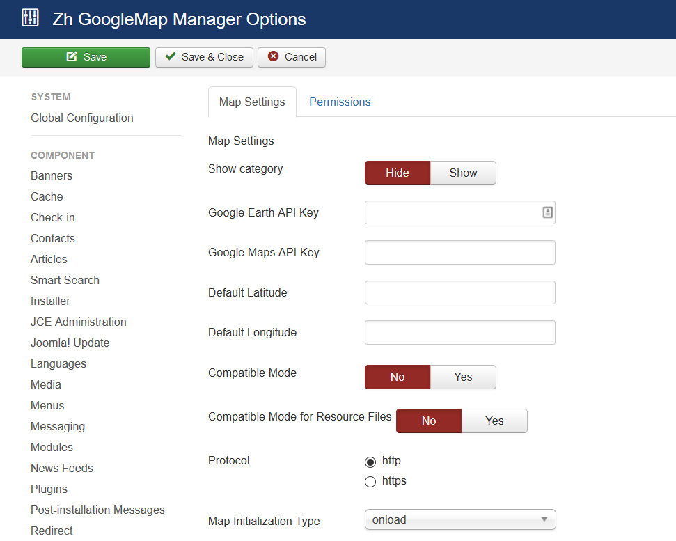
There are some parameters you can set in component options.
Press (menu):
- Components
- Zh GoogleMap
Press "Options" button
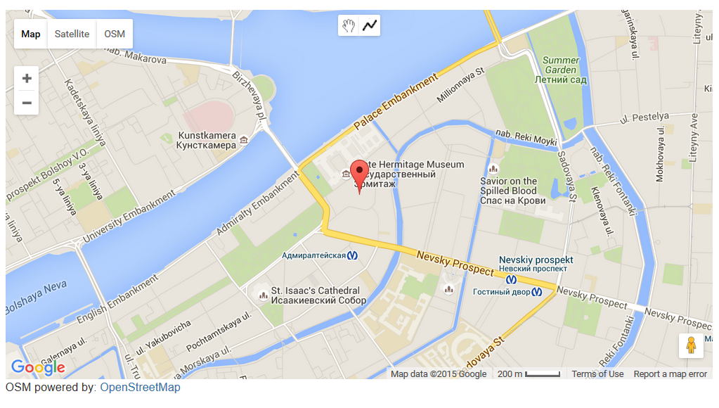
When you create new map objects at the opening map is automatically calculated location, if can not be calculated, then displaying center of Palace Square in St. Petersburg (if not set default place).
Default place
You can set latitude and longitude of your default place in Options page
After that when you try to create new map, placemark, path in backend, position of marker on map will be set to default.
API Key for Google Earth
If you want to use the Google Earth feature, you must obtain a key for the Google Earth API and enter it.
Despite the fact, that you can use Earth API without key, in current release you have to set it, because I can't get Maps and Earth API integration work together without key. When I can - I'll correct code and you'll have the ability to use Earth API without API Key
API Key for Google Maps
If you want to use the Google Maps API key for monitoring or billing overlimit quotas, you can obtain a key for the Google Maps API and enter it in Options page (like a Google Earth API Key)
Compatibility Mode
In some cases when on map is active Managing Placemarks by Group List, you can get an error
link.hasClass is not a function
It can be caused by conflict with JQuery and mootools in some templates, or in case mootools is disabled in joomla
In this case you can activate compatibility mode, when calling methods hasClass and toggleClass is changed to JavaScript functions which do like the same.
Compatibility Mode for Resource Files
In some cases you restrict access to administrator folder. In this folder for component by default exists assets folder , which used for storing icons, css-files for component and plugin.
If you block access to it, then when users will try to see your map will get login screen.
And just for this case there is a component option Compatible Mode for Resource Files.
Just set it to yes, and all references in document, which contains map (created as a component, or as a plugin), will be to site assets folder. Do not move any files or folders, just use it.
And you have to copy icons from admin icons folder (/administrator/components/com_zhgooglemap/assets/icons) to site folder (/components/com_zhgooglemap/assets/icons), because it is empty from installation (because if site folder will contain icons, then size of zip-archive of extension increase twice)
And if you want to use your icons for placemarks, you should copy your icons to both folders. In administrator folder icons will be used in backend (admin panel), and when displaying - from site folder.
Protocol
You can set protocol to use when you load map.
Map initialization type
In some cases your template or the other extensions can use onload function. And in this case map will not be initialized (displayed), therefore you can set domready type.
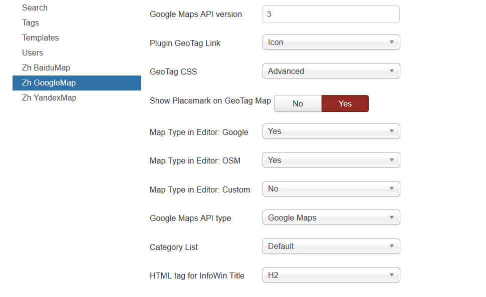
Google Maps API version
By default (empty value) loaded latest experimental version of maps API.
You can define what version you want to load. Read more about Google Maps API versioning
Map Type in Editor
You can manage what map types will be accessible when you define map objects (map, placemarks...) and there is a map in details.
Category List
You can define type of category list you can see in details Simple (plain) or Default (hierarchy)
HTML tag for InfoWin Title
Define h2 (h3...) tag for Infowin Title, for example, for placemark
powered by
You can define place to show my logo, or hide it
Creating Map
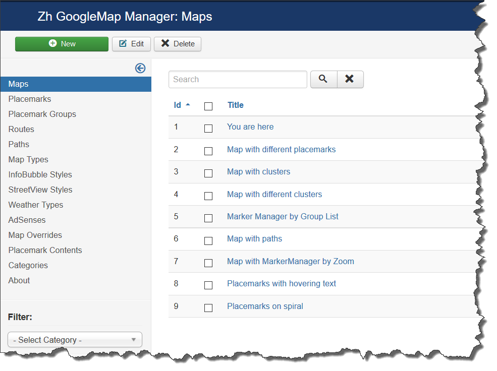
We turn to the menu "Maps".
Enter the number of maps with the correct configuration for us.
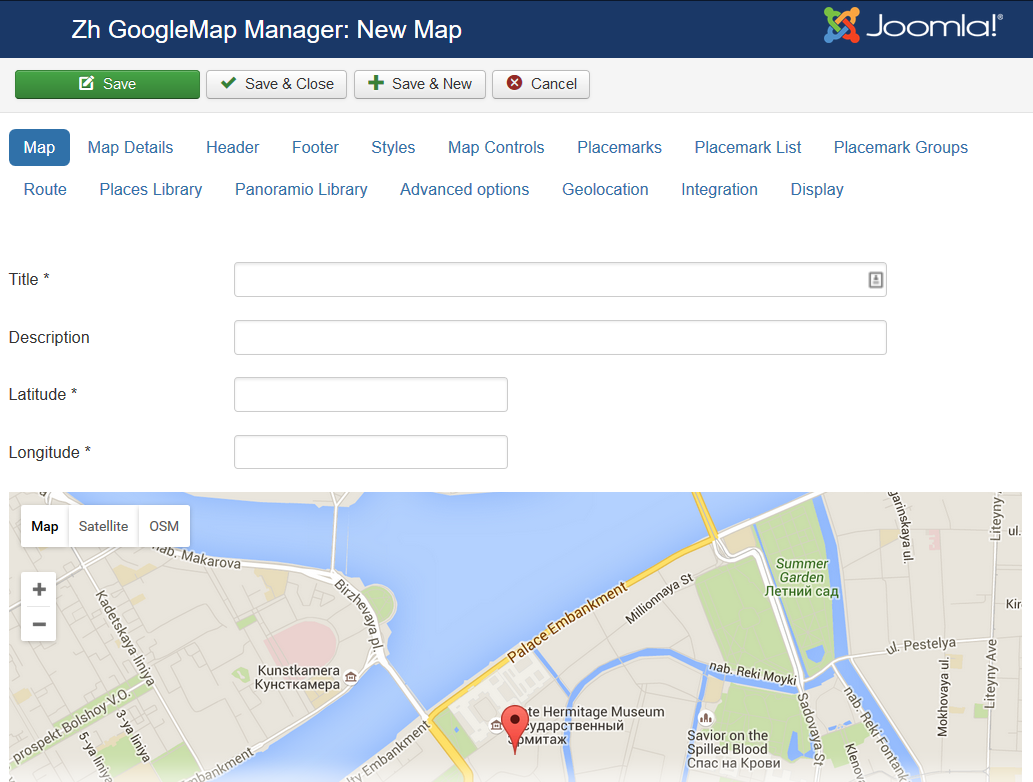
Coordinates it is convenient to choose by dragging the marker (the value is automatically substituted in the form fields ) or by clicking the mouse on the desired location.
Map properties
| Title | Map title |
| Description | Description |
| Latitude | Map center Latitude |
| Longitude | Map center Longitude |
| Width | Map Width, if set to 0, map will be 100% wide |
| Height | Map Height if set to 0, map will be 100% height. |
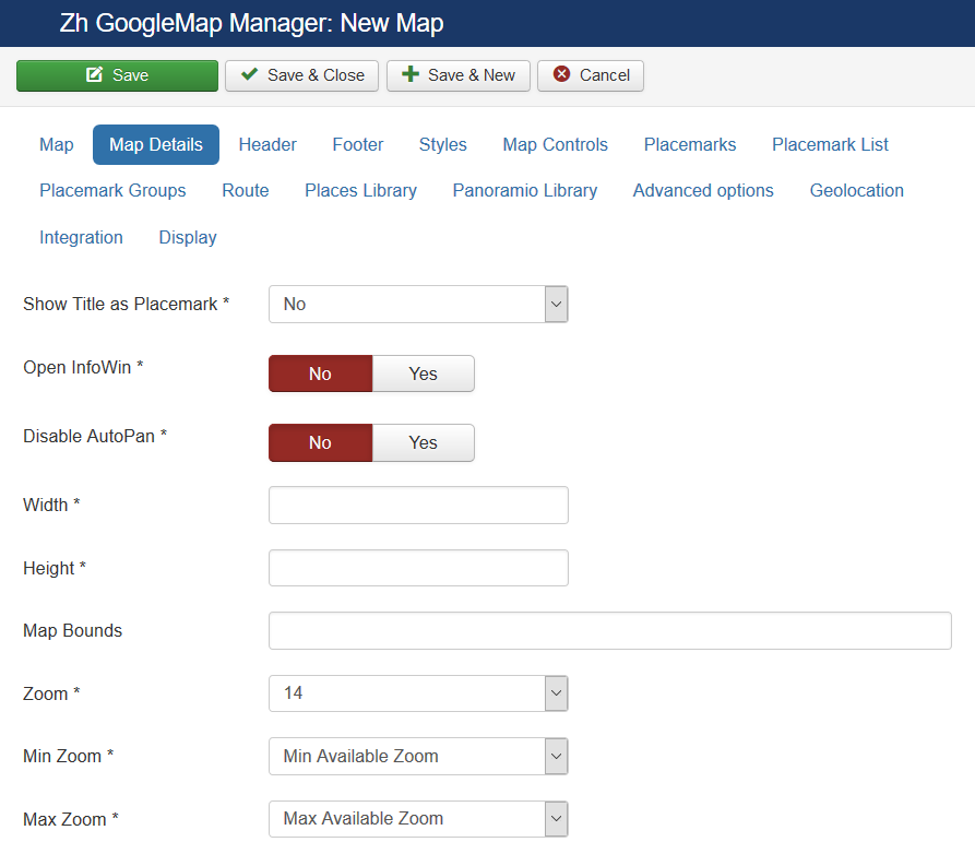
Map Details
| Show Title as Placemark | Show map title as a placemark
|
| Open InfoWin | Open InfoWindow for map title immediately |
| Disable AutoPan | Disable AutoPan when open infowin |
| Map Bounds | Map bounds to protect navigation outside map You have to enter Latitude1,Longitude1;Latitude2,Longitude2 |
| Zoom | Initial Map Zoom |
| Min Zoom | Min Zoom for Map |
| Max Zoom | Max Zoom for Map |
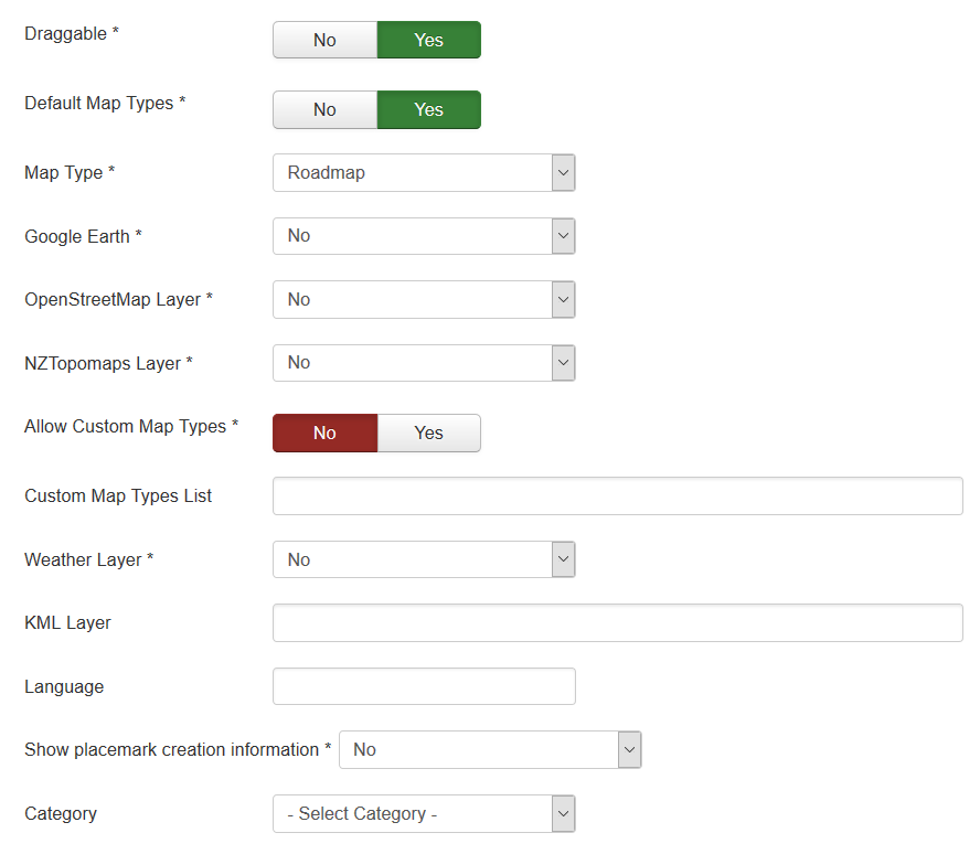
| Draggable | Enable/disable Map dragging |
| Default Map Types | Enable/disable standard map types in map type control |
| Map Type | Initial Map Type
|
| Google Earth | The enabled/disabled state of the Google Earth
|
| OpenStreetMap Layer | The enabled/disabled state of the OpenStreetMap Layer and ability to use Map Type Control to switch to that layer |
| NZTopomaps Layer | The enabled/disabled state of the NZTopomaps Layer and ability to use Map Type Control to switch to that layer |
| Allow Custom Map Types | The enabled/disabled using custom map type and ability to use Map Type Control to switch to that layers |
| Custom Map Types List | List of custom map types ID for using on map, separator ; Example: 1;2;5 |
| Weather Layer | Weather Layer, that would be displayed on the map |
| KML Layer | URL of the KML Layer, that would be displayed on the map |
| Language | Language for map objects names Example: ru-RU |
| Show placemark creation information | You can show information about user and date of placemark creation
|
| Category | The category that this map is assigned to |
Using Google Earth
We turn to component options.
Enter the key Google Earth API.
For you map select using Google Earth
- "Yes" - the map is displayed, but if you have not installed the plugin Google Earth Plugin, then that functionality is not available
- "Yes (Notify)" - the map is displayed, but if you have not installed the plugin Google Earth Plugin, then that functionality is not available and displays a message that there is no plugin
Using KML Layer
If you have KML-file, you can put into accessible folder on site and fill URL in map field KML Layer.
If you want to use more than one file, you can use "feature", that path field of Paths is not required
- go to Paths tab
- create path
- fill KML Layer field
And after that new layer will be displayed
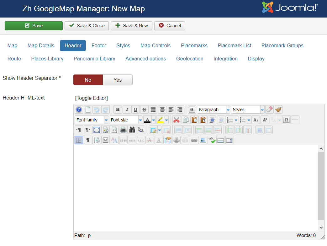
Map Header
| Header HTML-text | HTML text on top of the map |
| Show Header Separator | Show Separator after Header HTML text |
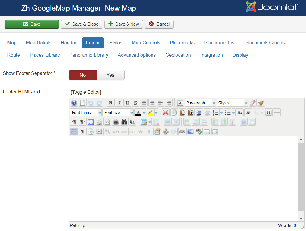
| Show Footer Separator | Show Separator before Footer HTML text |
| Footer HTML-text | HTML text on bottom of the map |
Styles
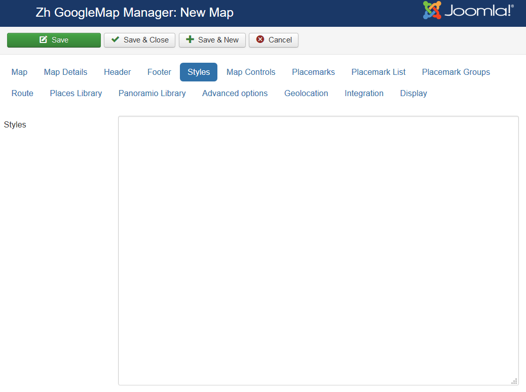
You can create styled maps, ie you have ability to change color, hide POI and so on.
| Styles | Styles for map Read more about styling Start Styling your Map
|
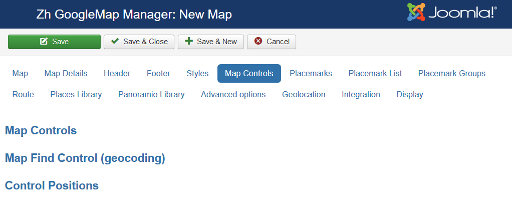
Map Controls
There are three sliders in this section
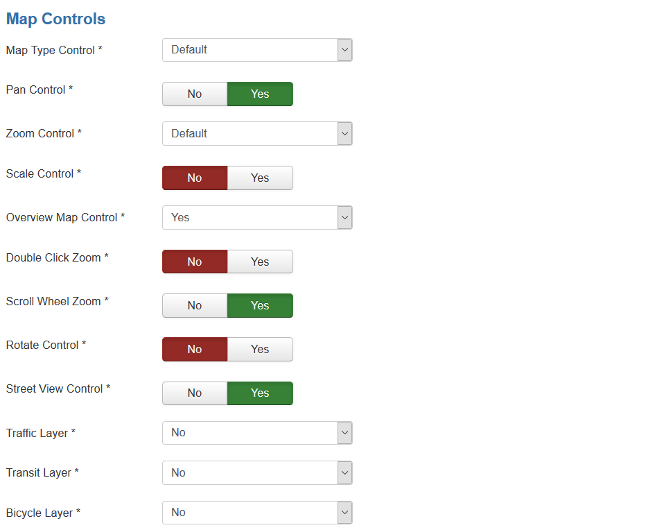
The first slider is
| Map Type Control | The enabled/disabled state of the Map Type Control |
| Pan Control | The enabled/disabled state of the Pan Control |
| Zoom Control | The enabled/disabled state of the Zoom Control |
| Scale Control | The enabled/disabled state of the Scale Control |
| Overview Map Control | The enabled/disabled state of the Overview Map Control
|
| Double Click Zoom | Enables/disables zoom and center on double click |
| Scroll Wheel Zoom | The enabled/disabled state of the scrollwheel zooming on the map |
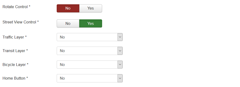
| Rotate Control | The enabled/disabled state of the Rotate Control |
| Street View Control | The enabled/disabled state of the Street View Control |
| Traffic Layer | The enabled/disabled state of the Traffic Layer |
| Bicycle Layer | The enabled/disabled state of the Bicycle Layer |
| Home Button | The enabled/disabled feature to reset map center and/or zoom to initial value |
The second slider is
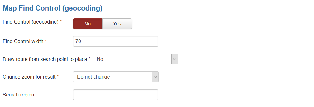
| Find Control (geocoding) | The enabled/disabled state of the Find Control (by geocoding) |
| Find Control width | Width of Find Control field |
| Draw route from search point to place | The enabled/disabled state of the drawing route from place which is found by Find Control |
| Change zoom for result | You can change zoom to show result |
| Search region | Region Localization: if you wish to alter your map to serve geocoding results towards the region. The value is Unicode region subtag identifiers. Most Unicode region identifiers are identical to ISO 3166-1 codes, with some notable exceptions. E.g., US, ES. But as for example for Great Britain is GB, not UK |
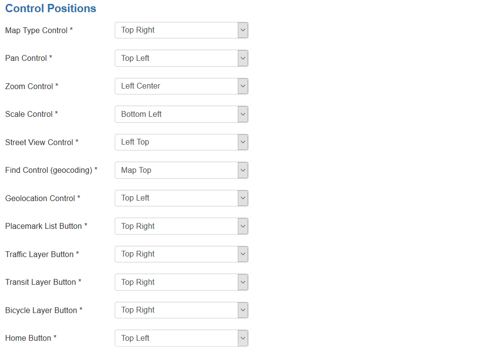
The third slider is
| Map Type Control | Position on a map |
| Pan Control | Position on a map |
| Zoom Control | Position on a map |
| Scale Control | Position on a map |
| Street View Control | Position on a map |
| Find Control (geocoding) | Position on a map |
| Geolocation Control | Position on a map |
| Placemark List Button | Position on a map |
| Traffic Layer Button | Position on a map |
| Transit Layer Button | Position on a map |
| Bicycle Layer Button | Position on a map |
| Home Button | Position on a map |
Map Properties for Placemarks
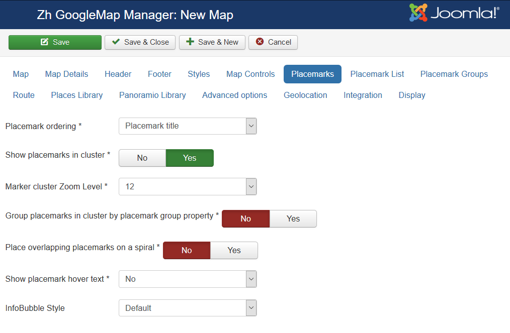
| Placemark ordering | Order placemarks. It is useful when you show placemark list
|
| Show placemarks in cluster | Create cluster for markers |
| Marker Cluster Zoom Level | Zoom Level on which Clusterer starts group markers |
| Group Placemarks in Cluster by Group Property | Create cluster for each group (and you can override cluster icon) Remember, if you use this feature (without managing markers by group list), you have to activate group in cluster (by setting Active in Group List) |
| Place overlapping placemarks on a spiral | Enable feature to show overlapped placemarks on a spiral |
| Show placemark hover text | Enable feature to show infowin/infobubble on hover placemark
|
| InfoBubble Style | If you use Open InfoBubble for Show placemark hover text feature to show hover text, than you can assign InfoBubble stype for it. |
Map Properties for Placemark List
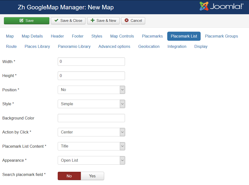
| Width | Placemark List Width in pixels If set 0 then you've got 100% width. |
| Height | Placemark List Height in pixels |
| Position | Values
For example, <ul id="GMapsMarkerUL" style="list-style-type: none;"></ul> |
| Style | Values
|
| Background Color | Background Color Example: #EAEAEA As for gradient in my example, I've got it from internet sites. When you specify background color #E6E6E6, I add into style line background: #E6E6E6 I've got this example background: #fefcea; /* For old browsers */
background: -moz-linear-gradient(top, #fefcea, #f1da36); /* Firefox 3.6+ */
/* Chrome 1-9, Safari 4-5 */
background: -webkit-gradient(linear, left top, left bottom,
color-stop(0%,#fefcea), color-stop(100%,#f1da36));
/* Chrome 10+, Safari 5.1+ */
background: -webkit-linear-gradient(top, #fefcea, #f1da36);
background: -o-linear-gradient(top, #fefcea, #f1da36); /* Opera 11.10+ */
background: -ms-linear-gradient(top, #fefcea, #f1da36); /* IE10 */
background: linear-gradient(top, #fefcea, #f1da36); /* CSS3 */
padding: 10px;
border: 1px solid #333;
And after all this is mine code #E6E6E6; /* For old browsers */
background: -moz-linear-gradient(top, #E6E6E6, #AAAAAA); /* Firefox 3.6+ */
/* Chrome 1-9, Safari 4-5 */
background: -webkit-gradient(linear, left top, left bottom,
color-stop(0%,#E6E6E6), color-stop(100%,#AAAAAA));
/* Chrome 10+, Safari 5.1+ */
background: -webkit-linear-gradient(top, #E6E6E6, #AAAAAA);
background: -o-linear-gradient(top, #E6E6E6, #AAAAAA); /* Opera 11.10+ */
background: -ms-linear-gradient(top, #E6E6E6, #AAAAAA); /* IE10 */
background: linear-gradient(top, #E6E6E6, #AAAAAA); /* CSS3 */
padding: 10px;
border: 1px solid #333;
I note that in IE9 there is no gradient. But it is not task to do it in my component by CSS. In any case you can do it by image and applying for class. |
| Action by Click | Action to do when you Click on link
|
| Placemark List Content | Text from which placemark list contains
|
| Appearance | Appearance of placemark list
|
| Search placemark field | Enable feature to search by autocomplete placemarks in placemark list |
Groups
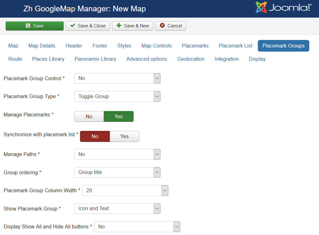
| Group Control | Position and type of list of group, that would be displayed for marker management
|
| Group Type | Behavior of group list
|
| Manage Placemarks | Enable ability to manage placemarks by Group List |
| Synchronize with placemark list | Show/Hide placemarks in placemark list depends on group state |
| Manage Paths | Enable ability to manage paths by Group List |
| Group ordering | Group order in list
|
| Group Column Width | Column width for the left or right position of list group |
| Show Group | Show text, icon of group in list of group
|
| Display Show All and Hide All buttons | Show buttons to show/hide all groups by one click
|
| Search group field | Display search field to find group in group list |
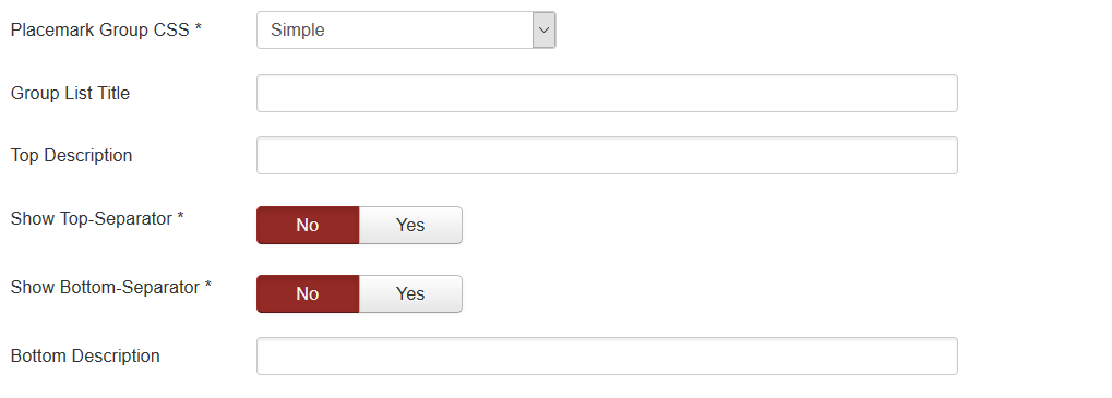
| Group CSS | Type of group decoration
There are two predefined style |
| Group List Title | Group List Title |
| Top Description | Description on top of the list |
| Show Top-Separator | The enabled/disabled state of Separator on top of the list |
| Show Bottom-Separator | The enabled/disabled state of Separator on botom of the list |
| Bottom Description | Description on bottom of the list |
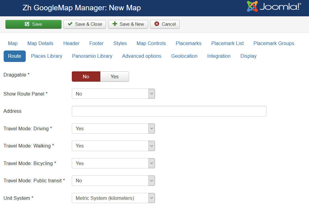
Route
This options for routes, which is shown for find your way to place
- by geocoding find feature (Map Find Control (geocoding) slider)
- autocomplete field (Places Library slider)
| Draggable | The enabled/disabled ability route to be draggable |
| Show Route Panel | Enable show route details |
| Address | If you want not use map center coordinates as a destination point of your route (for example, Google not right geocoded your address), you can enter text address into this field, and it would be used for drawing route Use value from autocomplete field (copy-paste) for entering more clear address for google router |
| Travel Mode: Driving | The enabled/disabled ability to be show this travel mode |
| Travel Mode: Walking | The enabled/disabled ability to be show this travel mode |
| Travel Mode: Bicycling | The enabled/disabled ability to be show this travel mode |
| Unit System | Use this unit system option when create route
|
| Avoid Highways | Use this option when create route |
| Avoid Tolls | Use this option when create route |
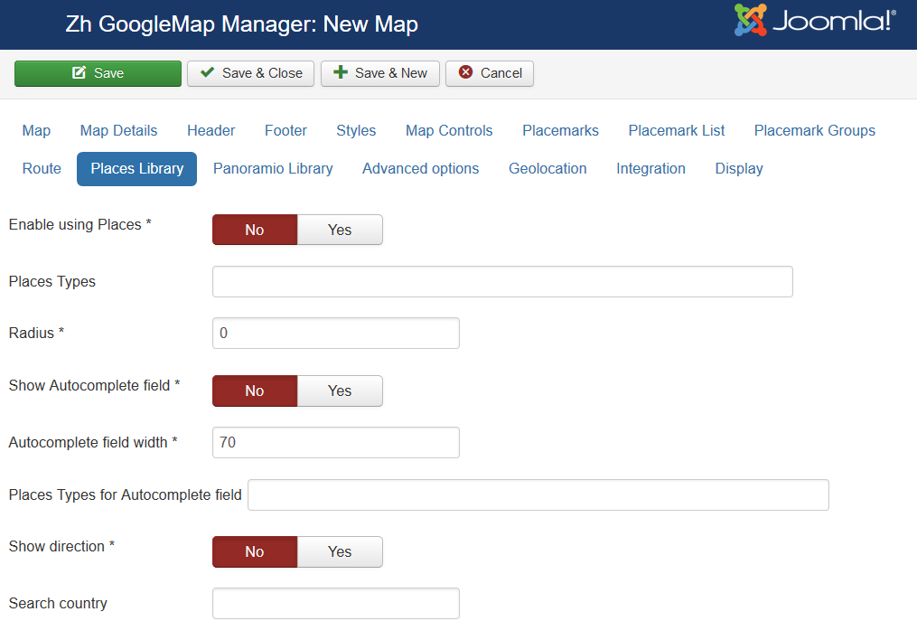
Using Places Library
| Enable using Places | The enabled/disabled state of using Places Library |
| Places Types | Places types in single quotes, delimited by comma for example: 'restaurant', 'store' |
| Radius | Radius from map center (in meters) If you don't want to see placemark from Places API, and only use autocomplete field, then set radius = 0 Places API show only up to 20 places! |
| Show Autocomplete field | The enabled/disabled state of using Autocomplete field |
| Autocomplete field width | Autocomplete field width |
| Places Types for Autocomplete field | Places types for Autocomplete field like a places types field, values in single quotes with comma delimiter
|
| Show direction | Show direction (by Directions API) from place, what you've found by autocomplete field (where marker is) and point on your map (which you set in map, center of map) |
| Search country | Country Localization: if you wish to alter your map to serve places autocomplete field values the towards specified country. The value is ISO 3166-1 Alpha-2 country code. E.g., US, BR, AU. |
Using Panoramio Library
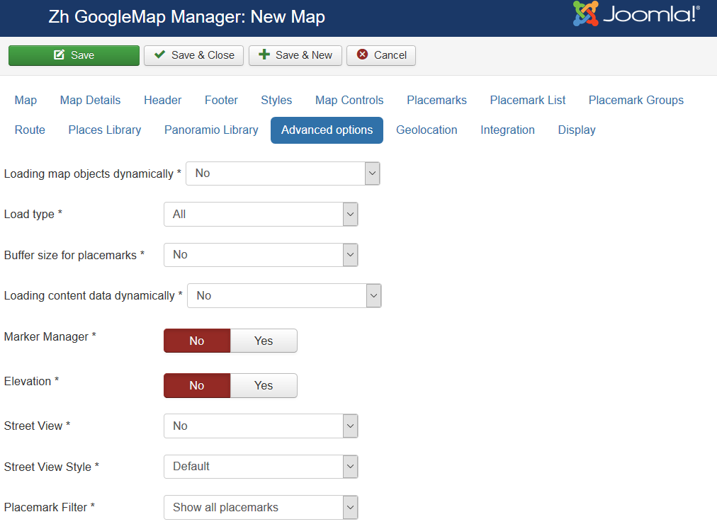
Advanced Options
| Loading map objects dynamically | Enable feature to load placemarks by AJAX
|
| Load type | Type of loading placemarks, ie load it all, or depends on some conditions
|
| Buffer size for placemarks | You can load placemarks by parts |
| Loading content data dynamically | Enable feature to load placemark infowin content by AJAX
Ie your page can contains placemark creation code, but all infowin/infobubble content can be loaded dynamically. |
| MarkerManager | The enabled/disabled state of using Marker Manager Marker Manager displaying markers on definite zoom. |
| Elevation | The enabled/disabled state of using Elevation API Show elevation at point where you click. |
| Street View | Enable/disable show Street View
|
| Street View Style | Style of Street View
|
| Placemark Filter | Restriction displaying placemarks on some rules. |
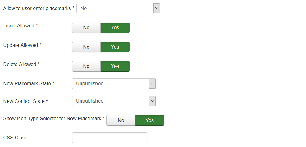
| Allow to user enter placemarks | Enable registered users to create and/or alter placemarks on map. |
| Insert Allowed | User can create new placemarks |
| Update Allowed | User can update existing placemarks |
| Delete Allowed | User can delete existing placemarks |
| New Placemark State | Placemark Status for created user placemark. |
| New Contact State | Contact Status for created user contact (if enabled contact integration). |
| Show Icon Type Selector for New Placemark | The enabled/disabled state of selecting Icon Type when user creates placemark. |
| CSS Class | The class name for map div tag |
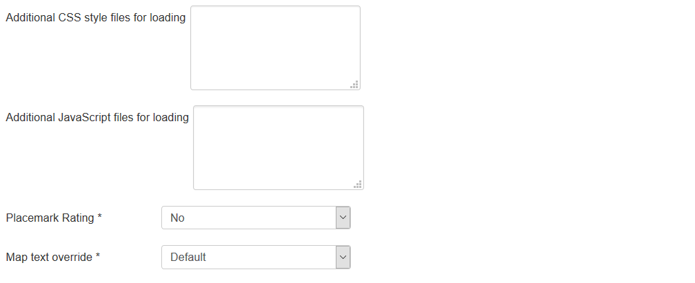
| Additional CSS styles for loading | List of CSS style files for loading when map is loading, separated by new line or semicolon |
| Additional JavaScript files for loading | List of JavaScript files for loading when map is loading, separated by new line or semicolon |
| Placemark Rating | Enable Placemark rating feature.
|
| Map text override | You can use this feature to override Standard text for map controls etc by using special interface in component administration area |
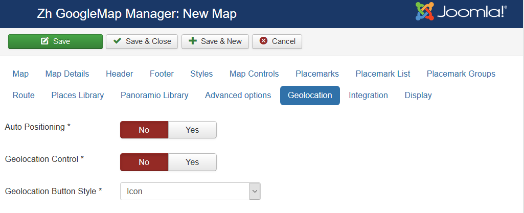
Geolocation
| Auto Positioning | Auto Positioning when map is loading |
| Geolocation Control | Show Geolocation Control |
| Geolocation Button Style | Geolocation Button Style
|
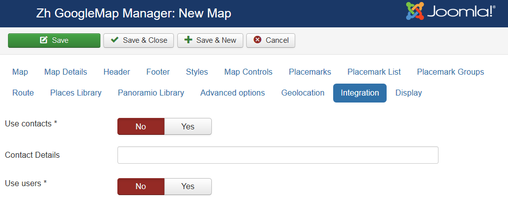
Integration
| Use contacts | The enabled/disabled state of using contacts You can enable using contact information and associate your placemark with contact to display contact information in placemark InfoWin. |
| Contact Details | You can enter names of attributes to show. Separator is ; Acceptable values
You can enter it in any order, and by it the contact will be shown. Note: postcode and zipcode – it is the same field, but different labels will be. Check contact fields, and you'll see this pairs: City or Suburb, State or Province, Postal / ZIP Code
to show position, contact name and mobile phone |
| Use users | The enabled/disabled state of using users You can enable using user information and associate your placemark with user to display user information in placemark InfoWin. |
Display
Using Marker Manager
You can use Marker Manager with restrictions:
- you can't use marker clustering - because cluster groups markers, and controls it displaying
- you can't use managing markers by group list
To use Marker Manager:
- set group for your markers
- set Min Zoom for Marker Manager and Max Zoom for Marker Manager for each group
- enable feature for the map
Creating Placemark
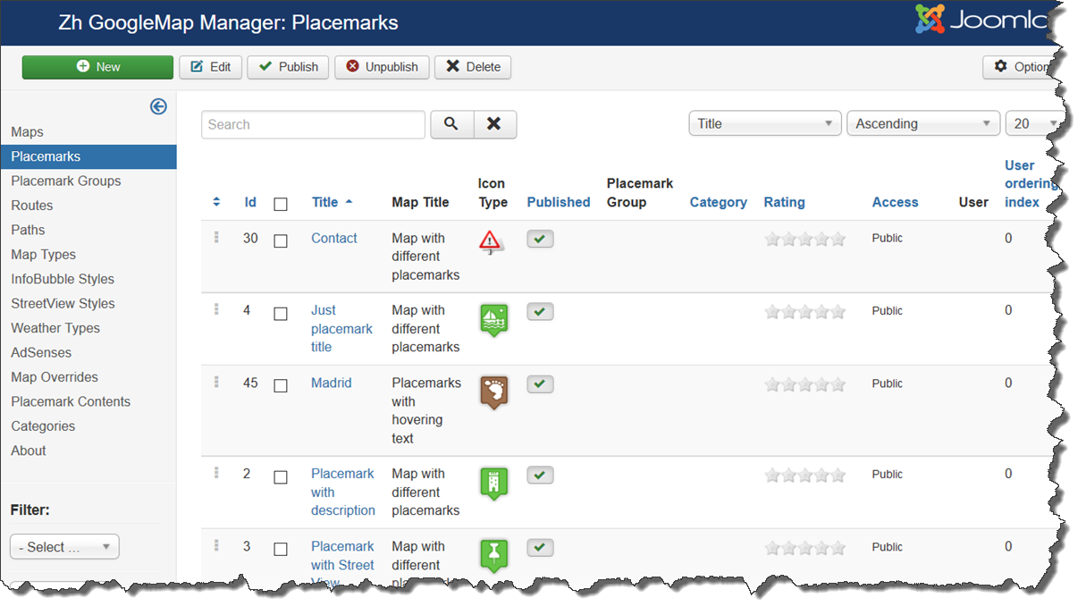
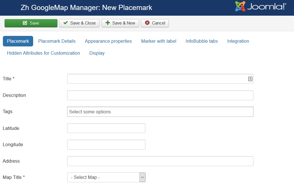
We turn to the tab "Placemarks".
Enter the number of markers bound to a specific map.
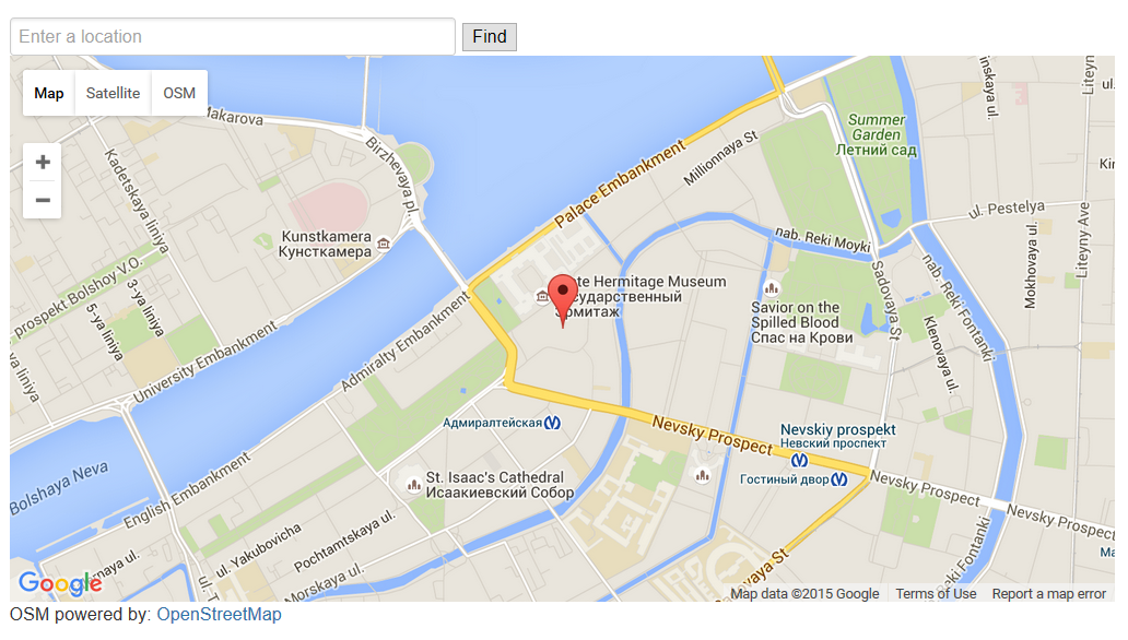
Coordinates it is convenient to choose by dragging the marker (the value is automatically substituted in the form fields ) or by clicking the mouse on the desired location.
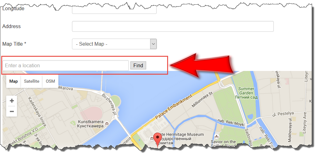
On the other hand you can use Autocomplete field above map to find your place.
Or enter text address into Autocomplete field and press Find button to find place by geocoding.
Placemark properties
| Title | Placemark Title |
| Description | Description |
| Tags | Tags |
| Latitude | Latitude |
| Longitude | Longitude |
| Address | Text address of your placemark. You can load your data into this field, if you don't have lat/lng data. In this case address will be automatically geocoded and markers are displayed. And in backend marker will be shown too. But if you move marker (change position by dragging or clicking somewhere else), new positions will be stored as lat/lng. Displaying markers by lat/lng is more quick because there is no need time for geocoding |
| Map Title | Title of the map, where marker would be displayed |
Placemark Details
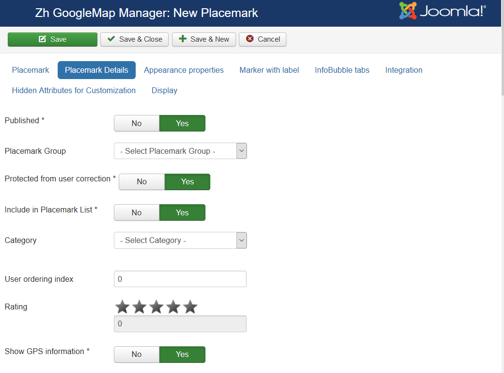
| Published | Published |
| Group | Group |
| Protected from user correction | Protected placemark from user correction, when you activate creating users placemark |
| Include in Placemark List | Include placemark in Placemark List |
| Category | The category that this placemark is assigned to |
| User ordering index | Use this field to manual sorting placemarks in placemark list |
| Rating | Rating of placemark, it can be set only by rating system |
| Show GPS information | Show GPS information (coordinates) in infowin |
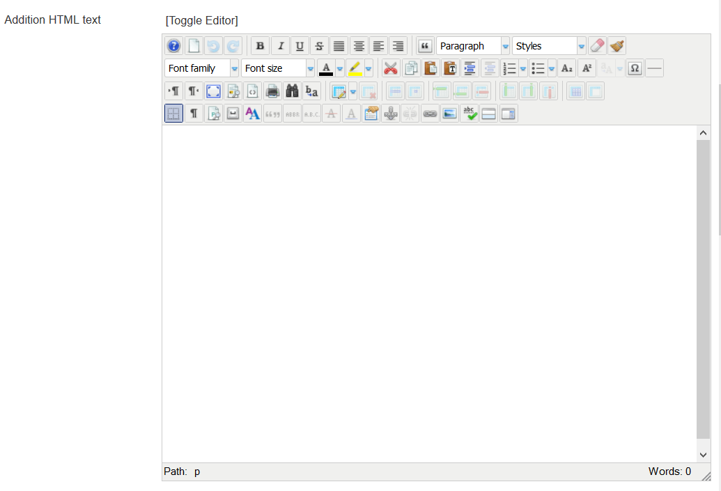
| Addition HTML text | HTML text, that will be included in placemark InfoWin content Be careful, if you enter email address, the other Joomla! plugin it changed, and there will be an error and map will not be shown. |
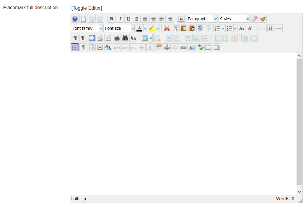
| Placemark full description | Placemark description (HTML text) in placemark detail view (single placemark page view) |
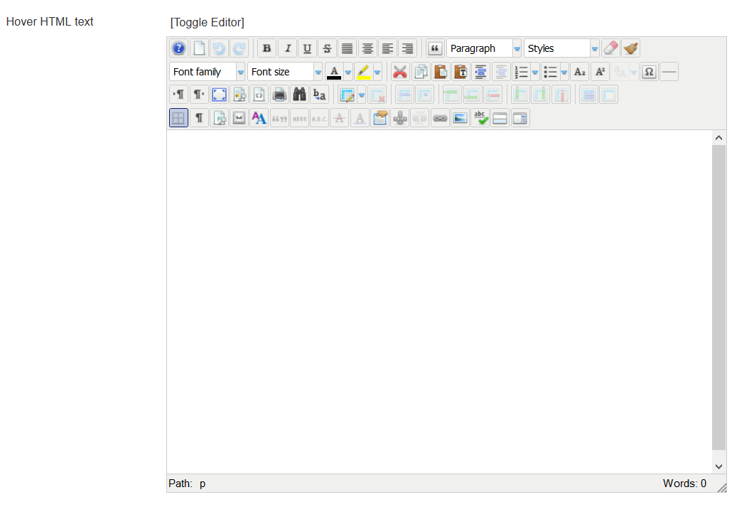
| Hover HTML text | Hover HTML text for placemark when enabled hovering feature |
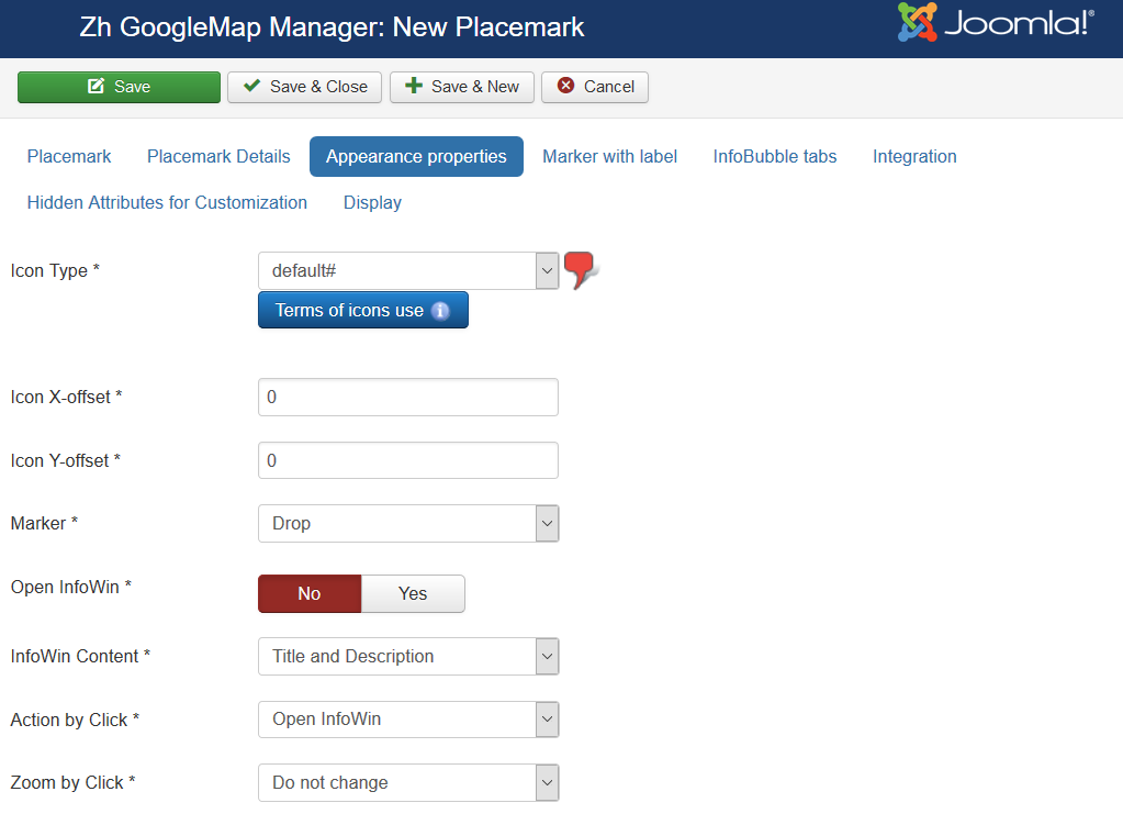
Appearance properties
| Icon Type | Icon Type |
| Icon X-offset | Icon offset |
| Icon Y-offset | Icon offset |
| Marker | Marker Type
|
| Open InfoWin | Execute action which described in Action by Click and Zoom by Click |
| InfoWin Content | Content of InfoWin
|
| Action by Click | Action by Click on this placemark
|
| Zoom by Click | Zoom by Click on this placemark You can change zoom when you click on marker
|
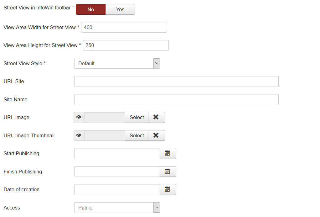
| Street View in InfoWin toolbar | Enable ability in infowin show button to show Street View |
| View Area Width for Street View | View Area Width for div section in infowin |
| View Area Height for Street View | View Area Height for div section in infowin |
| Street View Style | Additional Street View properties, which would be applied. This properties you can create on separate component tab |
| URL Site | Site URL to display in placemark InfoWin content |
| Site Name | Site Name to display instead of URL |
| URL Image | Image URL to display in placemark |
| URL Image Thumbnail | Image URL to display in placemark list |
| Start Publishing | Placemark start publishing date |
| Finish Publishing | Placemark finish publishing date |
| Date of creation | Placemark creation date |
| Access | ACL access level to view this placemark |
| Infographics Type | Dynamic Icon Type Example: chst=d_fnote&chld=thought|1|0088FF|h|Why+am+I+here? |
| Infographics Icon width | Dynamic Icon width |
| Infographics Icon height | Dynamic Icon height |
Marker with Label
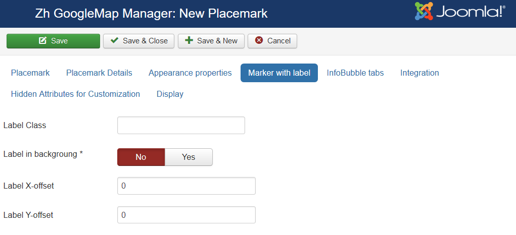
| Label Class | Label CSS Class |
| Label in background | Label in background |
| Label X-offset | Label offset |
| Label Y-offset | Label offset |
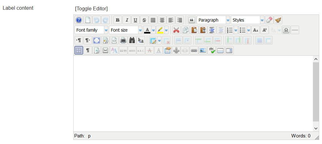
| Label content | HTML label content |
InfoBubble Tabs
About InfoBubble you can read there InfoBubble example
It is not created by component, there is only using this code. If it works not correctly - check in example, and if there not works - you should ask in google maps forum (component only calls JavaScript code)
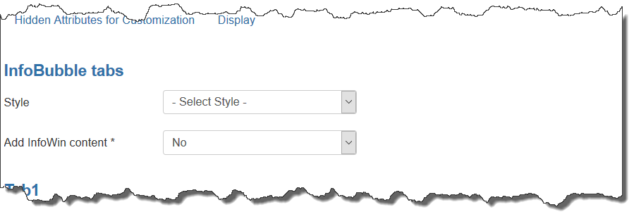
| Style | Style for InfoBubble |
| Add InfoWin content | Add InfoWin content into InfoBubble
|
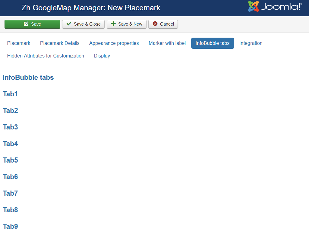
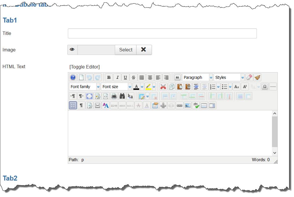
| Title | Tab Title |
| Image | You can use image to build image gallery in single placemark view |
| HTML Text | Tab text |
Integration
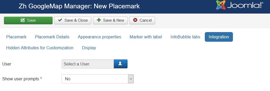
| User | User which associate with placemark |
| Show user prompts | Type of view user information
|
| Contact | Contact which associate with placemark |
| Show contact prompts | Type of view contact information
|
| Contact Button in InfoWin toolbar | Show Contact Button in InfoWin toolbar |
| Alternative Contact URL | You can alternative URL to show contact page (instead of standard joomla's call) |
| Placemark details Button in InfoWin toolbar | Show Placemark Button in InfoWin toolbar |
| Alternative Details URL | You can alternative URL to show details page (instead of standard call detail placemark view) |
| Placemark Details for standard call | You can override default details attributes for detail view
By default placemark detail page is opened without enabling additional loading bootstrap library and styles, without thumbnail and image gallery, without Additional HTML text and full text description. You can change default behavior by passing parameters, separated by comma (,)
For example, if you enter image gallery,addition html text,full description into field, the detail view for placemark will be with two additional description (short "Addition HTML text" and full "Placemark full description"), and image gallery will be displayed too |
| Article | Article which associate with placemark |
| Article Button in InfoWin toolbar | Show Article Button in InfoWin toolbar |
| Alternative Article URL | You can alternative URL to show article page (instead of standard joomla's call) |
| iframe tag Article CSS | You can apply CSS style for iframe tag (when use article in infowin content) |
Hidden Attributes for Customization
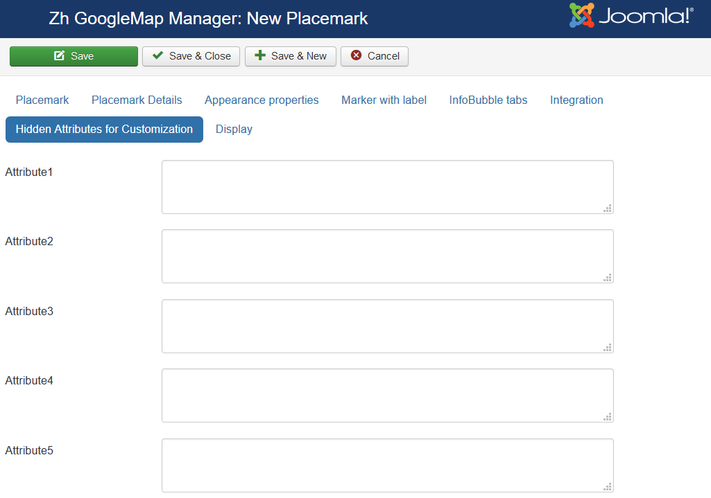
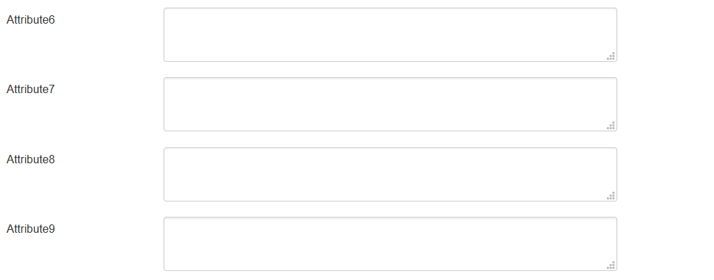
It is for you own customization. You can enter any values in this fields, and use what you want in you code. You can rename prompt in language file
For your convenience you can also change the labels of the fields in file
/administrator/language/en-GB/en-GB.com_zhgooglemap.ini
lines
COM_ZHGOOGLEMAP_MAPMARKER_DETAIL_ATTRIBUTE1_LABEL

COM_ZHGOOGLEMAP_MAPMARKER_DETAIL_ATTRIBUTE2_LABEL

…

COM_ZHGOOGLEMAP_MAPMARKER_DETAIL_ATTRIBUTE9_LABEL
For example, you can enter some data into this fields.
In table columns have names
attribute1

attribute2
...

attribute9
You can use this fields, for example, for integration with other systems or etc.
Display
Placemark Customization
Copy your marker images (format PNG) in the directory
/administrator/components/com_zhgooglemap/assets/icons/
Component will automatically pick up the picture when choosing the type of marker.
The only requirement - the file name use English letters and can't contain any special character; the file extension have to be a .png ie in lower case, because names of images stored in a database without the extension, and it is appended in the output.
Don't forget about Compatibility Mode for Resource Files
Grouping
The marker may be included in one group, for this to specify a marker belonging to the group. If the field of markers grouping is set (field value Group Control is different from No), then starts an additional feature: a list of active groups (the location is determined by this same field, with the first four (left, top, right, bottom) correspond to the table form of representation, while the two latter (Group-Map, Map-Group) - based on the div, and you have the opportunity to do anything with them.
The map also has a drop-down list Group CSS - which implements the following functionality:
- the first two styles - predefined
- the third - you can override it in your CSS file template
- while in three cases, just have three different names of objects, respectively, we can change the styles they like.
The following names
for the div-tag ID takes the value
- GMapsMenu-advanced
- GMapsMenu-simple
- GMapsMenu-external
for ul-tag
- zhgm-menu-advanced
- zhgm-menu-simple
- zhgm-menu-external
Accordingly, styles, prescribes for them. Field Show Group Icon is used to display icons in the list of groups.
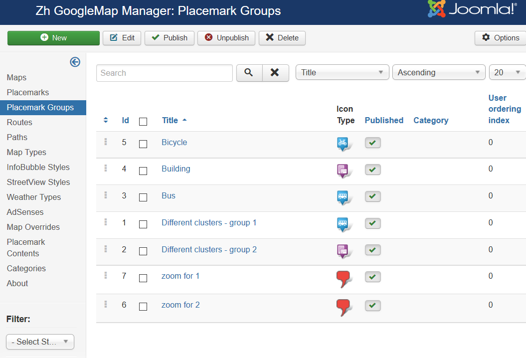
Creating Group
We turn to the tab "Groups".
Enter the number of groups.
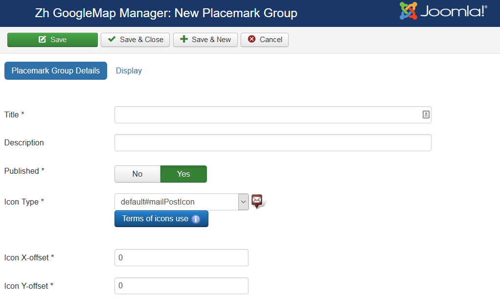
Group properties
| Title | Group Title |
| Description | Description |
| Published | Published |
| Icon Type | Icon Type |
| Icon X-offset | Icon offset |
| Icon Y-offset | Icon offset |
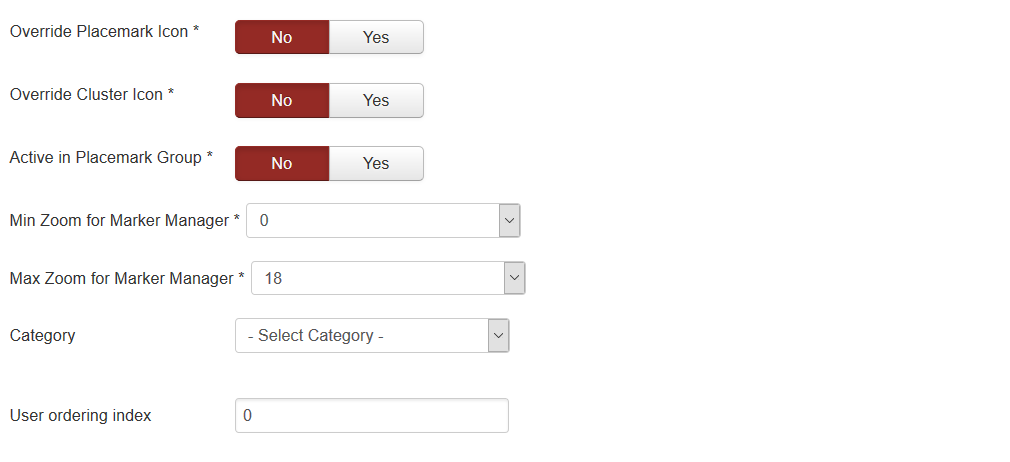
| Override Placemark Icon | Change icon of placemark to group icon |
| Override Cluster Icon | Change icon of cluster when you create cluster for each group |
| Active in Group List | Set Group state to active (show markers) when page displayed. This parameter uses in two cases: show markers in different clusters, or show markers and set active group in group list (when use marker managing by group list) |
| Min Zoom for Marker Manager | Zoom from which placemarks would be displayed by Marker Manager |
| Max Zoom for Marker Manager | Zoom after which placemarks wouldn't be displayed by Marker Manager |
| Category | The category that this group is assigned to |
| User ordering index | Use this field to manual sorting groups in group list |
Display
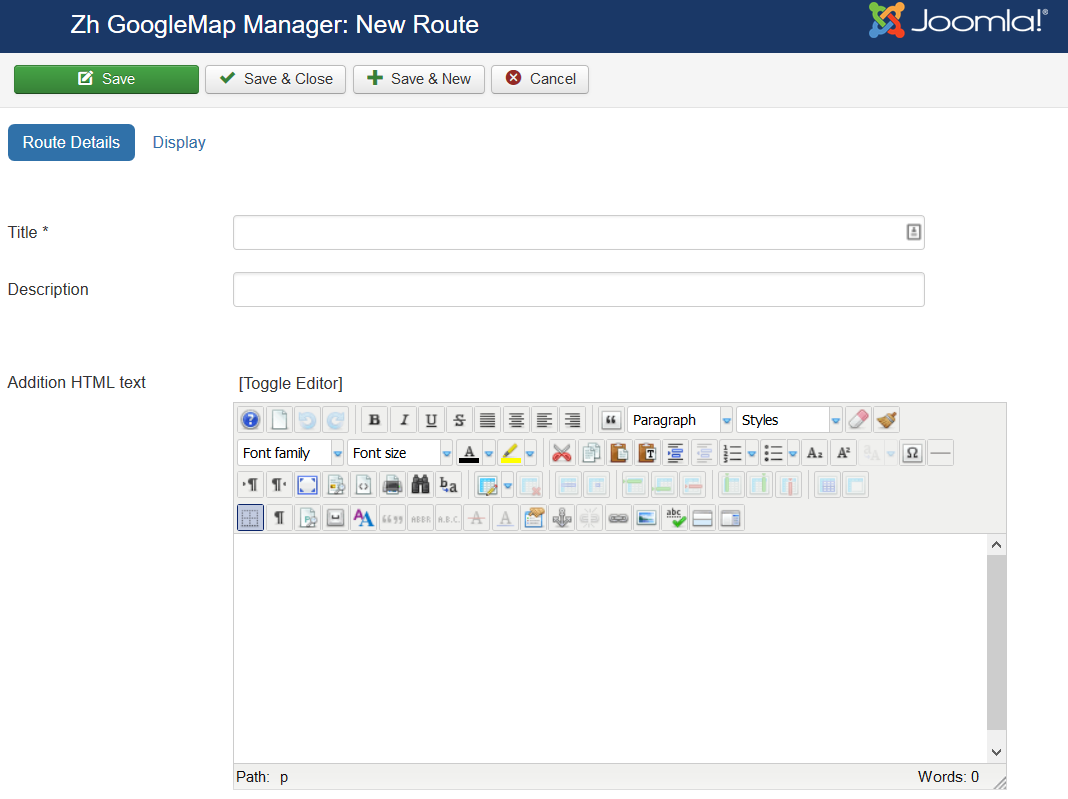
Creating Route
The route means automatic routing between way points (this functionality is present in the Google Maps API as a Directions API).
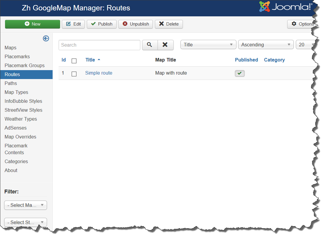
We turn to the tab "Routes".
Enter any number of routes with reference to a specific map.
Field Route - the route is entered for each route point in double quotes ("), the separator between two points is a semicolon (;)
Route Details
| Title | Route Title |
| Description | Description |
| Addition HTML text | Addition HTML text |
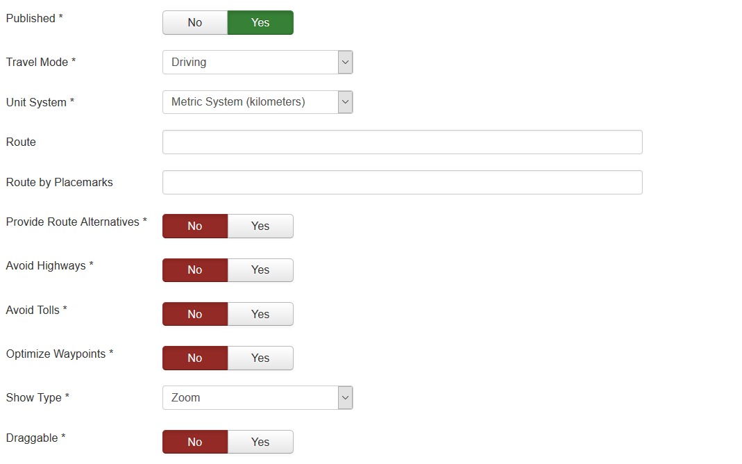
| Published | Published |
| Travel Mode | Travel Mode specifies what mode of transport to use when calculating directions |
| Unit System | The unit system to use when displaying distance |
| Route | Route value - text adderess waypoints in double quotes ("), separator between points is semicolon (;) for example: "Арбатская";"Кропоткинская"; "Москва, проспект Мира 20";"Москва, Петровка 10" |
| Route by Placemarks | Route by placemarks IDs, which separated by semicolon (;) for example: 1;2;4;6 |
| Provide Route Alternatives | Provide Route Alternatives specifies that the Directions service may provide more than one route alternative in the response. |
| Avoid Highways | If true, the routes between origins and destinations will be calculated to avoid highways where possible. |
| Avoid Tolls | If true, the directions between points will be calculated using non-toll routes, if possible. |
| Optimize Waypoints | Optimize Waypoints to allow the Directions service to optimize the provided route by rearranging the waypoints in a more efficient order. |
| Show Type | Map bounds for fitting the route
|
| Draggable | If true, allows the user to drag and modify the paths of routes |
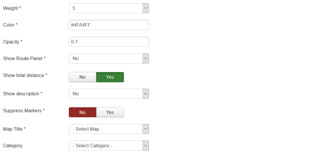
| Weight | Route line weight |
| Color | Route line color |
| Opacity | Route line opacity |
| Show Panel | Allow to show route panel to display the directions steps |
| Show total distance | Show total distance of route |
| Show description | Show description and addition HTML text of route below the map |
| Suppress Markers | Suppress markers, which created for start point, end point, waypoints |
| Map Title | Title of the map, where route would be displayed |
| Category | The category that this route is assigned to |
Display
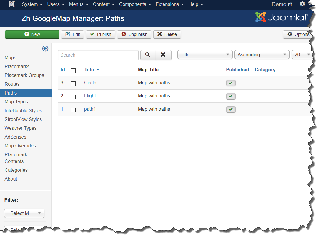
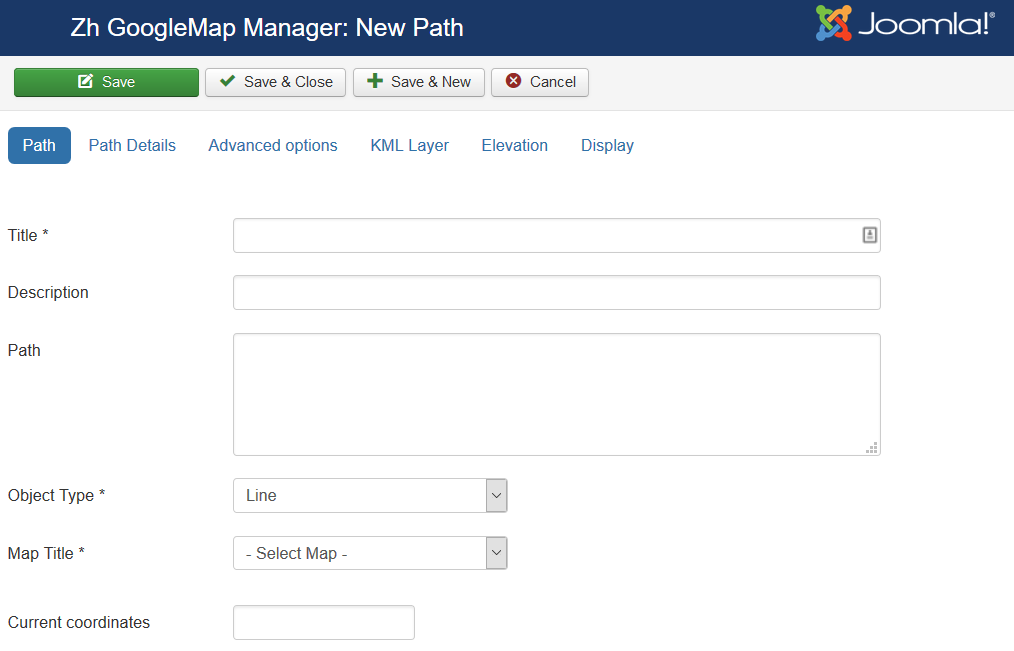
Creating Path
The path means polylines, polygons, circles or special map objects (layers).
We turn to the tab "Paths".
Enter the necessary number of paths with reference to a specific map.
Field Path - a set of coordinates of points, the coordinates (Latitude, Longitude) are separated by comma (,), the points themselves - separated by a semicolon (;)
Coordinates it is convenient to choose by dragging the marker (values are substituted into the reference field in the form Current coordinates, from there you can copy and add a separator and value in the field Path), or clicking the mouse on the desired location.
In second part there will be described how draw polyline by tools and get values for path field.
Path properties
| Title | Path Title |
| Description | Description |
| Path | Path for example: 59.92335689062723,30.385787878185525;59.92374467628344,30.387547407299284 |
| Object Type | Polyline, Polygon (area) or Circle |
| Map Title | Title of the map, where path would be displayed |
| Category | The category that this path is assigned to |
| Current coordinates | Current coordinates |
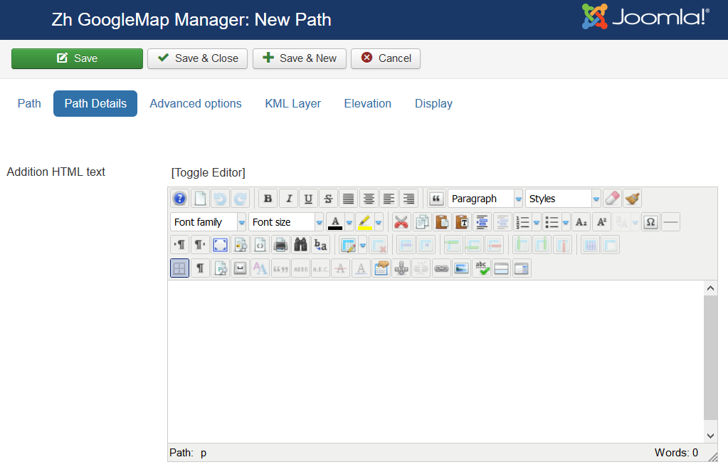
Path Details
| Addition HTML text | HTML text, that will be included in infowin Be careful, if you enter email address, the other Joomla! plugin it changed, and there will be an error and map will not be shown. |
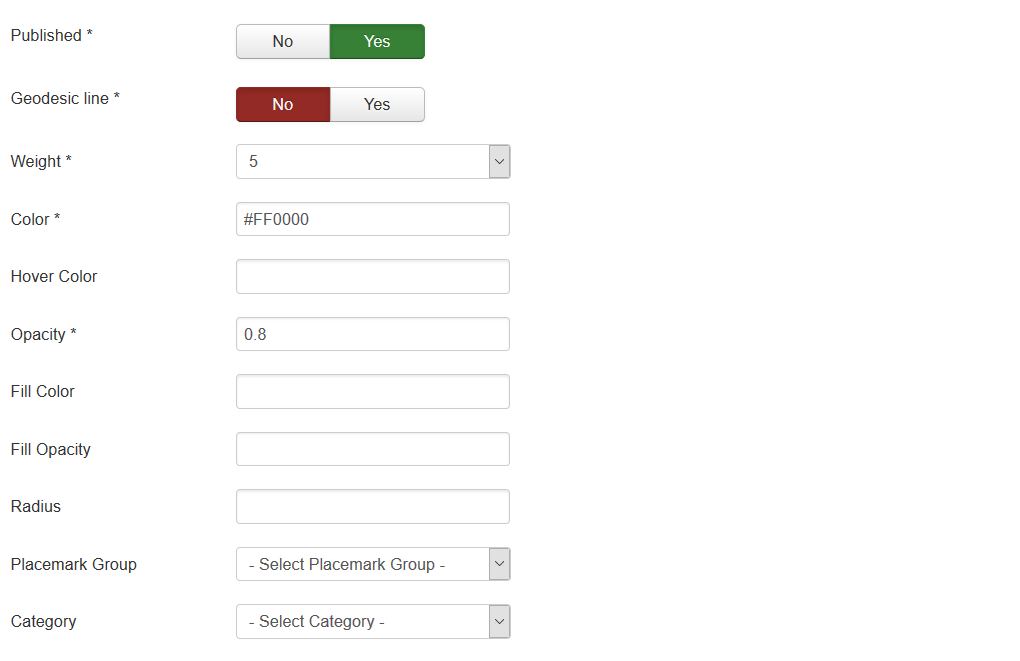
| Published | Published |
| Geodesic line | Create Geodesic line (circle-shaped) |
| Weight | Line Weight |
| Color | Line Color for example: #FF0000 |
| Opacity | Opacity, number value between 0.0 and 1.0 |
| Fill Color | Fill Color (for rectangles, circles) for example: #FF0000 |
| Fill Opacity | Fill Opacity, number value between 0.0 and 1.0 |
| Radius | Circle radius in meters |
| Group | Group, it can be used for managing by Group List |
| Category | The category that this path is assigned to |
Advanced options
| InfoWin Content | InfoWin Content
|
| KML Layer Show Type | Map bounds for fitting the KML layer
|
| Action by Click | Action when you click on path
|
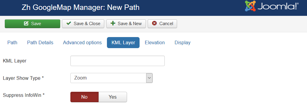
KML Layer
| KML Layer | URL of the KML Layer, that would be displayed on the map |
| Layer Show Type | Map bounds for fitting the KML layer
|
| Suppress InfoWin | Suppress open InfoWin when you click on layer |
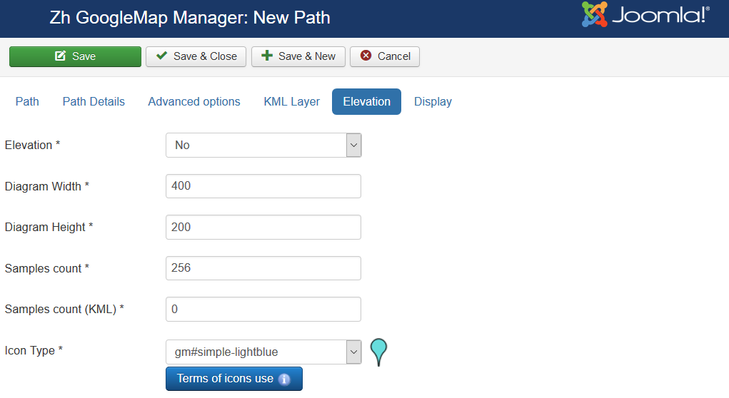
Elevation
| Elevation | Enable feature to draw elevation diagram |
| Diagram Width | Diagram Width |
| Diagram Height | Diagram Height |
| Samples count | Samples count in diagram |
| Samples count (KML) | Samples count from KML file to analyse |
| Icon Type | Icon Type to display on map current position on diagram |
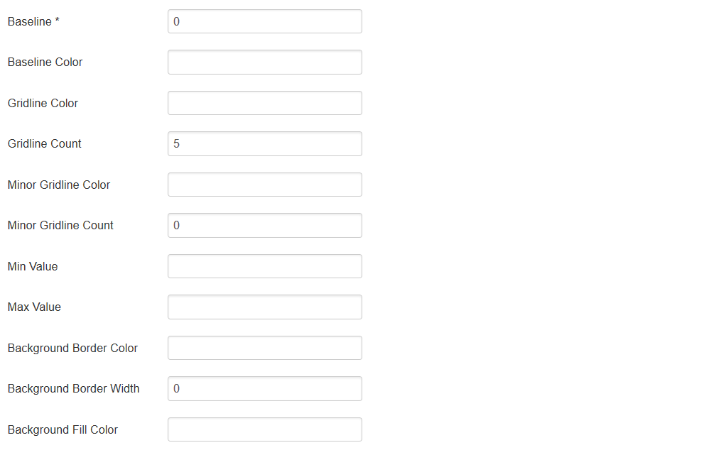
| Baseline | Baseline value |
| Baseline Color | Baseline Color |
| Gridline Color | Gridline Color |
| Gridline Count | Gridline Count |
| Minor Gridline Color | Minor Gridline Color |
| Minor Gridline Count | Minor Gridline Count |
| Min Value | Min Value |
| Max Value | Max Value |
| Background Border Color | Background Border Color |
| Background Border Width | Background Border Width |
| Background Fill Color | Background Fill Color |
Display
Create Path by drawing tool
The new feature added - drawing tool
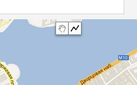
On map there are new controls
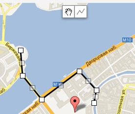
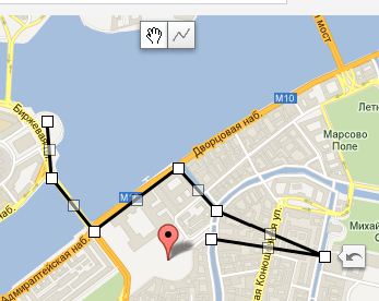
You just simple draw polyline by clicking on points. Double click to stop drawing.
When you finished draw, the Path field contain all coordinate values to build path.
If you wish to get some point coordinates, click on map in not drawing mode, and the field Current coordinates will contain it.
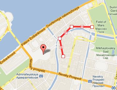
The Google's Drawing Library doesn't supports creating polyline with predefined points, therefore component not display drawing tools when you save, but in this case path is displaying as a editable polyline for more useful management. You can change it, or correct coordinates. To remove this polyline - clear path field with coordinates and save, in this case there is drawing tools appear again
Creating Map Type
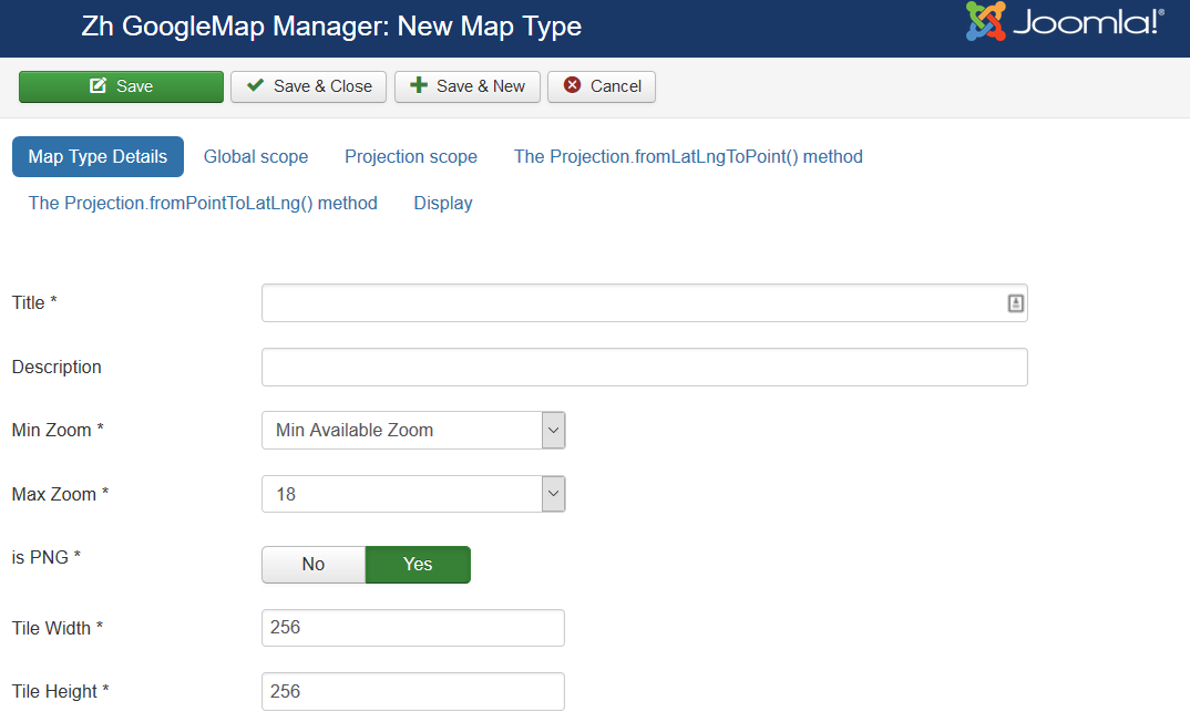
The map type means a custom map type for getting tiles.
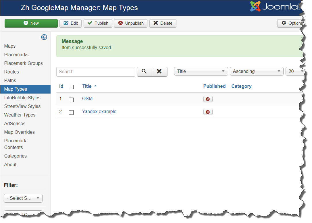
We turn to the tab "Map Types".
Enter the necessary number of map types.
See also: Google Maps JavaScript API v3 - Custom Map Types
Map Type Details
| Title | Map Type Title |
| Description | Description |
| Min Zoom | Min Map Zoom (for which exists tiles) |
| Max Zoom | Max Map Zoom (for which exists tiles) |
| is PNG | Type of tiles images |
| Tile Width | Tile Width |
| Tile Height | Tile Height |
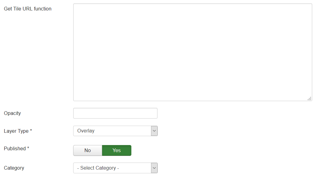
| Get Tile URL function | Implementation of function to get tile URL |
| Opacity | Opacity |
| Layer Type | Type of map layer
|
| Published | Published |
| Category | The category that this map type is assigned to |
See also: Creating Custom Map Type Tutorial
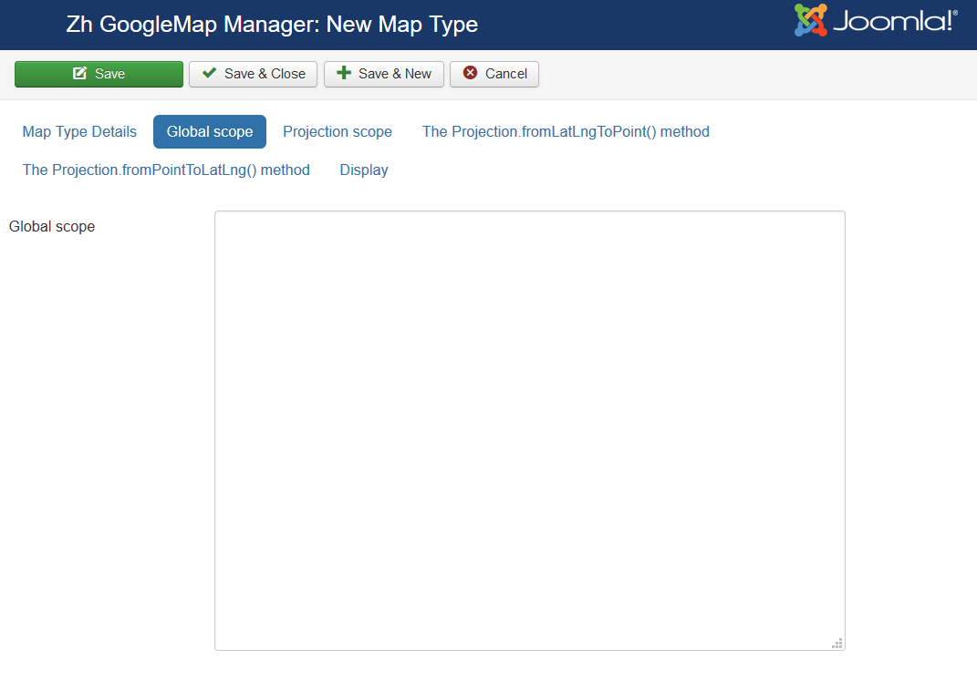
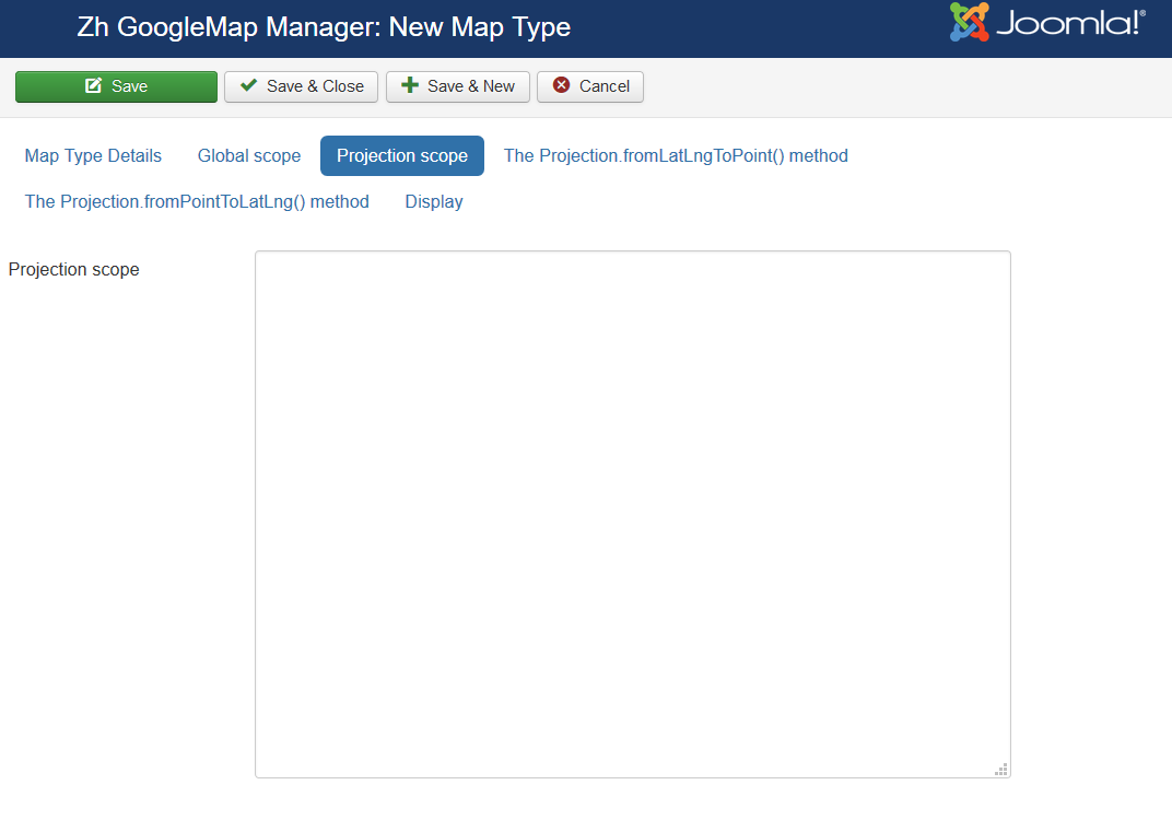
Projection Definition
This additional section you can use to create your own map projections.
Lets check how to create Custom Map Type with Projection
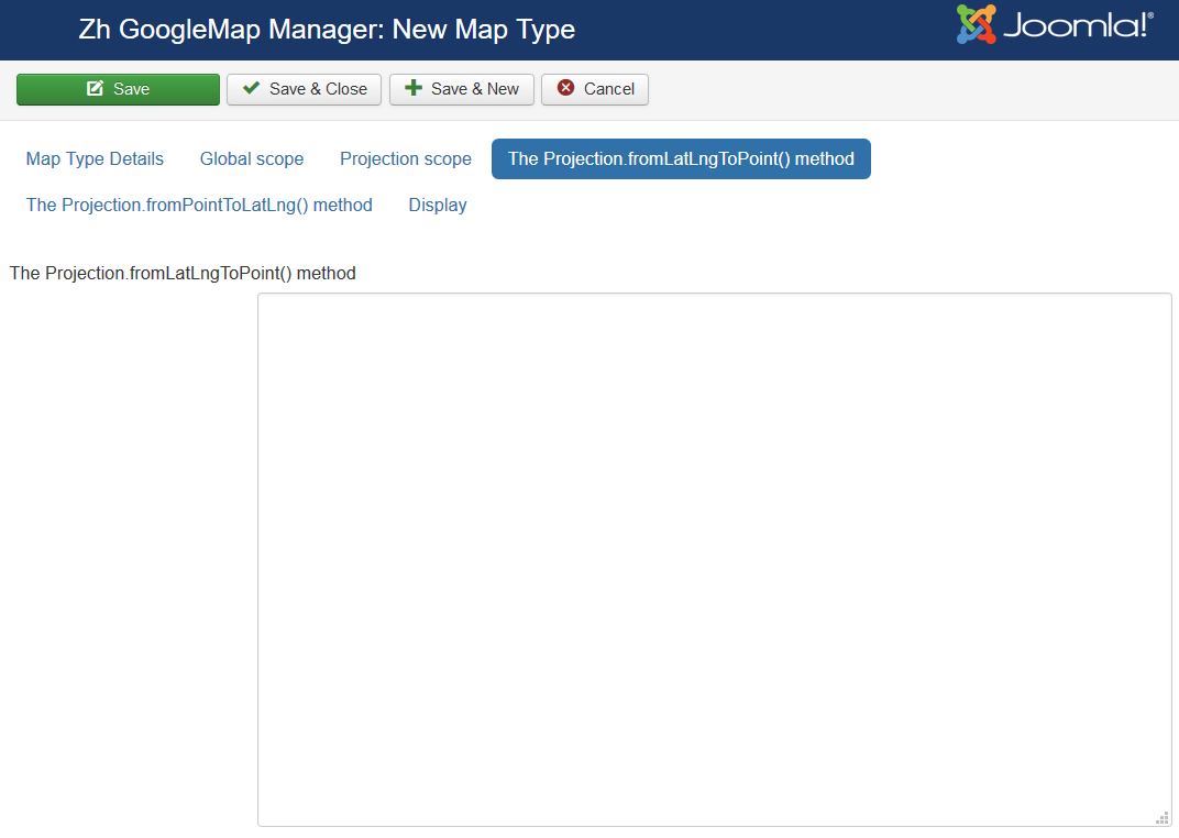
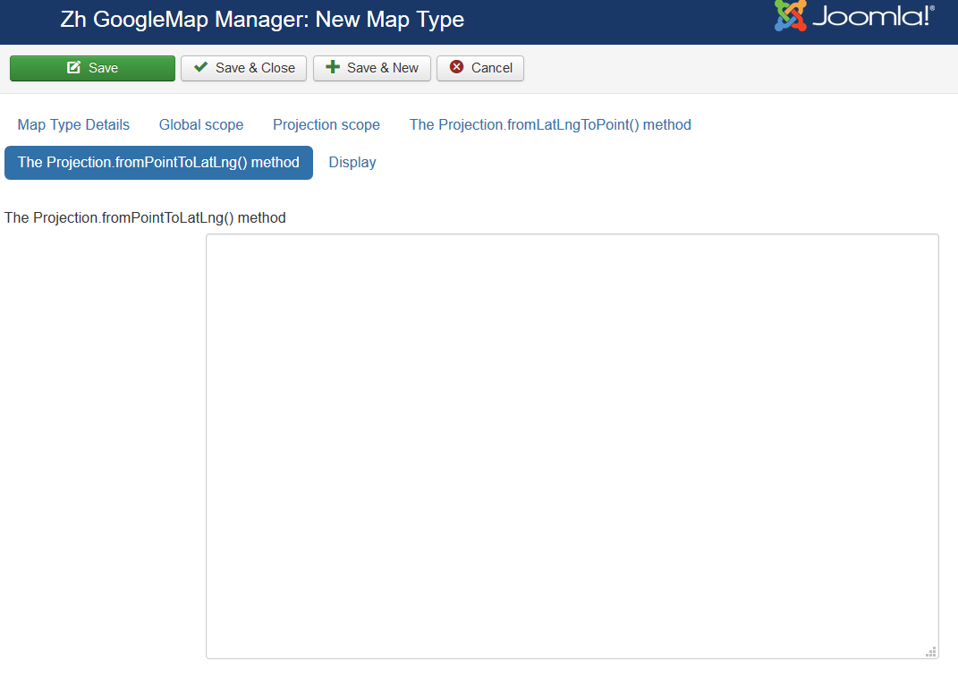
All fields in this sliders is text fields and for understand its purpose see tutorial Creating Custom Map Type Tutorial
See also: Creating Custom Map Type Tutorial
Display
Creating InfoBubble Style
About InfoBubbles see on page InfoBubble
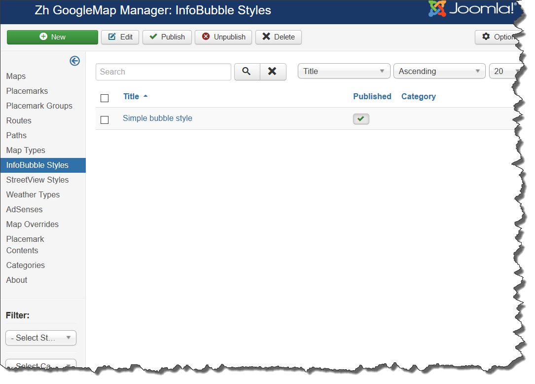
We turn to the tab "InfoBubbles Styles".
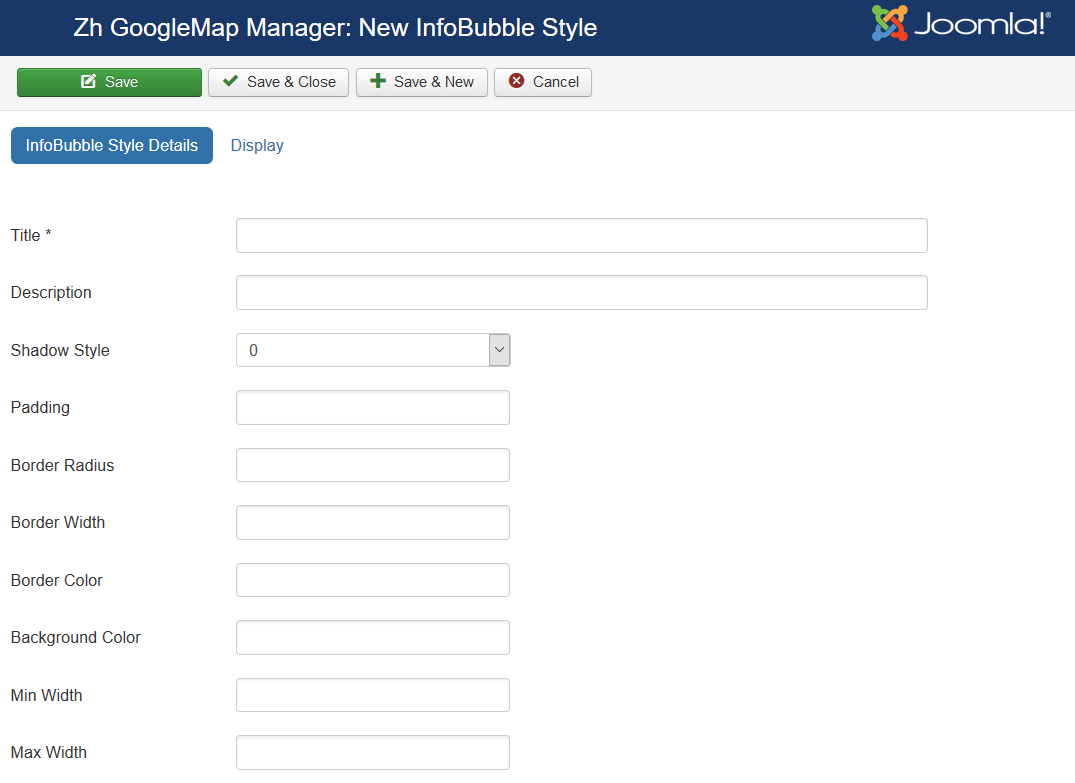
Enter the necessary number of InfoBubble styles.
InfoBubble Style Details
| Title | Title of InfoBubble style |
| Description | Description |
| Shadow Style | Shadow Style |
| Padding | Padding |
| Border Radius | Border Radius |
| Border Width | Border Width |
| Border Color | Border Color Example: #000000 |
| Background Color | Background Color Example: #EAEAEA |
| Min Width | Min Width (px) |
| Max Width | Max Width (px) |
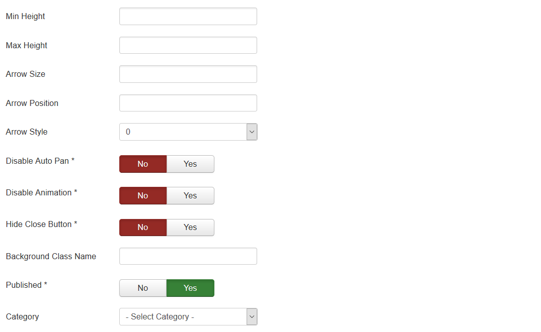
| Min Height | Min Height (px) |
| Max Height | Max Height (px) |
| Arrow Size | Arrow Size (px) |
| Arrow Position | Arrow Position (%) |
| Arrow Style | Arrow Style |
| Disable Auto Pan | Disable Auto Pan |
| Hide Close Button | Hide Close Button |
| Background Class Name | Background Class Name |
| Published | Published |
| Category | The category that this infobubble style is assigned to |
See also Creating InfoBubble Tutorial
Display
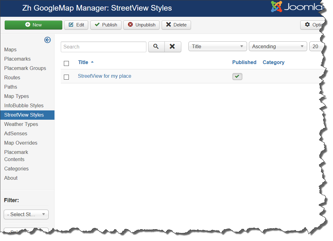
Creating StreetView Style
We turn to the tab "StreetView Styles".
Enter the necessary number of StreetView styles.
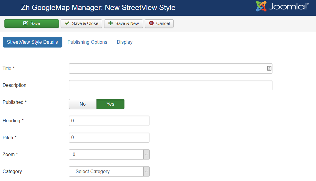
StreetView Style Details
| Title | Title of style |
| Description | Description |
| Published | Published |
| Heading | Heading |
| Pitch | Pitch |
| Zoom | Zoom |
| Category | The category that this style is assigned to |
Publishing Options
| Start Publishing | Start Publishing |
| Finish Publishing | Finish Publishing |
Display
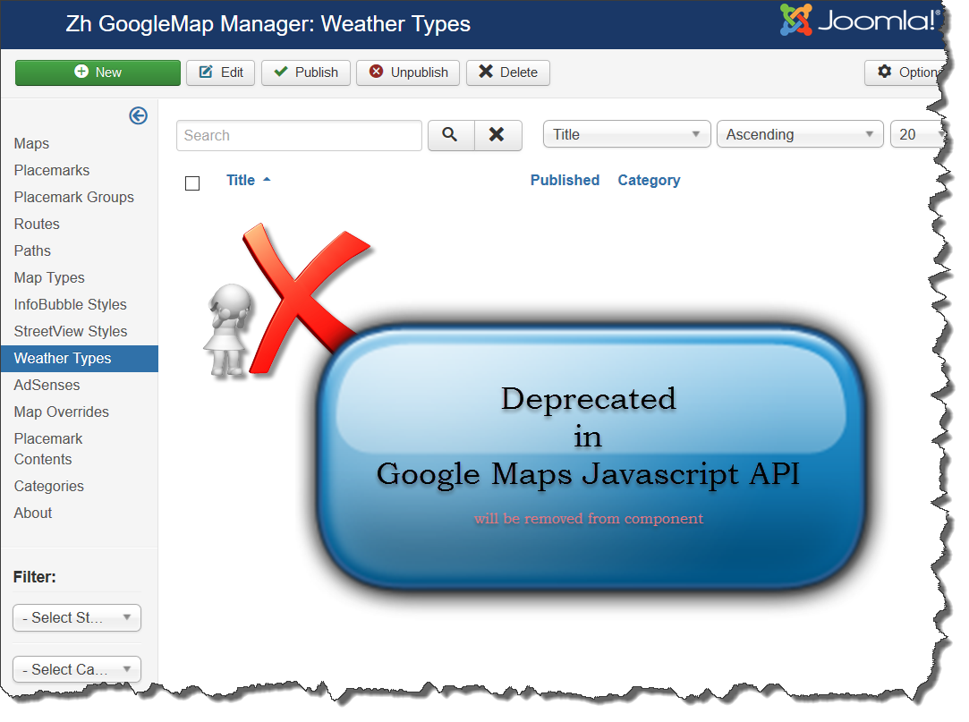
Creating Weather Type
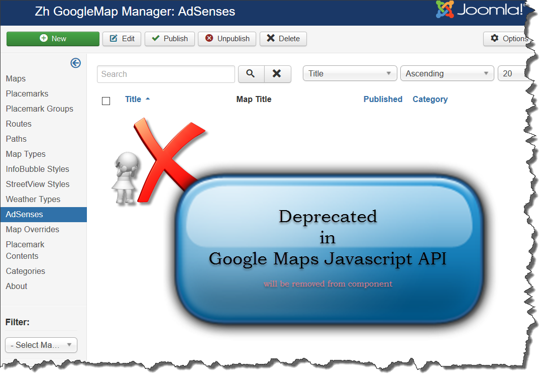
Creating AdSense
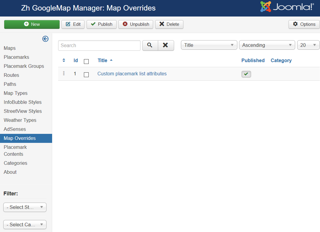
Creating Map Override
This feature can help you to override static text for map objects or change its behaviour (or properties).
You can define override and use it for map by assign in map details
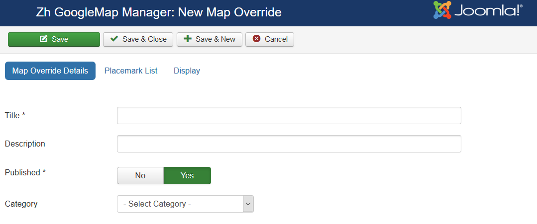
Map Override Details
| Title | Title |
| Description | Description |
| Published | Published |
| Category | The category that this override is assigned to |
Placemark List
In this section you can define text for placemark list objects.
| Button title | Placemark list button title |
| Button tooltip text | Placemark list button tooltip text |
| Placeholder text: Search | You can override text Search in placemark list search field |
Display
Creating Category
You can go to the tab "Categories" and add categories to the component.
Then you can walk on the map objects and tag them by category.
On the basis of categories can be further in any way extend the functionality of the component
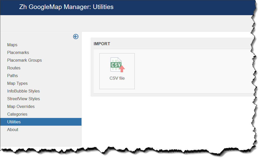
Utilities
In this section you can find different utilities
Import CSV
Select Import CSV to upload placemark definition by CSV file.
Each line of file - one placemark definition.
First line of file - column name list.
Keep in mind - values can't contain delimiter. For example, if your placemark HTML description can contain colon, use semicolon as delimiter (and don't use it in this description).
Main process screen
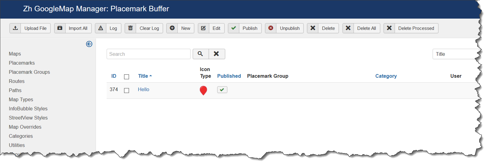
You can see table of placemark buffer.
All import process has next steps
- upload CSV file in buffer
- check data, edit it
- import data to placemark table
- analyze log
- correct processed placemarks with warnings
- delete processed data in from buffer
You can see buttons in toolbar
- Upload File - upload CSV file
- Import All - import data
- Log - show process log
- Clear Log - delete data from process log
- New - create simple placemark definition (for example, for test purposes)
- Edit - edit record in buffer (for example, for fixing errors and upload again)
- Publish and Unpublish - you can change buffer placemark status
- Delete - delete record from buffer
- Delete All - delete all records from buffer
- Delete Processed - delete all records from buffer in state Processed
When you upload file all records have state New
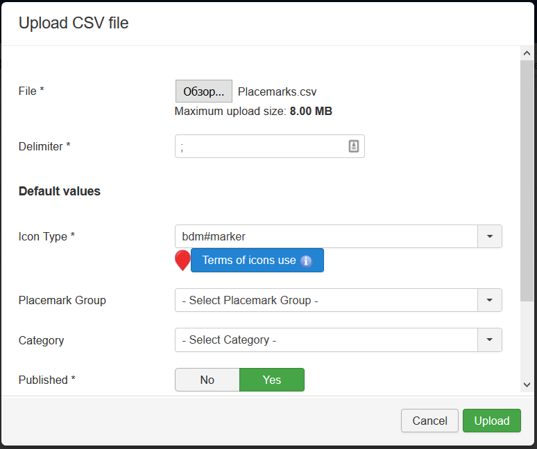
Press Upload File
Select file to upload.
Check and if you need - change Delimiter
You can set some defaults - if in file there is no value (not defined or empty value), you can apply default.
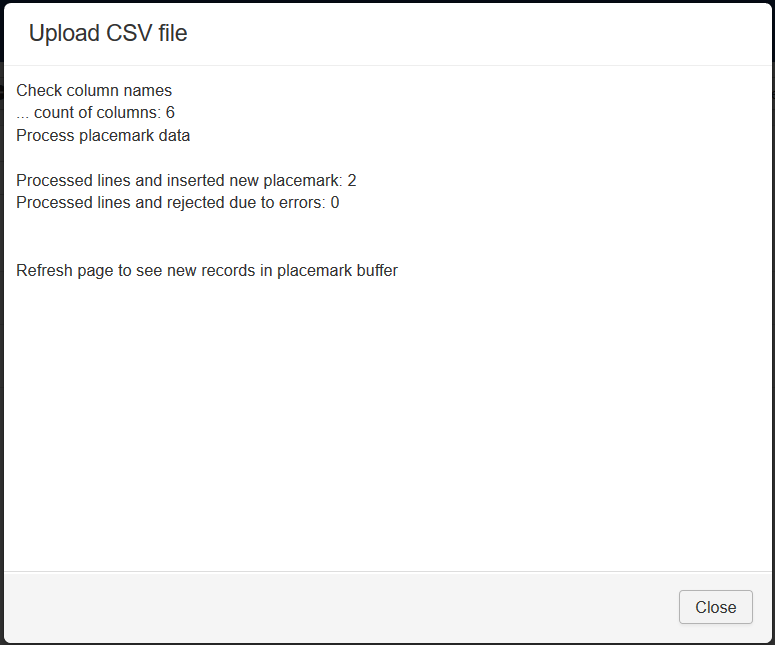
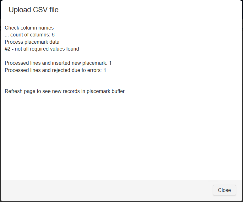
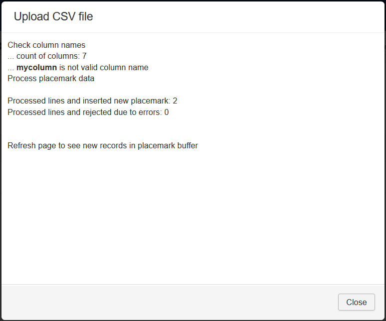
After loading you'll get upload log, it is not stored, only showed
Records can be rejected, if you not define required values. You can see record number (to edit line and upload it)
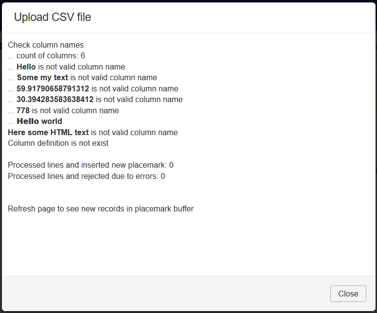
Records will not be uploaded if your first line doesn't contain column definition.
If you enter wrong colunm name, this column will not processed.
Next column names can be used
| title | required | Placemark title |
| latitude | required | Latitude |
| longitude | required | Longitude |
| published | optional | Placemark status, values 0 or 1 |
| addresstext | optional | Text address |
| icontype | optional | Icon Type |
| iconofsetx | optional | Icon X-offset |
| iconofsety | optional | Icon Y-offset |
| description | optional | Description |
| descriptionhtml | optional | Addition HTML text. All HTML formatted text in one line, line breaks are not allowed. |
| hrefimage | optional | URL Image |
| catid | optional | Category ID |
| markergroup | optional | Group ID |
| createdbyuser | optional | User ID, which associate with placemark |
| showuser | optional | Show user prompts, one integer value Type of view user information
|
| showgps | optional | Show GPS information
|
| preparecontent | optional | Prepare the content with the Joomla Content Plugins
|
| markercontent | optional | InfoWin Content
|
You can enter columns in any order, ie order of column names define order of placemark properties
If you want to import placemarks with definite status, you can change it in list or by buttons Publish or Unpublish.
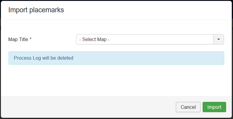
By pressing Import All you start to import placemarks into working table.
You have to select map, to whic imported placemarks will be belong.
And press Import button.
In this case process log will be cleared and import process will start.
All placemarks with New state will be taken to process.
If some required values is not defined - will be rejected and state will be set to Error
In case of processing placemark has the same title with the other placemark, belonging the destination map, this processing placemark will not be imported, and state of it will be set to Skiped. You can't import placemark with same title.
Change title, change status to New and process again. Or import to the other map.
The process result screen
Imported placemarks in buffer change status to Processed
For demo purposes I uploaded placemark data with incorrect category ID, ie I set category ID which is not exists in categories.
In this case you can't see in buffer list category value, but it exists. The same for group ID.
If you will edit placemark in buffer - incorrect values will be set to 0 and data will be imported without category.
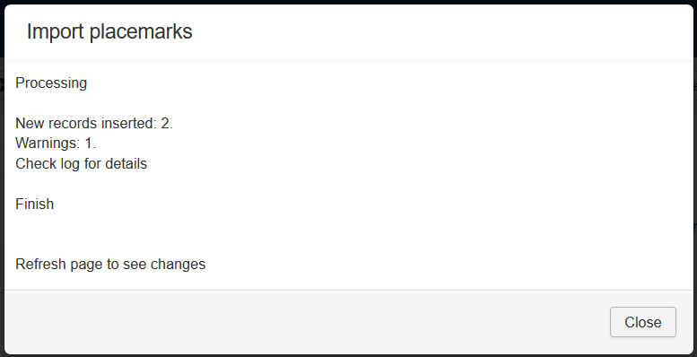
But if you enter into CSV file categories (or groups), which are not exists, and try to import - you'll get warnings and imported placemarks will be without it.
In future this checks will be available not only on import stage.
In case of warnings - if you need to have placemarks belonging to category or group you can delete imported placemarks and do
- recreate file with correct IDs, upload it
- remove incorrect ID and upload it with defaults
- remove incorrect column with values and upload it with defaults
After that import again
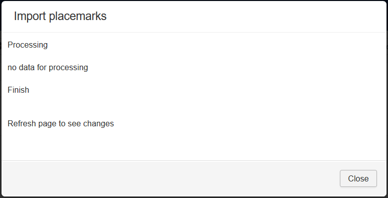
If there is no any placemarks in buffer with state New and you try to process it (to import placemarks), you'll get message that no data to process
When you processed buffer you can delete processed placemarks by pressing Delete Processed
You can also can delete records by applying filters, selecting records and pressing Delete button.
You can delete all records from buffer by button Delete All
When you got warnings, you can analyze it by checking process log. It is stored in database until next import, therefore you can analyze it any times.
As described above, one record was imported with warnings, lets check this warning to understand log
Press Log
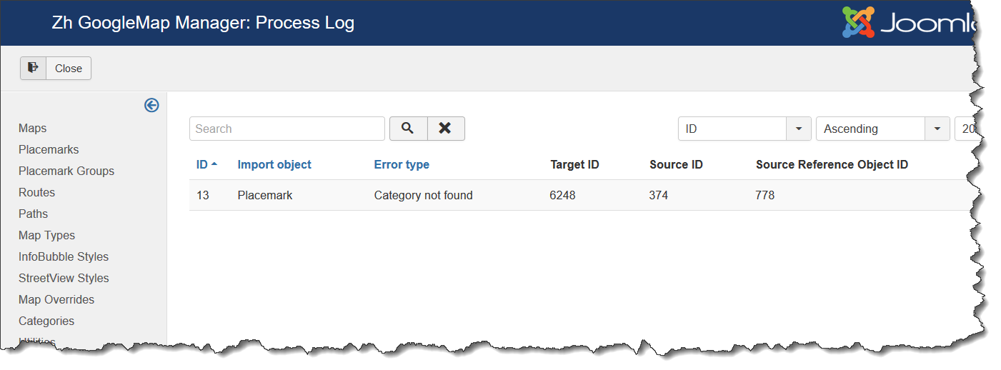
There are 6 columns with common title
- ID - record log ID, just sequence
- Import object - what object is processed, in our case it is Placemark
- Error type - type of error, in my case I tried to load wrong category, value is Category not found
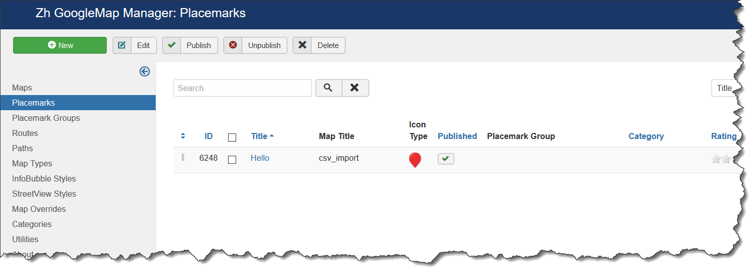
- Target ID - it is ID of my imported object (placemark). In my case new imported placemark has ID 6248. Check images below.
- Source ID - it is ID of object in buffer (placemark). In my case placemark in buffer has ID 374. Check images below.
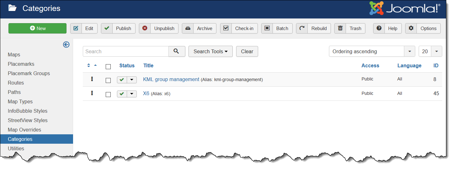
- Source Reference Object ID - it is ID of object, which is not assigned due to is doesn't exist. In my case I tried to set placemark category ID to 778. Check images below.
In other words, I tries to import placemark with category ID=778. But category with this ID is not exist. Therefore placemark was imported without category.
Source placemark to import (in buffer) has ID=374
New imported placemark has ID=6248
Images for log description
Source placemark (in buffer) with wrong value for category
Target placemark, to which category is not applied
Categories
Sorce placemark (in buffer) with correct category
Result imported placemark with correct category
My test file is
title;description;latitude;longitude;catid;descriptionhtml
Hello;Some my text;59.91790658791312;30.394283583638412;778;<b>Hello</b> world<br />Here some HTML text
HHH;;59.92354196553846;30.38381223964427;45
Displaying the Map
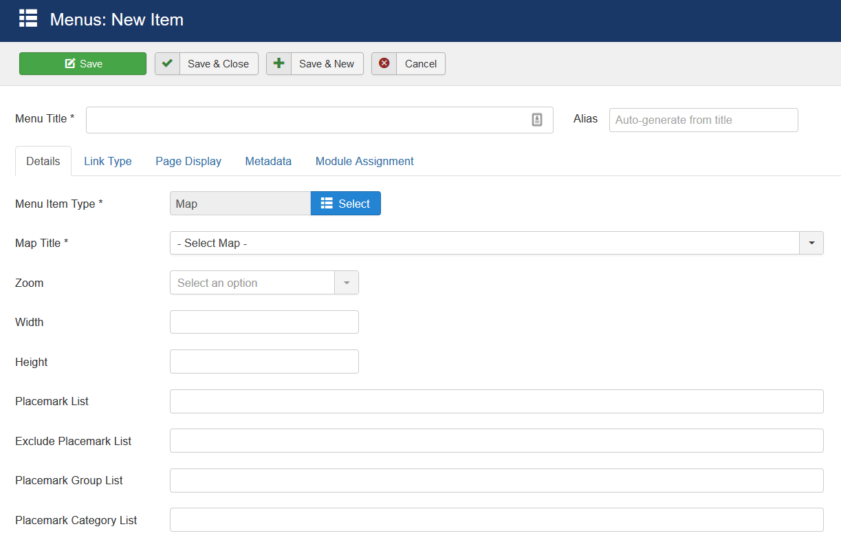
There are a few menu item types.
The first menu item type is Map.
It can show preconfigured map. You can override some map properties.
Create a menu item and select the type of Zh GoogleMap - Map.
Select the appropriate map.
If you do not change any other fields - you'll get the map as you defined it.
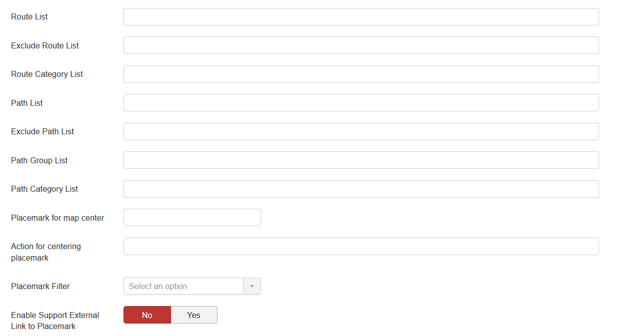
For lists you have to enter IDs by semicolon as separator
| Map Title | Map to display |
| Zoom | Map zoom |
| Width | Map Width |
| Height | Map Height |
| Placemark List | IDs of placemarks to show on map (for example, if it from different maps). |
| Exclude Placemark List | IDs of placemarks to not display on map |
| Placemark Group List | Group IDs for placemarks to show |
| Placemark Category List | Category IDs for placemarks to show |
| Route List | IDs of routes to show on map |
| Exclude Route List | IDs of routes to not display on map |
| Route Category List | Category IDs for routes to show |
| Path List | IDs of paths to show on map |
| Exclude Path List | IDs of paths to not display on map |
| Path Group List | Group IDs for paths to show |
| Path Category List | Category IDs for paths to show |
| Placemark for map center | Placemark ID for override map center |
| Action for centering placemark | Actions for centering placemark |
| Placemark Filter | Placemark Filter |
| Enable Support External Link to Placemark | Enable feature to create your own placemark list feature. See also in tutorials |
See also
| Language: | English • русский |
|---|

