Template:Zh OpenStreetMap Description Map
Creating Map
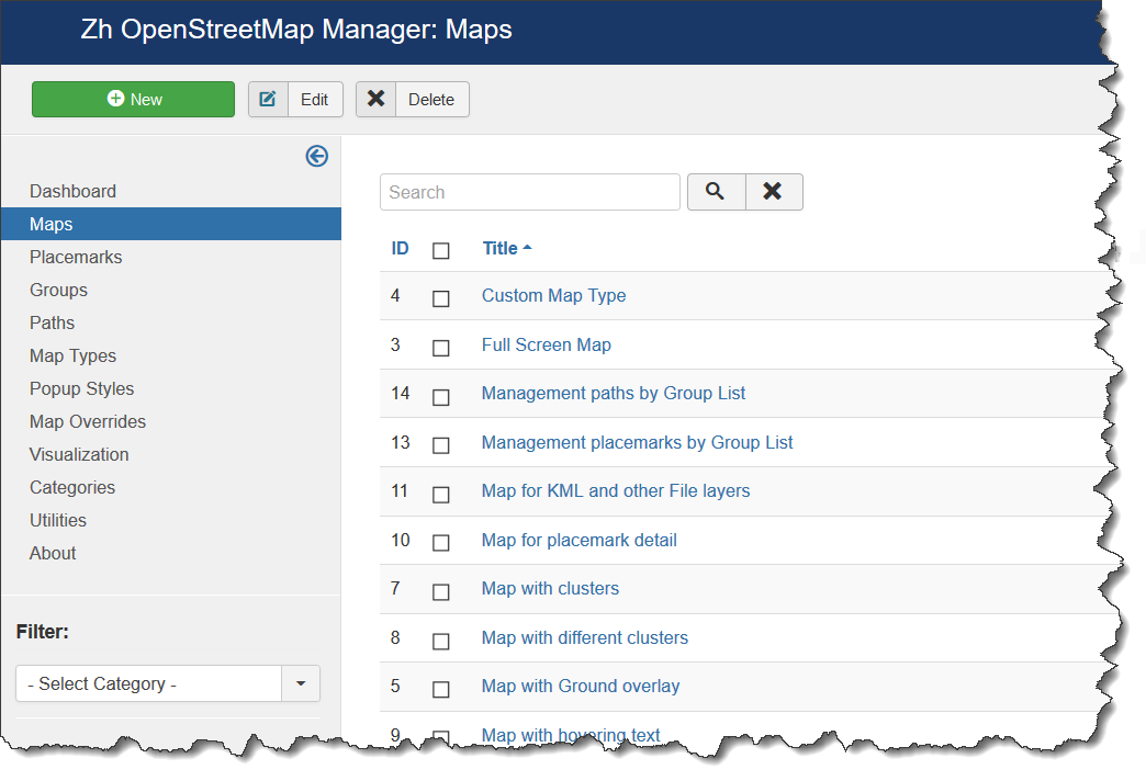
We turn to the menu "Maps".
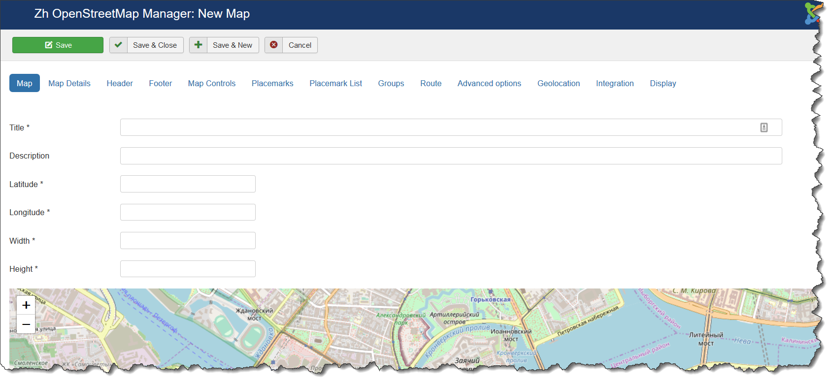
Enter the number of maps with the correct configuration for us.
Coordinates it is convenient to choose by dragging the marker (the value is automatically substituted in the form fields ) or by clicking the mouse on the desired location.
Map properties
| Title | Map title |
| Description | Description |
| Latitude | Map center Latitude |
| Longitude | Map center Longitude |
| Width | Map Width, if set to 0, map will be 100% wide |
| Height | Map Height if set to 0, map will be 100% height. |
Map Details
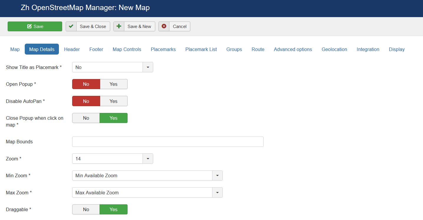
| Show Title as Placemark | Show map title as a placemark
|
| Open Popup | Open Popup for map title immediately |
| Disable AutoPan | Disable AutoPan when open popup |
| Map Bounds | Map bounds to protect navigation outside map You have to enter Latitude1,Longitude1;Latitude2,Longitude2 |
| Zoom | Initial Map Zoom |
| Min Zoom | Min Zoom for Map |
| Max Zoom | Max Zoom for Map |
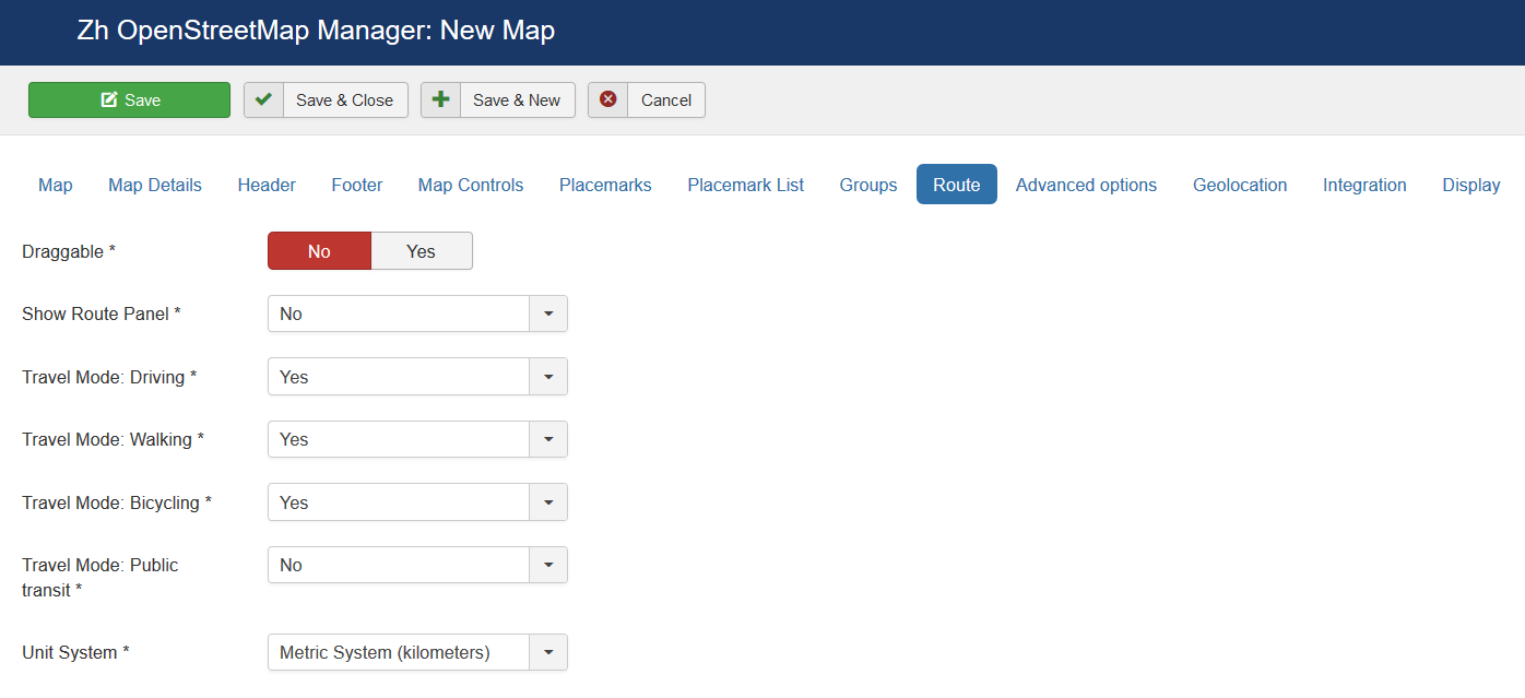
| Draggable | Enable/disable Map dragging |
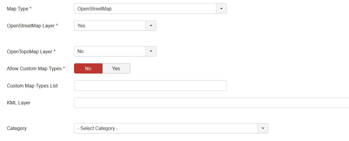
| Map Type | Initial Map Type
|
| OpenStreetMap Layer | The enabled/disabled state of the OpenStreetMap Layer and ability to use Map Type Control to switch to that layer |
| Open TopoMap Layer | The enabled/disabled state of the Open TopoMap Layer and ability to use Map Type Control to switch to that layer |
| Allow Custom Map Types | The enabled/disabled using custom map type and ability to use Map Type Control to switch to that layers |
| Custom Map Types List | List of custom map types ID for using on map, separator ; Example: 1;2;5 |
| KML Layer | URL of the KML Layer, that would be displayed on the map |
| Language | Language for map objects names Example: ru-RU |
| Category | The category that this map is assigned to |
Using KML Layer
If you have KML-file, you can put into accessible folder on site and fill URL in map field KML Layer.
If you want to use more than one file, you can use "featute", that path field of Paths is not required
- go to Paths tab
- create path
- fill KML Layer field
And after that new layer will be displayed
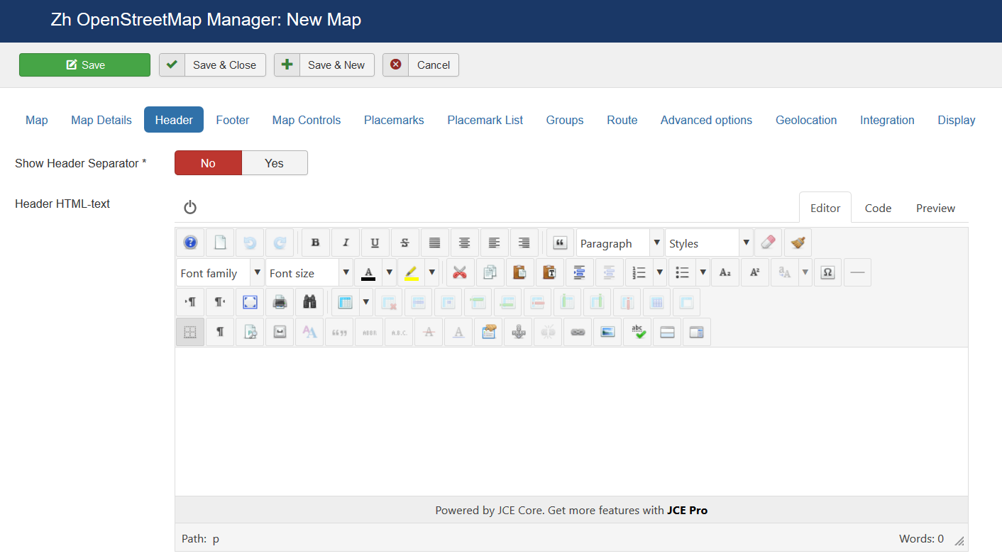
Map Header
| Header HTML-text | HTML text on top of the map |
| Show Header Separator | Show Separator after Header HTML text |
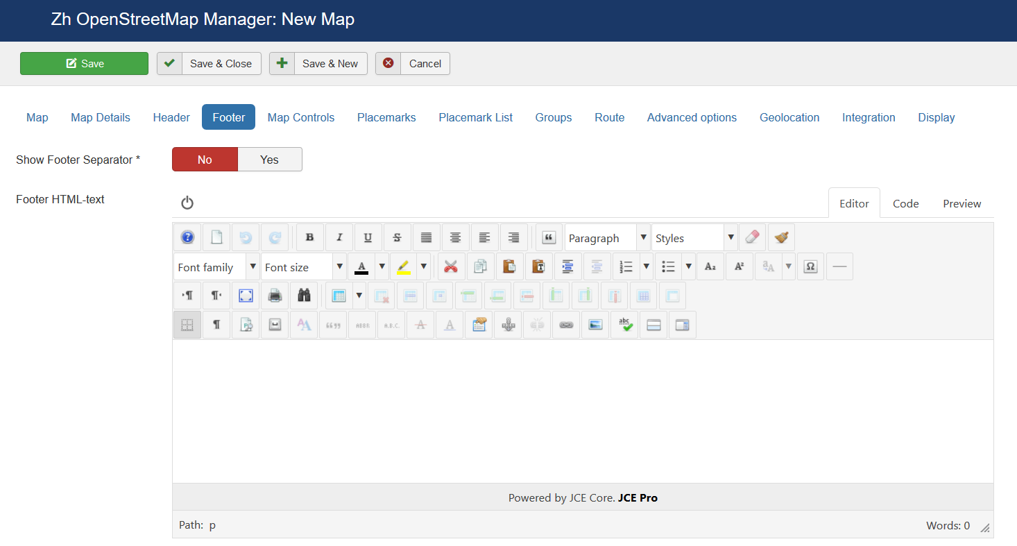
| Show Footer Separator | Show Separator before Footer HTML text |
| Footer HTML-text | HTML text on bottom of the map |
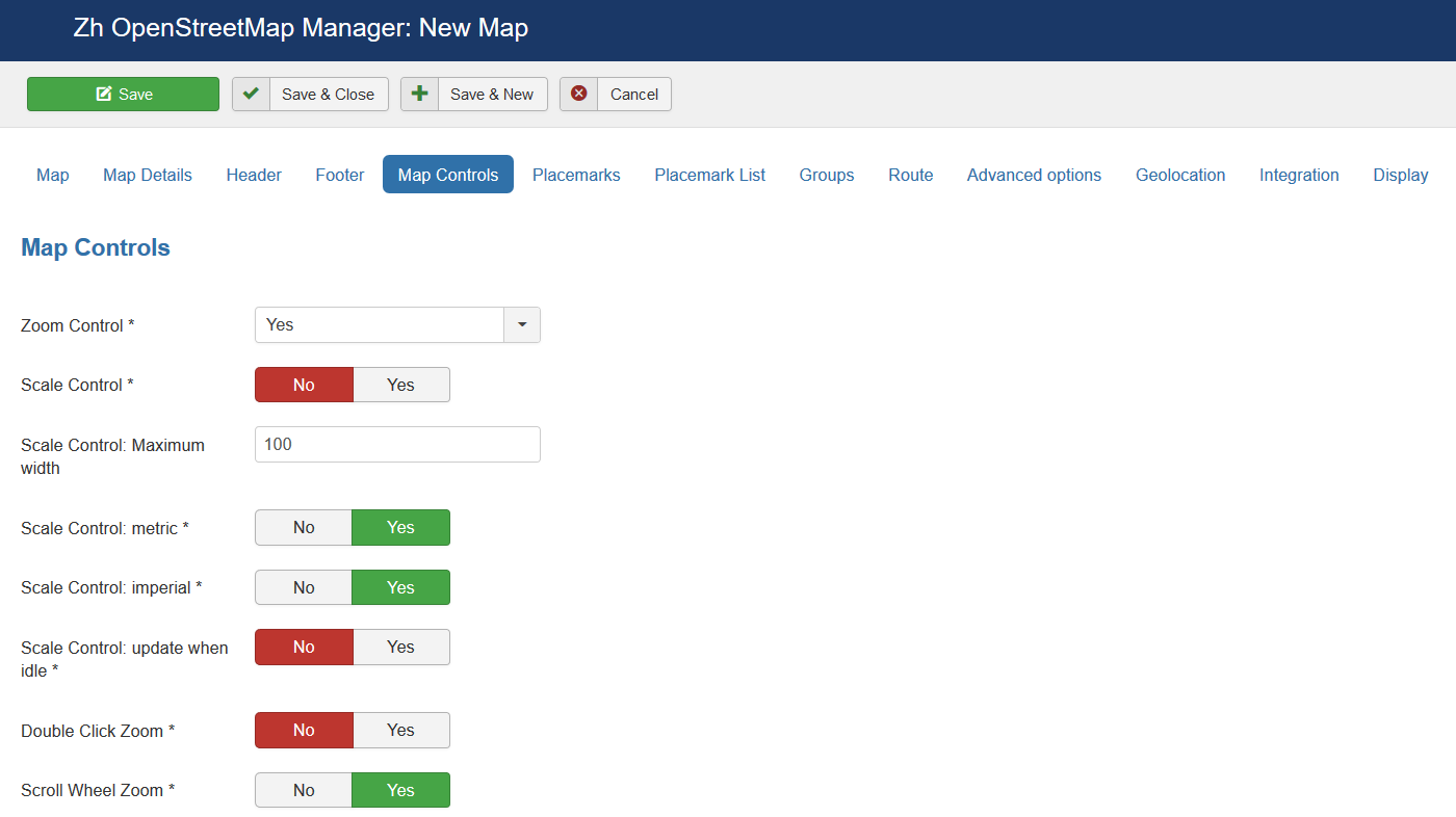
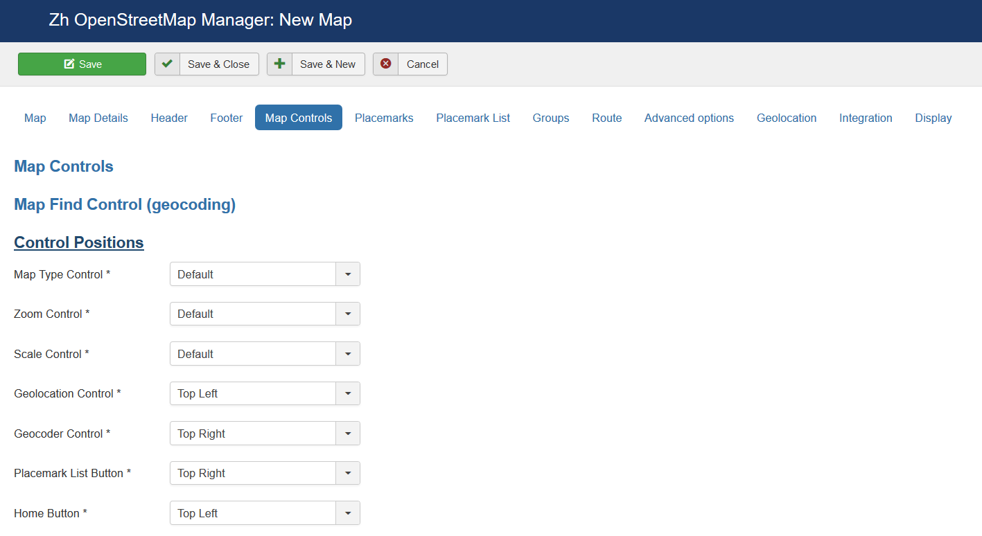
Map Controls
There are three sliders in this section
The first slider is
| Zoom Control | The enabled/disabled state of the Zoom Control |
| Scale Control | The enabled/disabled state of the Scale Control |
| Scale Control: Maximum width | Maximum width of the control in pixels. The width is set dynamically to show round values (e.g. 100, 200, 500) |
| Scale Control: metric | Whether to show the metric scale line (m/km) |
| Scale Control: imperial | Whether to show the imperial scale line (mi/ft) |
| Scale Control: update when idle | If true, the control is updated on move end, otherwise it's always up-to-date (updated on move) |
| Double Click Zoom | Enables/disables zoom and center on double click |
| Scroll Wheel Zoom | The enabled/disabled state of the scrollwheel zooming on the map |
| Home Button | The enabled/disabled feature to reset map center and/or zoom to initial value |
| Overlay Opacity | The enabled/disabled feature to change opacity for Ground Overlays |
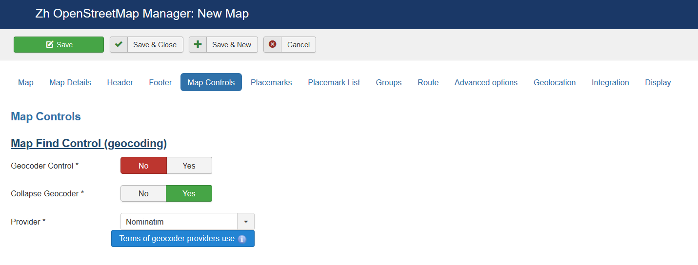
The second slider is
| Geocoder Control | The enabled/disabled state of the Geocoder Control |
| Collapse Geocoder | Collapse control unless hovered or clicked |
| Provider | Geocoding service used by the control to perform the actual geocoding queries |
The third slider is
| Map Type Control | Position on a map |
| Zoom Control | Position on a map |
| Scale Control | Position on a map |
| Geolocation Control | Position on a map |
| Geocoder Control | Position on a map |
| Placemark List Button | Position on a map |
| Home Button | Position on a map |
| Overlay Opacity | Position on a map |
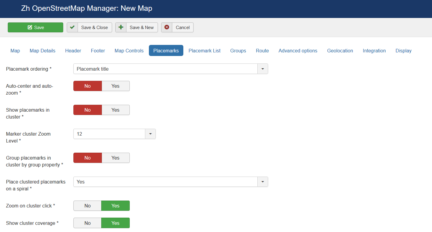
Map Properties for Placemarks
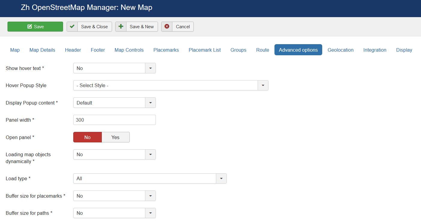
| Placemark ordering | Order placemarks. It is useful when you show placemark list
|
| Auto-center and auto-zoom | Calculate and set zoom and map center to show all placemarks |
| Show placemarks in cluster | Create cluster for markers |
| Marker Cluster Zoom Level | Zoom Level on which Clusterer starts group markers |
| Group Placemarks in Cluster by Group Property | Create cluster for each marker group (and you can override cluster icon) Remember, if you use this feature (without managing markers by group list), you have to activate group in cluster (by setting Active in Group List) |
| Place overlapping placemarks on a spiral | Enable feature to show overlapped placemarks on a spiral or create special list |
| Zoom on cluster click | Zoom map to fit cluster bounds |
| Show cluster coverage | When mouse over a cluster it shows the bounds of its markers |
| Show placemark creation information | You can show information about user and date of placemark creation
|
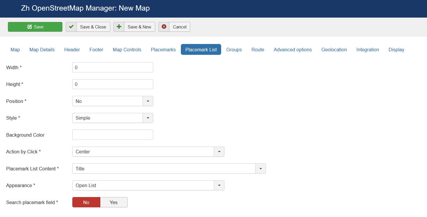
Map Properties for Placemark List
| Width | Placemark List Width in px If set 0 then you've got 100% width. |
| Height | Placemark List Height in px |
| Position | Values
For example, <ul id="OMapsMarkerUL" style="list-style-type: none;"></ul> |
| Style | Values
|
| Background Color | Background Color Example: #EAEAEA As for gradient in my example, I've got it from internet sites. When you specify background color #E6E6E6, I add into style line background: #E6E6E6 I've got this example background: #fefcea; /* For old browsers */
background: -moz-linear-gradient(top, #fefcea, #f1da36); /* Firefox 3.6+ */
/* Chrome 1-9, Safari 4-5 */
background: -webkit-gradient(linear, left top, left bottom,
color-stop(0%,#fefcea), color-stop(100%,#f1da36));
/* Chrome 10+, Safari 5.1+ */
background: -webkit-linear-gradient(top, #fefcea, #f1da36);
background: -o-linear-gradient(top, #fefcea, #f1da36); /* Opera 11.10+ */
background: -ms-linear-gradient(top, #fefcea, #f1da36); /* IE10 */
background: linear-gradient(top, #fefcea, #f1da36); /* CSS3 */
padding: 10px;
border: 1px solid #333;
And after all this is mine code #E6E6E6; /* For old browsers */
background: -moz-linear-gradient(top, #E6E6E6, #AAAAAA); /* Firefox 3.6+ */
/* Chrome 1-9, Safari 4-5 */
background: -webkit-gradient(linear, left top, left bottom,
color-stop(0%,#E6E6E6), color-stop(100%,#AAAAAA));
/* Chrome 10+, Safari 5.1+ */
background: -webkit-linear-gradient(top, #E6E6E6, #AAAAAA);
background: -o-linear-gradient(top, #E6E6E6, #AAAAAA); /* Opera 11.10+ */
background: -ms-linear-gradient(top, #E6E6E6, #AAAAAA); /* IE10 */
background: linear-gradient(top, #E6E6E6, #AAAAAA); /* CSS3 */
padding: 10px;
border: 1px solid #333;
I note that in IE9 there is no gradient. But it is not task to do it in my component by CSS. In any case you can do it by image and applying for class. |
| Action by Click | Action to do when you Click on link
|
| Placemark List Content | Text from which placemark list contains
|
| Appearance | Appearance of placemark list
|
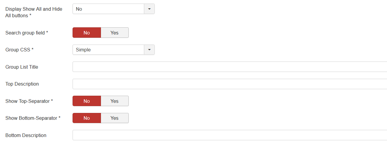
| Search placemark field | Enable feature to search by autocomplete placemarks in placemark list |
