Template:Zh GoogleMap Description Map: Difference between revisions
m (→Map Controls) |
m (→Map Controls) |
||
| Line 152: | Line 152: | ||
[[File:GM-Map-Detail-MapControls-1.png]] | [[File:GM-Map-Detail-MapControls-1.png]] | ||
[[File:GM-Map-Detail-MapControls-2.png]] | |||
{|class="zhpropertytable" | {|class="zhpropertytable" | ||
| Line 182: | Line 184: | ||
|} | |} | ||
==== Map Find Control (geocoding) ==== | ==== Map Find Control (geocoding) ==== | ||
[[File:GM-Map-Detail-MapControls-3.png]] | |||
{|class="zhpropertytable" | {|class="zhpropertytable" | ||
| Line 198: | Line 199: | ||
[[File:GM-Map-Detail-MapControls-4.png]] | [[File:GM-Map-Detail-MapControls-4.png]] | ||
Revision as of 14:58, 9 November 2015
Creating Map
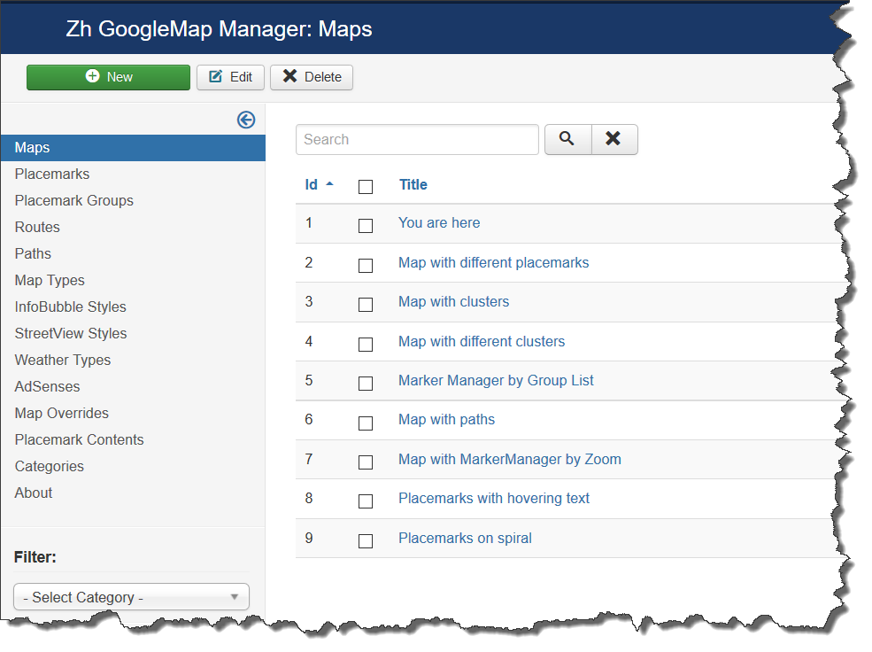
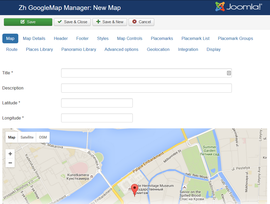
We turn to the tab "Maps".
Enter the number of maps with the correct configuration for us.
Coordinates it is convenient to choose by dragging the marker (the value is automatically substituted in the form fields ) or by clicking the mouse on the desired location.
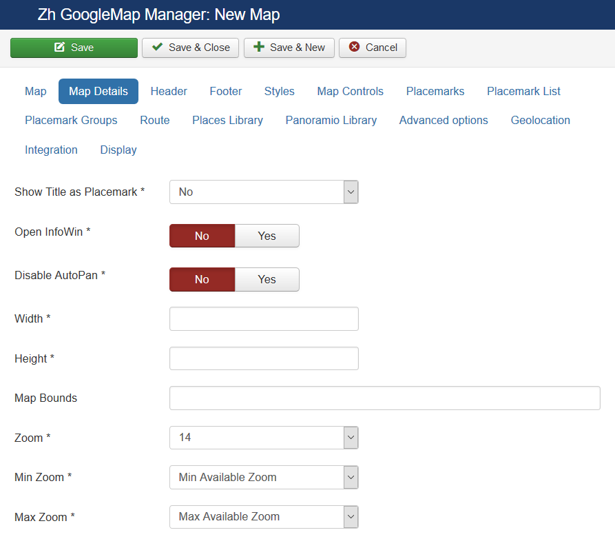
Map properties
| Title | Map title |
| Description | Description |
| Show Title as Placemark | Show map title as a placemark
|
| Open InfoWin | Open InfoWindow for map title immediately |
| Width | Map Width, if set to 0, map will be 100% wide |
| Height | Map Height if set to 0, map will be 100% height. |
| Latitude | Map center Latitude |
| Longitude | Map center Longitude |
| Map Bounds | Map bounds to protect navigation outside map You have to enter Latitude1,Longitude1;Latitude2,Longitude2 |
| Zoom | Initial Map Zoom |
| Min Zoom | Min Zoom for Map |
| Max Zoom | Max Zoom for Map |
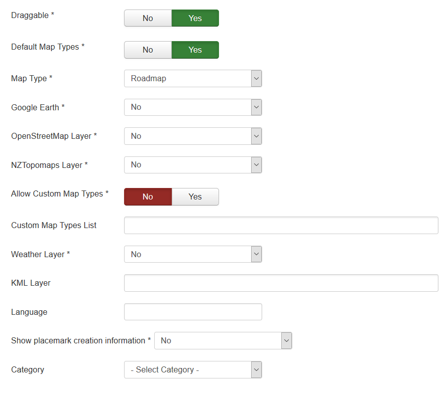
| Draggable | Enable/disable Map dragging |
| Map Type | Initial Map Type
|
| Google Earth | The enabled/disabled state of the Google Earth
|
| OpenStreetMap Layer | The enabled/disabled state of the OpenStreetMap Layer and ability to use Map Type Control to switch to that layer |
| NZTopomaps Layer | The enabled/disabled state of the NZTopomaps Layer and ability to use Map Type Control to switch to that layer |
| Allow Custom Map Types | The enabled/disabled using custom map type and ability to use Map Type Control to switch to that layers |
| Custom Map Types List | List of custom map types ID for using on map, separator ; Example: 1;2;5 |
| Weather Layer | Weather Layer, that would be displayed on the map |
| KML Layer | URL of the KML Layer, that would be displayed on the map |
| Language | Language for map objects names Example: ru-RU |
| Category | The category that this map is assigned to |
Using Google Earth
We turn to component options.
Enter the key Google Earth API.
For you map select using Google Earth
- "Yes" - the map is displayed, but if you have not installed the plugin Google Earth Plugin, then that functionality is not available
- "Yes (Notify)" - the map is displayed, but if you have not installed the plugin Google Earth Plugin, then that functionality is not available and displays a message that there is no plugin
Using KML Layer
If you have KML-file, you can put into accessible folder on site and fill URL in map field KML Layer.
If you want to use more than one file, you can use "featute", that path field of Paths is not required
- go to Paths tab
- create path
- fill KML Layer field
And after that new layer will be displayed
Map Decoration
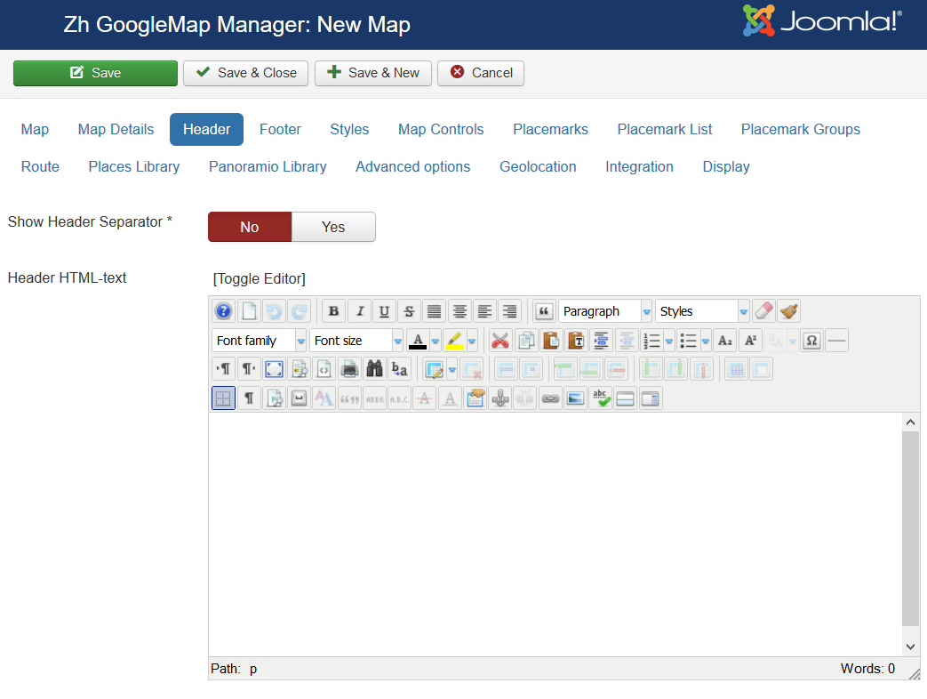
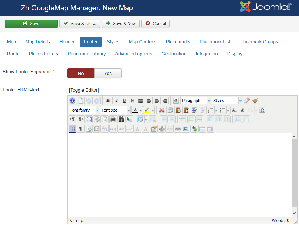
| Header HTML-text | HTML text on top of the map |
| Show Header Separator | Show Separator after Header HTML text |
| Show Footer Separator | Show Separator before Footer HTML text |
| Footer HTML-text | HTML text on bottom of the map |
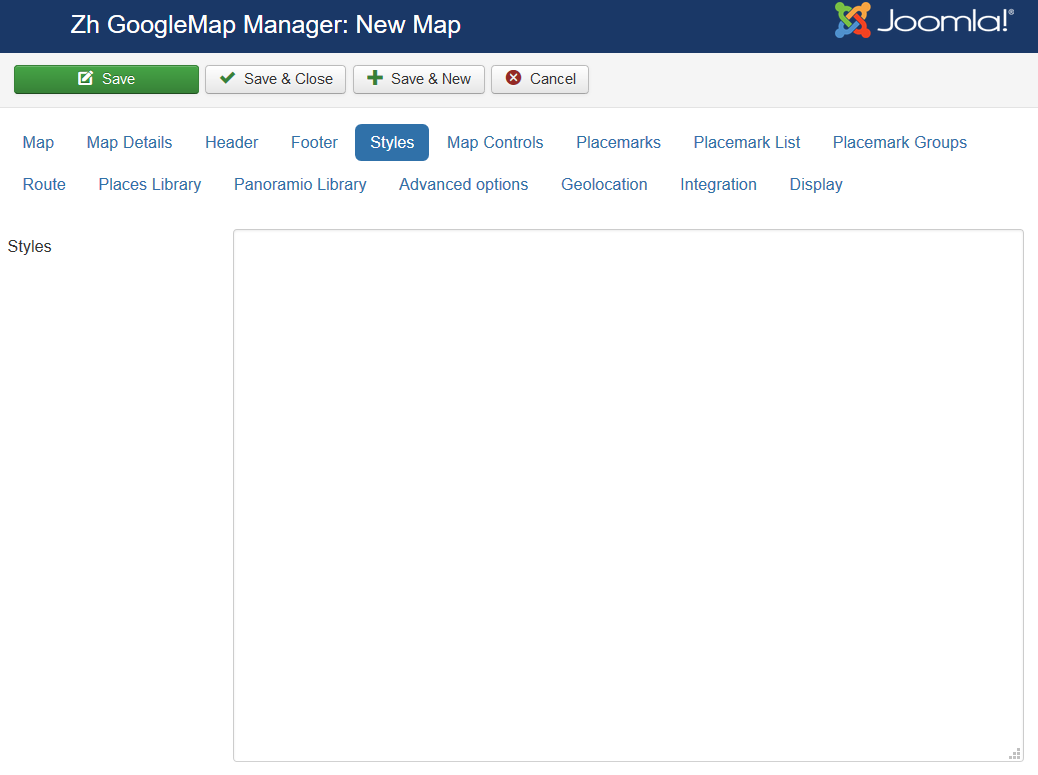
| Styles | Styles for map See Google Maps API Styled Map Wizard |
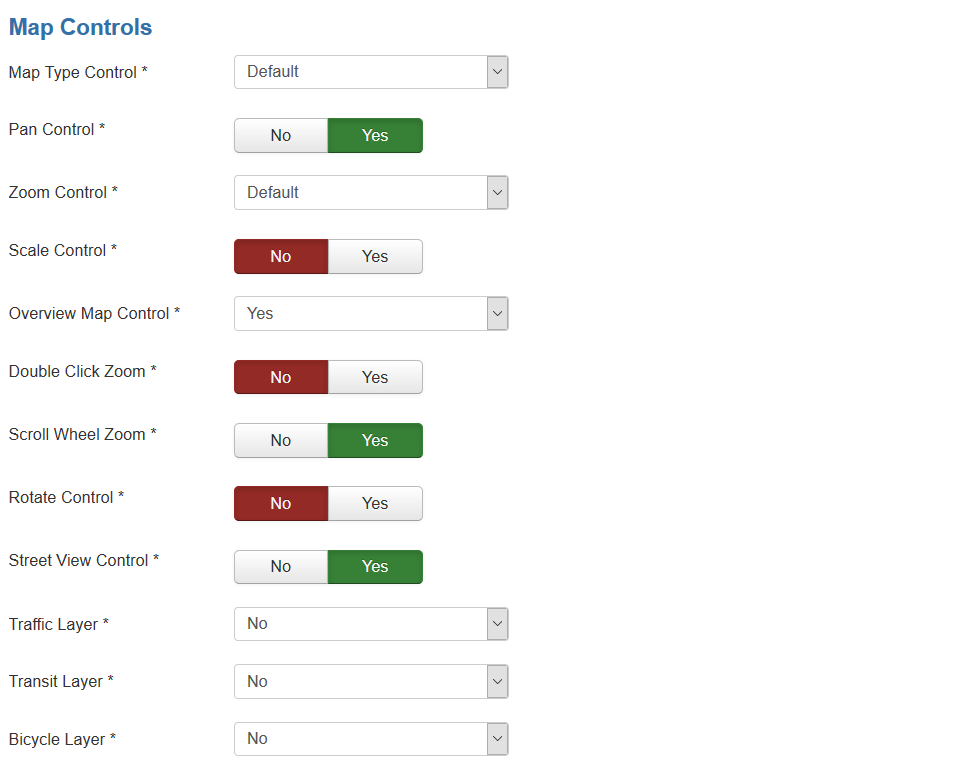
Map Controls
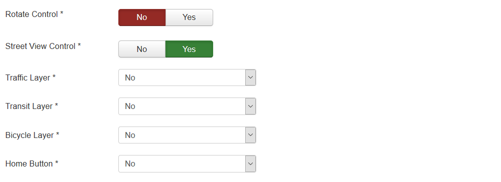
| Map Type Control | The enabled/disabled state of the Map Type Control |
| Pan Control | The enabled/disabled state of the Pan Control |
| Zoom Control | The enabled/disabled state of the Zoom Control |
| Scale Control | The enabled/disabled state of the Scale Control |
| Overview Map Control | The enabled/disabled state of the Overview Map Control
|
| Double Click Zoom | Enables/disables zoom and center on double click |
| Scroll Wheel Zoom | The enabled/disabled state of the scrollwheel zooming on the map |
| Rotate Control | The enabled/disabled state of the Rotate Control |
| Street View Control | The enabled/disabled state of the Street View Control |
| Traffic Layer | The enabled/disabled state of the Traffic Layer |
| Bicycle Layer | The enabled/disabled state of the Bicycle Layer
from place witch is found by Find Control |
Map Find Control (geocoding)
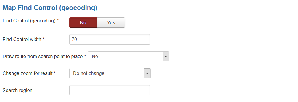
| Find Control (geocoding) | The enabled/disabled state of the Find Control (by geocoding) |
| Find Control width | Width of Find Control field |
| Draw route from search point to place | The enabled/disabled state of the drawing route from place witch is found by Find Control |
Control Positions
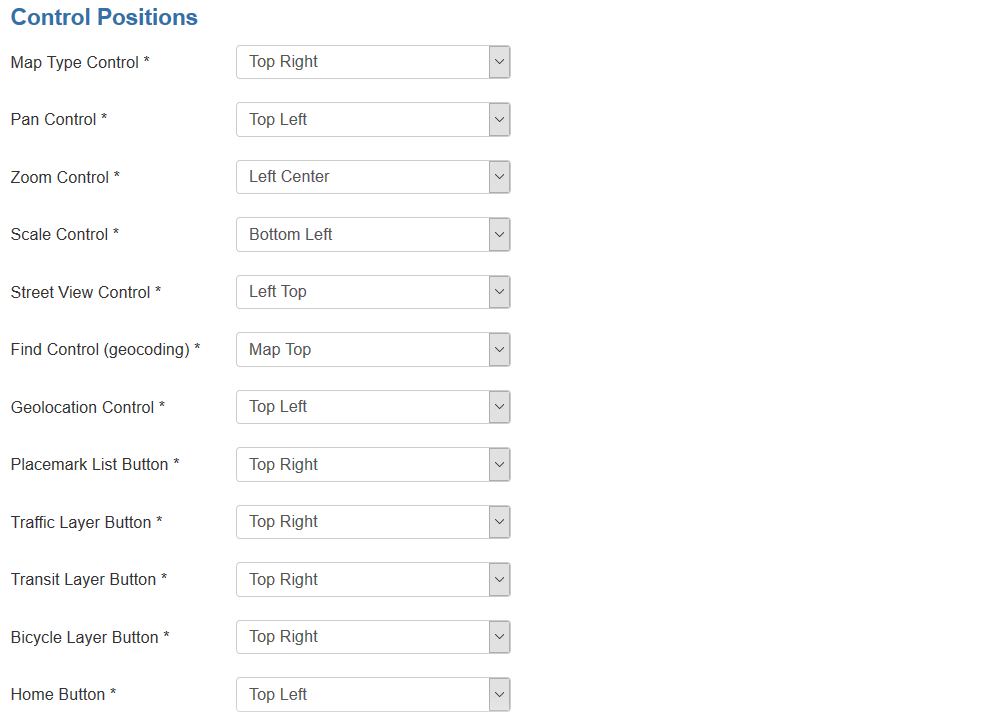
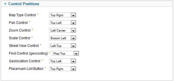
| Map Type Control | Position on a map |
| Pan Control | Position on a map |
| Zoom Control | Position on a map |
| Scale Control | Position on a map |
| Street View Control | Position on a map |
| Find Control (geocoding) | Position on a map |
| Geolocation Control | Position on a map |
| Placemark List Button | Position on a map |
Map Properties for Placemarks
| Show placemarks in cluster | Create cluster for markers |
| Marker Cluster Zoom Level | Zoom Level on which Cluster starts group markers |
| Group Placemarks in Cluster by Placemark Group Property | Create cluster for each marker group (and you can override cluster icon) Remember, if you use this feature (without managing markers by group list), you have to activate group in cluster (by setting Active in Placemark Group List) |
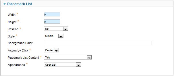
Map Properties for Placemark List
| Width | Placemark List Width in px If set 0 then you've got 100% width. |
| Height | Placemark List Height in px |
| Position | Values
For example, <ul id="GMapsMarkerUL" style="list-style-type: none;"></ul> |
| Style | Values
|
| Background Color | Background Color Example: #EAEAEA As for gradient in my example, I've got it from internet sites. When you specify background color #E6E6E6, I add into style line background: #E6E6E6 I've got this example background: #fefcea; /* For old browsers */
background: -moz-linear-gradient(top, #fefcea, #f1da36); /* Firefox 3.6+ */
/* Chrome 1-9, Safari 4-5 */
background: -webkit-gradient(linear, left top, left bottom,
color-stop(0%,#fefcea), color-stop(100%,#f1da36));
/* Chrome 10+, Safari 5.1+ */
background: -webkit-linear-gradient(top, #fefcea, #f1da36);
background: -o-linear-gradient(top, #fefcea, #f1da36); /* Opera 11.10+ */
background: -ms-linear-gradient(top, #fefcea, #f1da36); /* IE10 */
background: linear-gradient(top, #fefcea, #f1da36); /* CSS3 */
padding: 10px;
border: 1px solid #333;
And after all this is mine code #E6E6E6; /* For old browsers */
background: -moz-linear-gradient(top, #E6E6E6, #AAAAAA); /* Firefox 3.6+ */
/* Chrome 1-9, Safari 4-5 */
background: -webkit-gradient(linear, left top, left bottom,
color-stop(0%,#E6E6E6), color-stop(100%,#AAAAAA));
/* Chrome 10+, Safari 5.1+ */
background: -webkit-linear-gradient(top, #E6E6E6, #AAAAAA);
background: -o-linear-gradient(top, #E6E6E6, #AAAAAA); /* Opera 11.10+ */
background: -ms-linear-gradient(top, #E6E6E6, #AAAAAA); /* IE10 */
background: linear-gradient(top, #E6E6E6, #AAAAAA); /* CSS3 */
padding: 10px;
border: 1px solid #333;
I note that in IE9 there is no gradient. But it is not task to do it in my component by CSS. In any case you can do it by image and applying for class. |
| Action by Click | Action to do when you Click on link
|
| Placemark List Content | Text from which placemark list contains
|
| Appearance | Appearance of placemark list
|
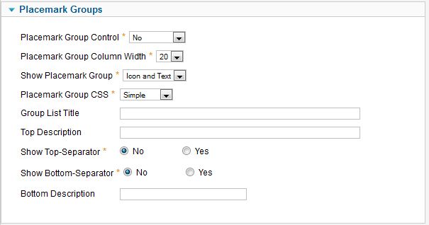
Managing Placemarks by Placemark Group List
| Placemark Group Control | Position and type of list of group, that would be displayed for marker management
|
| Placemark Group Column Width | Column width for the left or right position of list group |
| Show Placemark Group | Show text, icon of group in list of group
|
| Placemark Group CSS | Type of group decoration
There are two predefined style in
and one (external) – for you, which you can set style in you template. ID for tags depend on Placemark Group CSS field. See details in Marker Grouping |
| Group List Title | Group List Title |
| Top Description | Description on top of the list |
| Show Top-Separator | The enabled/disabled state of Separator on top of the list |
| Show Bottom-Separator | The enabled/disabled state of Separator on botom of the list |
| Bottom Description | Description on bottom of the list |
Route
This options for routes, which is shown for find your way to place
- by geocoding find feature (Map Find Control (geocoding) slider)
- autocomplete field (Places Library slider)
| Draggable | The enabled/disabled ability route to be draggable |
| Show Route Panel | Enable show route details |
| Address | If you want not use map center coordinates as a destination point of your route (for example, Google not right geocoded your address), you can enter text address into this field, and it would be used for drawing route Use value from autocomplete field (copy-paste) for entering more clear address for google router |
| Travel Mode: Driving | The enabled/disabled ability to be show this travel mode |
| Travel Mode: Walking | The enabled/disabled ability to be show this travel mode |
| Travel Mode: Bicycling | The enabled/disabled ability to be show this travel mode |
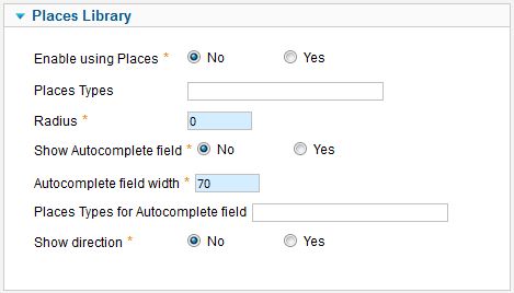
Using Places Library
| Enable using Places | The enabled/disabled state of using Places Library |
| Places Types | Places types in single quotes, delimited by comma for example: 'restaurant', 'store' |
| Radius | Radius from map center (in meters) If you don't want to see placemark from Places API, and only use autocomplete field, then set radius = 0 Places API show only up to 20 places! |
| Show Autocomplete field | The enabled/disabled state of using Autocomplete field |
| Places Types for Autocomplete field | Places types for Autocomplete field like a places types field, values in single quotes with comma delimiter
|
| Show direction | Show direction (by Directions API) from place, what you've found by autocomplete field (where marker is) and point on your map (which you set in map, center of map) |
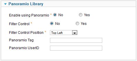
Using Panoramio Library
For using feature set enable by Enable using Panoramio = Yes
You can add filter control to map, and it's position.
And you can specify preset restriction on data by settin "Panoramio Tag" or/and "Panoramio UserID"
- tag - a panoramio tag used to filter the photos which are displayed. Only photos which have been tagged with the supplied string will be shown.
- userId - a panoramio user ID. If provided, only photos by this user will be displayed on the map.
- If both a tag and user ID are provided, the tag will take precedence.
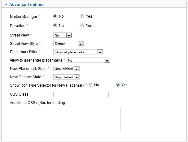
Advanced Options
| MarkerManager | The enabled/disabled state of using Marker Manager Marker Manager displaying markers on definite zoom. |
| Elevation | The enabled/disabled state of using Elevation API Show elevation at point where you click. |
| Street View | Enable/disable show Street View
|
| Street View Style | Style of Street View
|
| Placemark Filter | Restriction displaying placemarks on some rules. |
| Allow to user enter placemarks | Enable registered users to create placemarks on map. |
| New Placemark State | Placemark Status for created user placemark. |
| New Contact State | Contact Status for created user contact (if enabled contact integration). |
| Show Icon Type Selector for New Placemark | The enabled/disabled state of selecting Icon Type when user creates placemark. |
| CSS Class | The class name for map div tag |
| Additional CSS styles for loading | List of CSS style files for loading when map is loading, separated by new line or semicolon |
Using Marker Manager
You can use Marker Manager with restrictions:
- you can't use marker clustering - because cluster groups markers, and controls it displaying
- you can't use managing markers by group list
To use Marker Manager:
- set marker group for your markers
- set Min Zoom for Marker Manager and Max Zoom for Marker Manager for each group
- enable feature for the map
Geolocation
| Auto Positioning | Auto Positioning when map is loading |
| Geolocation Control | Show Geolocation Control |
| Geolocation Button Style | Geolocation Button Style
|
Integration
| Use contacts | The enabled/disabled state of using contacts You can enable using contact information and associate your placemark with contact to display contact information in placemark InfoWin. |
| Contact Details | You can enter names of attributes to show. Separator is ; Acceptable values
You can enter it in any order, and by it the contact will be shown. Note: postcode and zipcode – it is the same field, but different labels will be. Check contact fields, and you'll see this pairs: City or Suburb, State or Province, Postal / ZIP Code
to show position, contact name and mobile phone |
| Use users | The enabled/disabled state of using users You can enable using user information and associate your placemark with user to display user information in placemark InfoWin. |
