Zh BaiduMap Description: Difference between revisions
mNo edit summary |
mNo edit summary |
||
| Line 1: | Line 1: | ||
{{Zh_BaiduMap_Description_Install}} | {{Zh_BaiduMap_Description_Install}} | ||
{{Zh_BaiduMap_Description_Options}} | |||
Latest revision as of 12:10, 19 December 2019
Installation
Component is installed on Joomla! 3.x in a standard way through the Extension Manager.
Component supports autoupdate feature
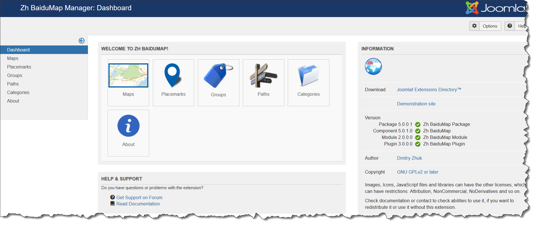
Main dashboard
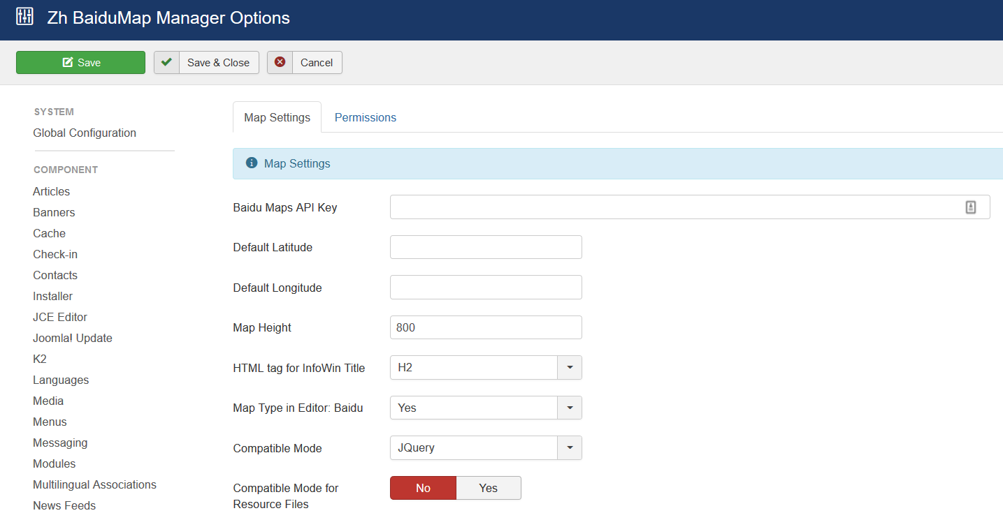
Options
You do not need to configurate it.
There are some parameters you can set in component options.
Press (menu):
- Components
- Zh BaiduMap
When you create new map objects at the opening map is automatically calculated location, if can not be calculated, then displaying center of Palace Square in St. Petersburg (if not set default place).
Default place
You can set latitude and longitude of your default place in Options page
After that when you try to create new map, placemark, path in backend, position of marker on map will be set to default.
Map Height
You can control map height in admin panel
HTML tag for InfoWin Title
Define h2 (h3...) tag for InfoWin Title, for example, for placemark
Map Type in Editor
You can manage what map types will be accessible when you define map objects (map, placemarks...) and there is a map in details.
Compatibility Mode
In some cases when on map is active Managing Placemarks by Group List, you can get an error
link.hasClass is not a function
It can be caused by conflict with JQuery and mootools in some templates, or in case mootools is disabled in joomla
In this case you can activate compatibility mode, when calling methods hasClass and toggleClass is changed to JavaScript functions which do like the same.
Compatibility Mode for Resource Files
In some cases you restrict access to administrator folder. In this folder for component by default exists assets folder , which used for storing icons for component and plugin.
If you block access to it, then when users will try to see your map will get login screen.
And just for this case there is a component option Compatible Mode for Resource Files.
Just set it to yes, and all references in document, which contains map (created as a component, or as a plugin), will be to site assets folder. Do not move any files or folders, just use it.
And you have to copy icons from admin icons folder (/administrator/components/com_zhbaidumap/assets/icons) to site folder (/components/com_zhbaidumap/assets/icons), because it is empty from installation (because if site folder will contain icons, then size of zip-archive of extension increase twice)
And if you want to use your icons for placemarks, you should copy your icons to both folders. In administrator folder icons will be used in backend (admin panel), and when displaying - from site folder.
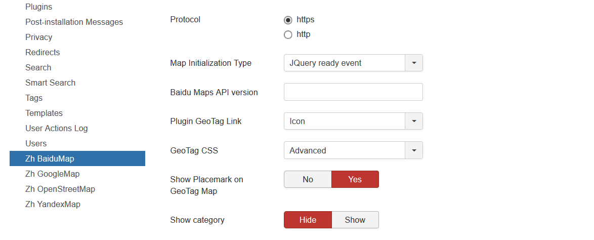
Protocol
You can set protocol to use when you load map.
Map initialization type
In some cases your template or the other extensions can use onload function. And in this case map will not be initialized (displayed), therefore you can set domready type.
Baidu Maps API version
By default loaded latest version of maps API.
powered by
You can define place to show my logo, or hide it
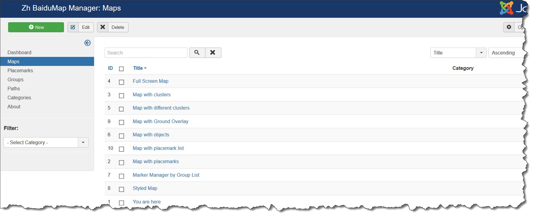
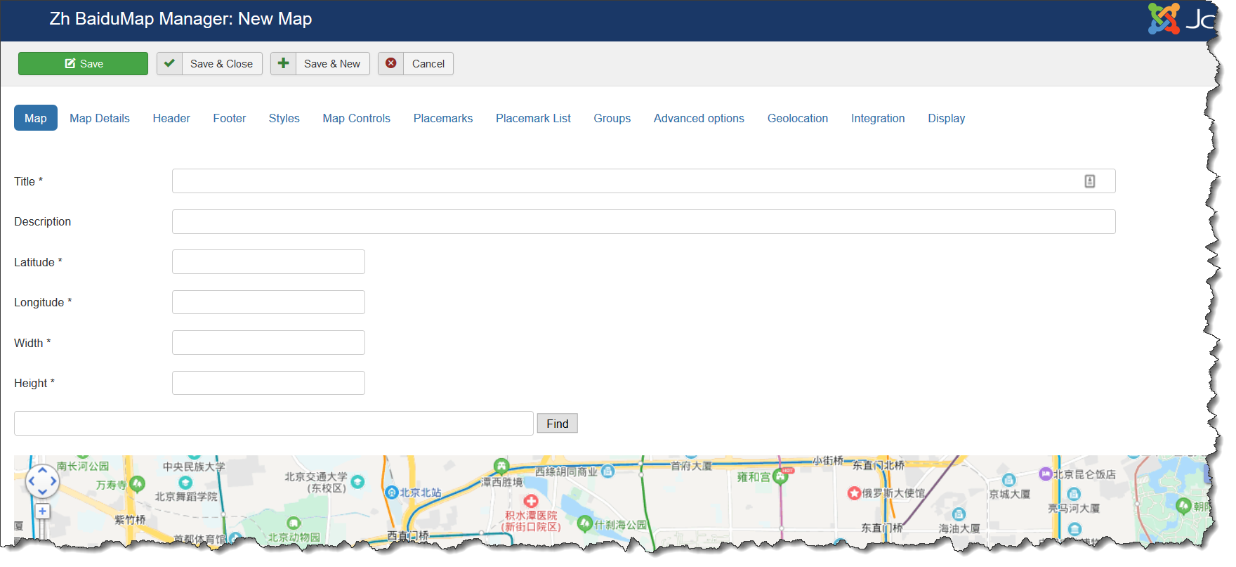
Creating Map
We turn to the menu "Maps".
Enter the number of maps with the correct configuration for us.
Coordinates it is convenient to choose by dragging the marker (the value is automatically substituted in the form fields ) or by clicking the mouse on the desired location.
Map properties
| Title | Map title |
| Description | Description |
| Latitude | Map center Latitude |
| Longitude | Map center Longitude |
| Width | Map Width, if set to 0, map will be 100% wide |
| Height | Map Height if set to 0, map will be 100% height. |
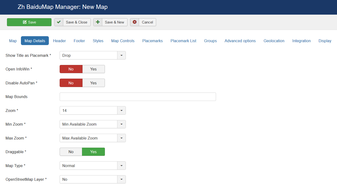
Map Details
| Show Title as Placemark | Show map title as a placemark
|
| Open InfoWin | Open InfoWin for map title immediately |
| Disable AutoPan | Disable AutoPan when open popup |
| Map Bounds | Map bounds to protect navigation outside map You have to enter Longitude1,Latitude1;Longitude2,Latitude2 |
| Zoom | Initial Map Zoom |
| Min Zoom | Min Zoom for Map |
| Max Zoom | Max Zoom for Map |
| Draggable | Enable/disable Map dragging |
| Map Type | Initial Map Type
|
| OpenStreetMap Layer | The enabled/disabled state of the OpenStreetMap Layer and ability to use Map Type Control to switch to that layer |
| Allow Custom Map Types | The enabled/disabled using custom map type and ability to use Map Type Control to switch to that layers |
| Category | The category that this map is assigned to |
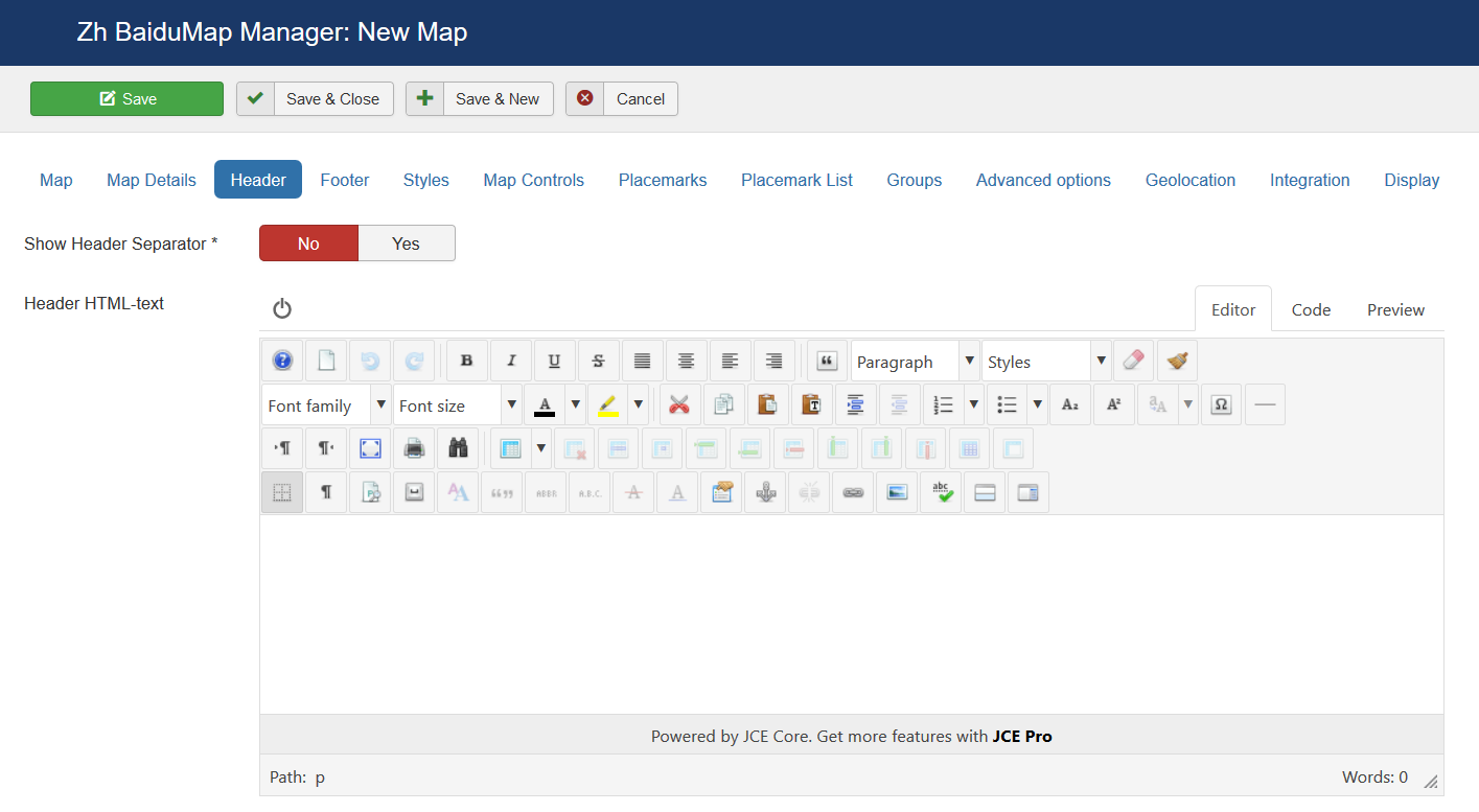
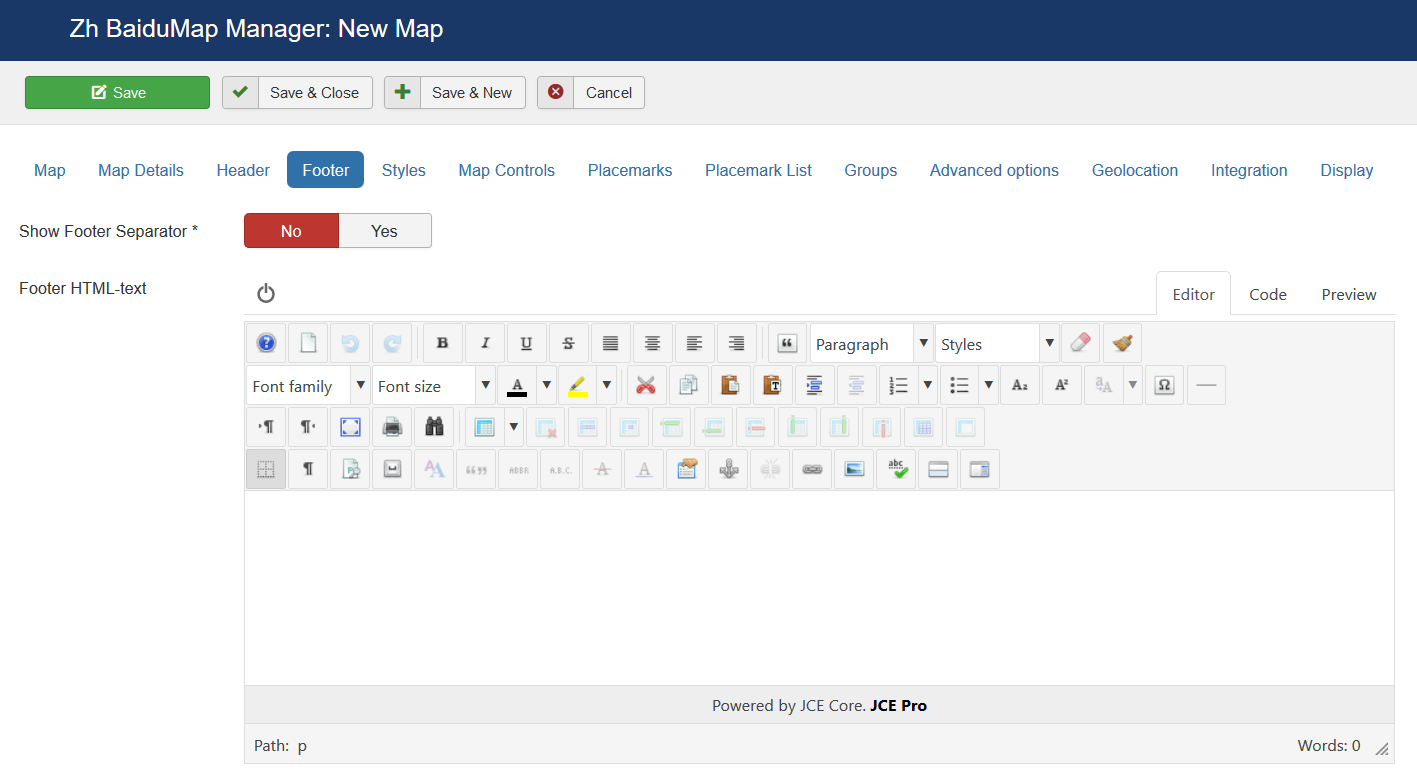
Map Header
| Header HTML-text | HTML text on top of the map |
| Show Header Separator | Show Separator after Header HTML text |
| Show Footer Separator | Show Separator before Footer HTML text |
| Footer HTML-text | HTML text on bottom of the map |
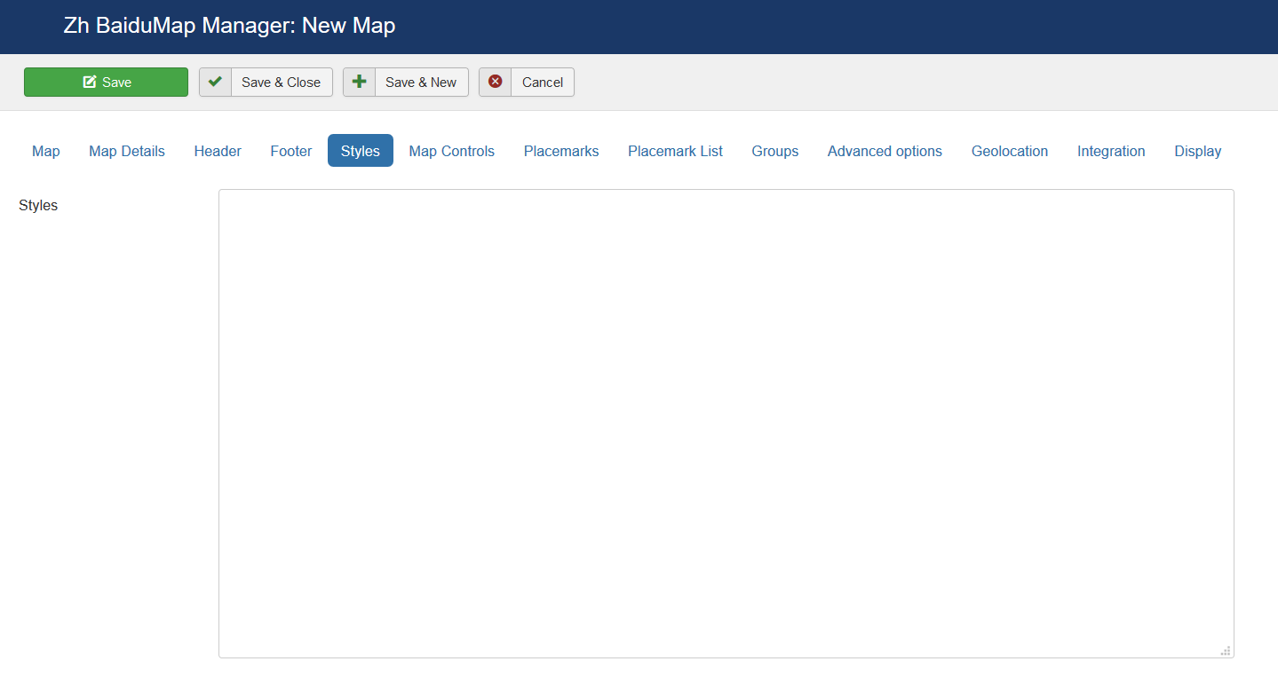
Styles
| Styles | Map style For example [
{
"featureType": "all",
"elementType": "geometry",
"stylers": {
"hue": "#007fff",
"saturation": 89
}
},
{
"featureType": "water",
"elementType": "all",
"stylers": {
"color": "#ffffff"
}
}
]
|
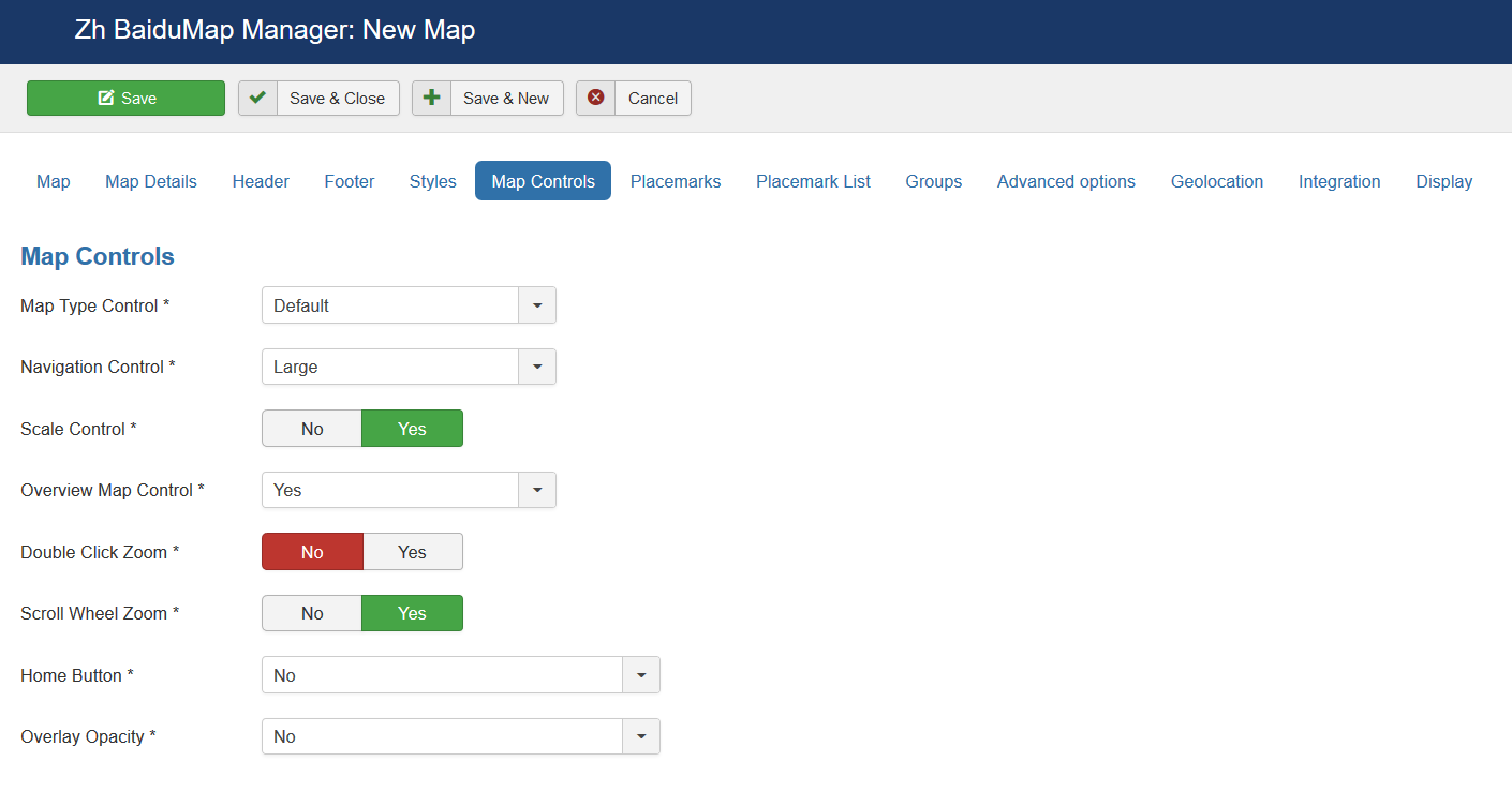
Map Controls
There are three sliders in this section
| Map Type Control | The enabled/disabled state of the Map type control
|
| Navigation Control | The enabled/disabled state of the Navigation Control
|
| Scale Control | The enabled/disabled state of the Scale Control |
| Overview Map Control | The enabled/disabled state of the Overview Map |
| Double Click Zoom | Enables/disables zoom and center on double click |
| Scroll Wheel Zoom | The enabled/disabled state of the scrollwheel zooming on the map |
| Home Button | The enabled/disabled feature to reset map center and/or zoom to initial value |
| Overlay Opacity | The enabled/disabled feature to change opacity for Ground Overlays |
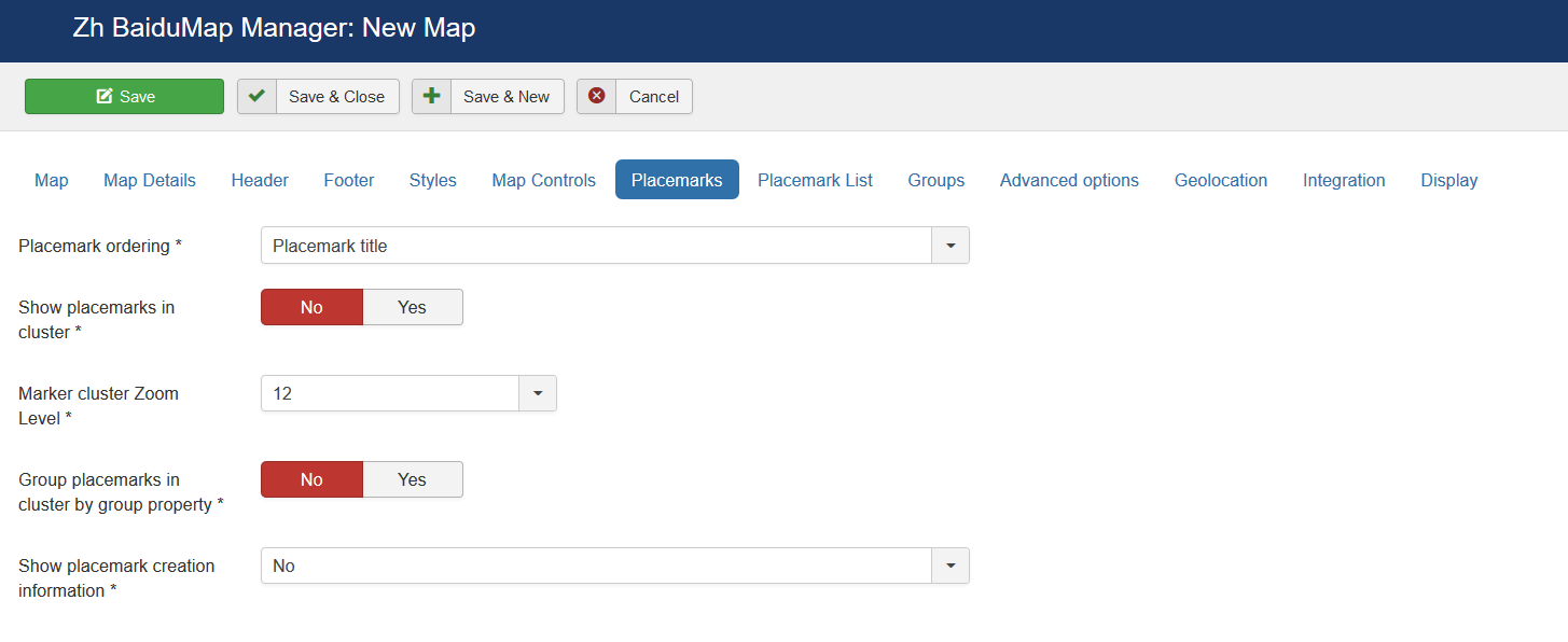
Map Properties for Placemarks
| Placemark ordering | Order placemarks. It is useful when you show placemark list
|
| Show placemarks in cluster | Create cluster for markers |
| Marker Cluster Zoom Level | Zoom Level on which Clusterer starts group markers |
| Group Placemarks in Cluster by Group Property | Create cluster for each group (and you can override cluster icon) Remember, if you use this feature (without managing markers by group list), you have to activate group in cluster (by setting Active in Group List) |
| Show placemark creation information | You can show information about user and date of placemark creation
|
Map Properties for Placemark List
| Width | Placemark List Width in pixels If set 0 then you've got 100% width. |
| Height | Placemark List Height in pixels |
| Position | Values
|
| Style | Values
|
| Background Color | Background Color Example: #EAEAEA As for gradient in my example, I've got it from internet sites. When you specify background color #E6E6E6, I add into style line background: #E6E6E6 I've got this example background: #fefcea; /* For old browsers */
background: -moz-linear-gradient(top, #fefcea, #f1da36); /* Firefox 3.6+ */
/* Chrome 1-9, Safari 4-5 */
background: -webkit-gradient(linear, left top, left bottom,
color-stop(0%,#fefcea), color-stop(100%,#f1da36));
/* Chrome 10+, Safari 5.1+ */
background: -webkit-linear-gradient(top, #fefcea, #f1da36);
background: -o-linear-gradient(top, #fefcea, #f1da36); /* Opera 11.10+ */
background: -ms-linear-gradient(top, #fefcea, #f1da36); /* IE10 */
background: linear-gradient(top, #fefcea, #f1da36); /* CSS3 */
padding: 10px;
border: 1px solid #333;
And after all this is mine code #E6E6E6; /* For old browsers */
background: -moz-linear-gradient(top, #E6E6E6, #AAAAAA); /* Firefox 3.6+ */
/* Chrome 1-9, Safari 4-5 */
background: -webkit-gradient(linear, left top, left bottom,
color-stop(0%,#E6E6E6), color-stop(100%,#AAAAAA));
/* Chrome 10+, Safari 5.1+ */
background: -webkit-linear-gradient(top, #E6E6E6, #AAAAAA);
background: -o-linear-gradient(top, #E6E6E6, #AAAAAA); /* Opera 11.10+ */
background: -ms-linear-gradient(top, #E6E6E6, #AAAAAA); /* IE10 */
background: linear-gradient(top, #E6E6E6, #AAAAAA); /* CSS3 */
padding: 10px;
border: 1px solid #333;
I note that in IE9 there is no gradient. But it is not task to do it in my component by CSS. In any case you can do it by image and applying for class. |
| Action by Click | Action to do when you Click on link
|
| Placemark List Content | Text from which placemark list contains
|
| Appearance | Appearance of placemark list
|
| Search placemark field | Enable feature to search by autocomplete placemarks in placemark list |
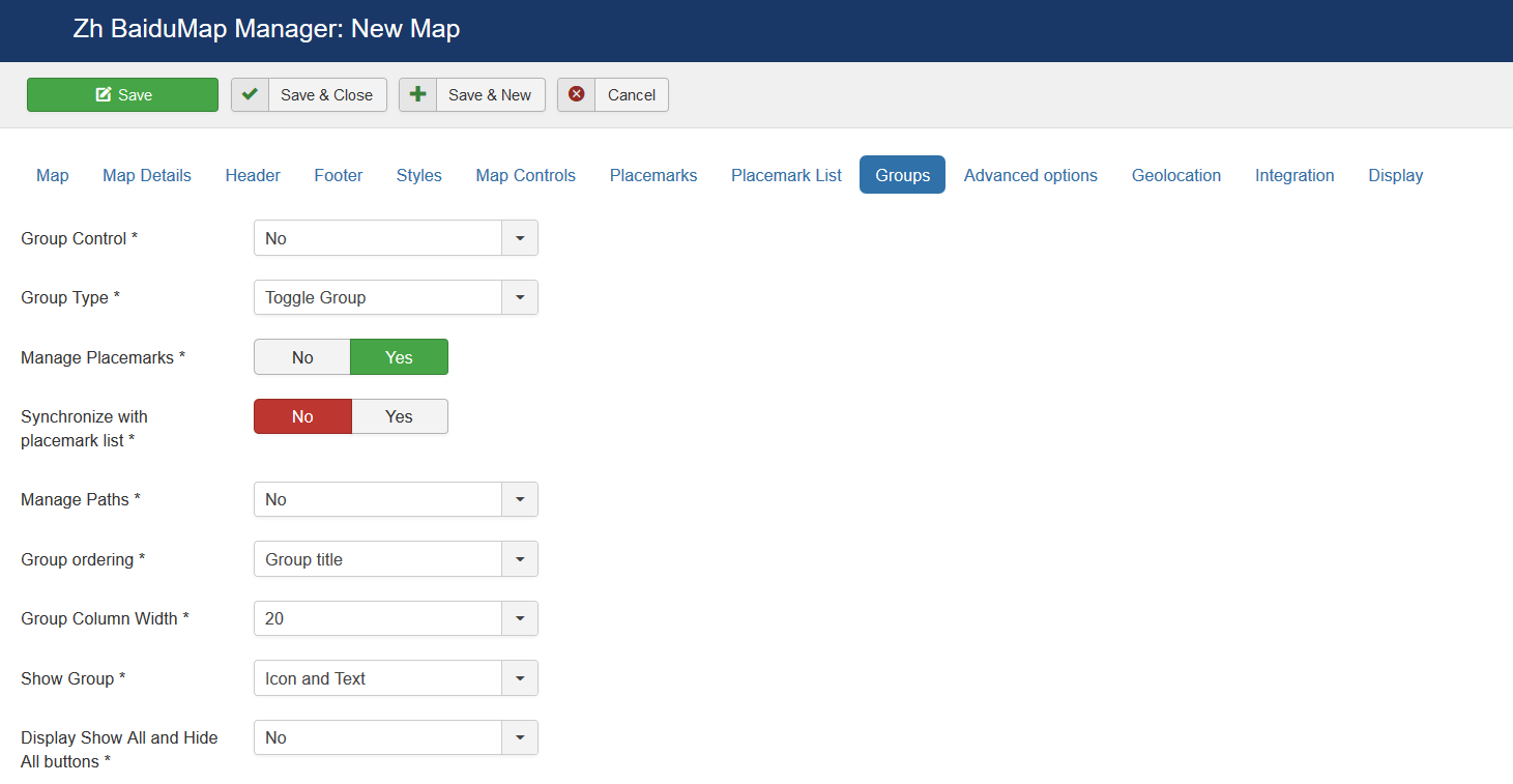
Groups
| Group Control | Position and type of list of group, that would be displayed for marker management
|
| Group Type | Behavior of group list
|
| Manage Placemarks | Enable ability to manage placemarks by Group List |
| Synchronize with placemark list | Show/Hide placemarks in placemark list depends on group state |
| Manage Paths | Enable ability to manage paths by Group List |
| Group ordering | Group order in list
|
| Group Column Width | Column width for the left or right position of list group |
| Show Group | Show text, icon of group in list of group
|
| Display Show All and Hide All buttons | Show buttons to show/hide all groups by one click
|
| Search group field | Display search field to find group in group list |
| Group CSS | Type of group decoration
There are two predefined style |
| Group List Title | Group List Title |
| Top Description | Description on top of the list |
| Show Top-Separator | The enabled/disabled state of Separator on top of the list |
| Show Bottom-Separator | The enabled/disabled state of Separator on botom of the list |
| Bottom Description | Description on bottom of the list |
Advanced Options
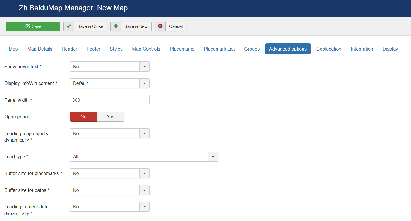
| Show hover text | Show hover text for placemarks |
| Display InfoWin Content | Display InfoWin Content
|
| Panel width | Panel width in pixels |
| Open Panel | Initial Panel state |
| Loading map objects dynamically | Enable feature to load placemarks by AJAX
|
| Load type | Type of loading placemarks, ie load it all, or depends on some conditions
|
| Buffer size for placemarks | You can load placemarks by parts |
| Buffer size for paths | You can load paths by parts |
| Loading content data dynamically | Enable feature to load placemark infowin content by AJAX
Ie your page can contains placemark creation code, but all infowin/infobubble content can be loaded dynamically. |
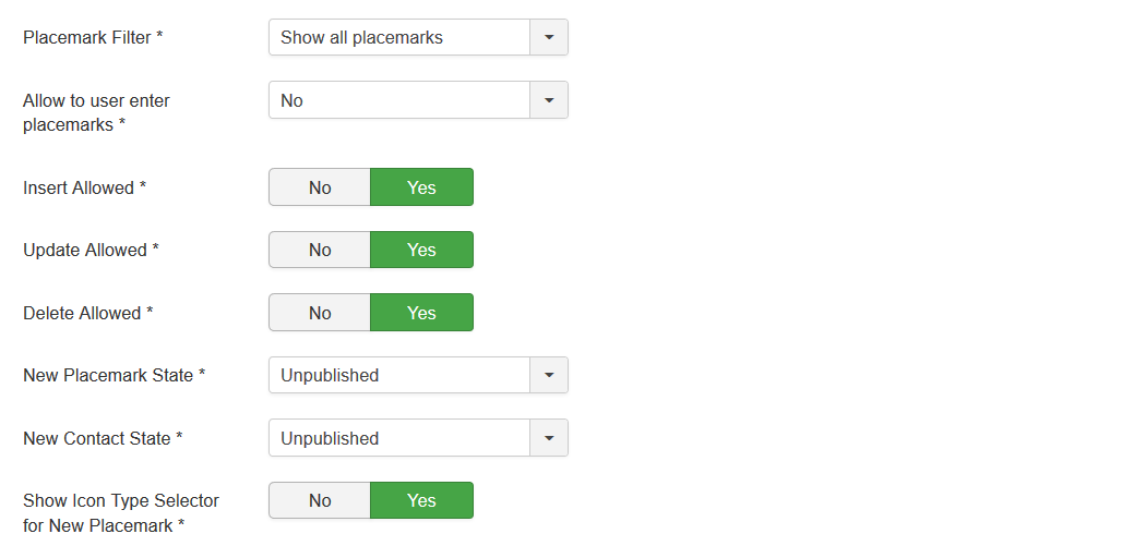
| Placemark Filter | Restriction displaying placemarks on some rules. |
| Allow to user enter placemarks | Enable registered users to create and/or alter placemarks on map. |
| Insert Allowed | User can create new placemarks |
| Update Allowed | User can update existing placemarks |
| Delete Allowed | User can delete existing placemarks |
| New Placemark State | Placemark Status for created user placemark. |
| New Contact State | Contact Status for created user contact (if enabled contact integration). |
| Show Icon Type Selector for New Placemark | The enabled/disabled state of selecting Icon Type when user creates placemark. |
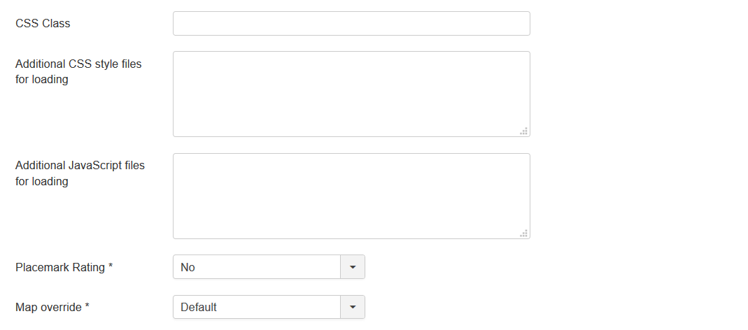
| CSS Class | The class name for map div tag |
| Additional CSS styles for loading | List of CSS style files for loading when map is loading, separated by new line or semicolon |
| Additional JavaScript files for loading | List of JavaScript files for loading when map is loading, separated by new line or semicolon |
| Placemark Rating | Enable Placemark rating feature.
|
| Map text override | You can use this feature to override Standard text for map controls etc by using special interface in component administration area or change some interface or map object properties |
Geolocation
| Auto Positioning | Auto Positioning when map is loading |
| Geolocation Control | Show Geolocation Control |
| Geolocation Button Style | Geolocation Button Style
|
Integration
| Use contacts | The enabled/disabled state of using contacts You can enable using contact information and associate your placemark with contact to display contact information in placemark InfoWin. |
| Contact Details | You can enter names of attributes to show. Separator is ; Acceptable values
You can enter it in any order, and by it the contact will be shown. Note: postcode and zipcode – it is the same field, but different labels will be. Check contact fields, and you'll see this pairs: City or Suburb, State or Province, Postal / ZIP Code
to show position, contact name and mobile phone |
| Use users | The enabled/disabled state of using users You can enable using user information and associate your placemark with user to display user information in placemark InfoWin. |
Display
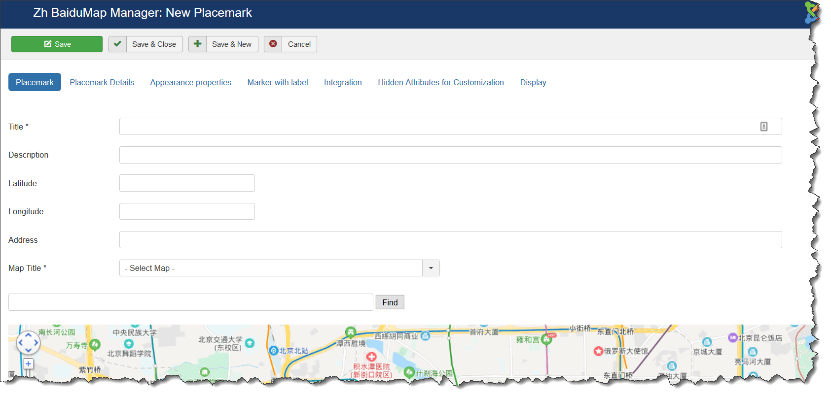
Creating Placemark
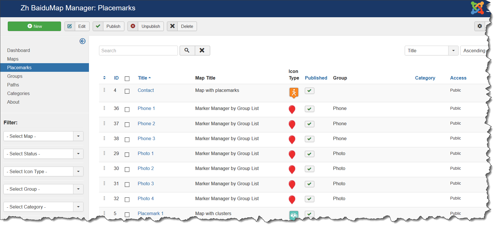
We turn to the menu "Placemarks".
Enter the number of markers bound to a specific map.
Coordinates it is convenient to choose by dragging the marker (the value is automatically substituted in the form fields ) or by clicking the mouse on the desired location.
Placemark properties
| Title | Placemark Title |
| Description | Description |
| Tags | Tags |
| Latitude | Latitude |
| Longitude | Longitude |
| Address | Text address of your placemark |
| Map Title | Title of the map, where marker would be displayed |
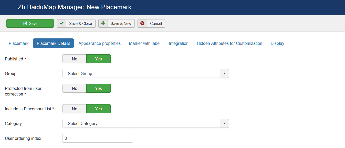
Placemark Details
| Published | Published |
| Group | Group |
| Protected from user correction | Protected placemark from user correction, when you activate creating users placemark |
| Include in Placemark List | Include placemark in Placemark List |
| Category | The category that this placemark is assigned to |
| User ordering index | Use this field to manual sorting placemarks in placemark list |
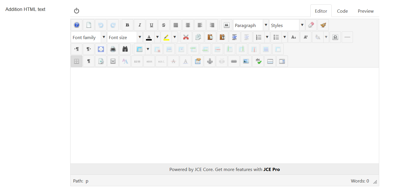
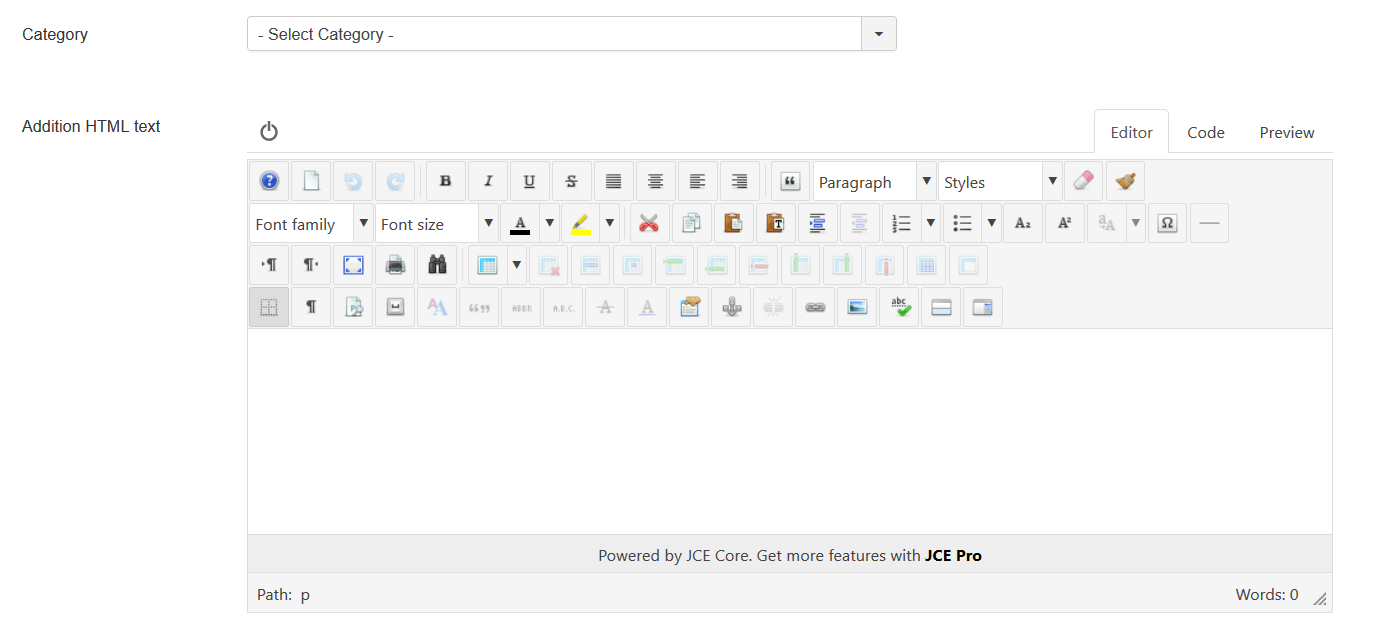
| Addition HTML text | HTML text, that will be included in placemark popup content Be careful, if you enter email address, the other Joomla! plugin it changed, and there will be an error and map will not be shown. |
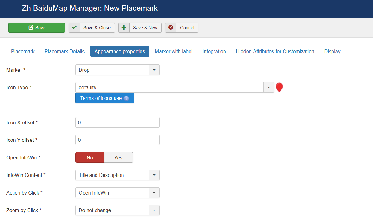
Appearance properties
| Marker | Marker Type
|
| Icon Type | Icon Type |
| Icon X-offset | Icon offset |
| Icon Y-offset | Icon offset |
| Open InfoWin | Execute action which described in Action by Click and Zoom by Click |
| InfoWin Content | Content of InfoWin
|
| Action by Click | Action by Click on this placemark
|
| Zoom by Click | Zoom by Click on this placemark You can change zoom when you click on marker
|
| URL Site | Site URL to display in placemark InfoWin content |
| Site Name | Site Name to display instead of URL |
| URL Image | Image URL to display in placemark |
| URL Image Thumbnail | Image URL to display in placemark list |
| Start Publishing | Placemark start publishing date |
| Finish Publishing | Placemark finish publishing date |
| Date of creation | Placemark creation date |
| Access | ACL access level to view this placemark |
Marker with Label
| Label X-offset | Label offset |
| Label Y-offset | Label offset |
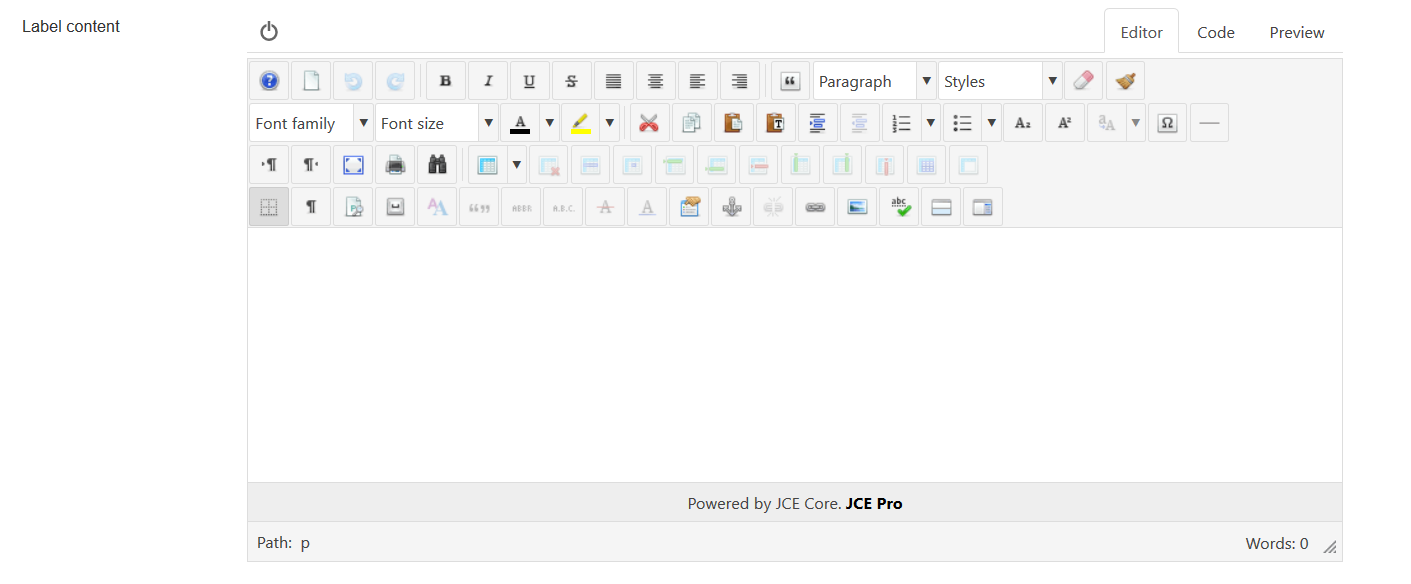
| Label content | HTML label content |
| Label Style | Label CSS style. Note: If the attribute name of css contains a hyphen, the hyphen should be removed and capitalized. For example, the background color property should be written as backgroundColor |
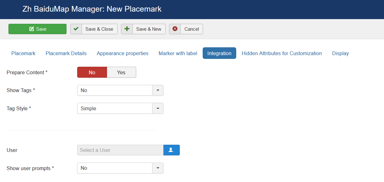
Integration
| Prepare Content | Run other plugins for InfoWin content |
| Show Tags | Show tags in InfoWin content
|
| Tag Style | User which associate with placemark
|
| User | User which associate with placemark |
| Show user prompts | Type of view user information
|
| Contact | Contact which associate with placemark |
| Show contact prompts | Type of view contact information
|
| Contact Button in InfoWin toolbar | Show Contact Button in InfoWin toolbar |
| Alternative Contact URL | You can alternative URL to show contact page (instead of standard joomla's call) |
| Placemark details Button in InfoWin toolbar | Show Placemark Button in InfoWin toolbar |
| Alternative Details URL | You can alternative URL to show details page (instead of standard call detail placemark view) |
| Article | Article which associate with placemark |
| Article Button in InfoWin toolbar | Show Article Button in InfoWin toolbar |
| Alternative Article URL | You can alternative URL to show article page (instead of standard joomla's call) |
| iframe tag Article CSS | You can apply CSS style for iframe tag (when use article in infowin content) |
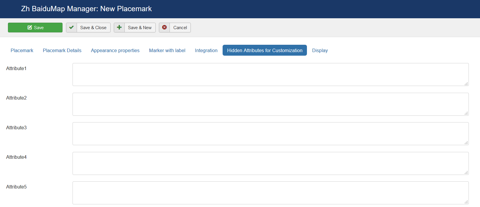
Hidden Attributes for Customization
For your convenience you can also change the labels of the fields by joomla overrides
COM_ZHBAIDUMAP_MAPMARKER_DETAIL_ATTRIBUTE1_LABEL

COM_ZHBAIDUMAP_MAPMARKER_DETAIL_ATTRIBUTE2_LABEL

…

COM_ZHBAIDUMAP_MAPMARKER_DETAIL_ATTRIBUTE9_LABEL
For example, you can enter some data into this fields.
In table columns have names
attribute1

attribute2
...

attribute9
You can use this fields, for example, for integration with other systems or etc.
Display
Placemark Customization
Copy your marker images (format PNG) in the directory
/administrator/components/com_zhbaidumap/assets/icons/
Component will automatically pick up the picture when choosing the type of marker.
The only requirement - the file name use English letters and can't contain any special character; the file extension have to be a .png ie in lower case, because names of images stored in a database without the extension, and it is appended in the output.
Don't forget about Compatibility Mode for Resource Files
Grouping
The marker may be included in one group, for this to specify a marker belonging to the group. If the field of markers grouping is set (field value Group Control is different from No), then starts an additional feature: a list of active groups (the location is determined by this same field, with the first four (left, top, right, bottom) correspond to the table form of representation, while the two latter (Group-Map, Map-Group) - based on the div, and you have the opportunity to do anything with them.
The map also has a drop-down list Group CSS - which implements the following functionality:
- the first two styles - predefined
- the third - you can override it in your CSS file template
- while in three cases, just have three different names of objects, respectively, we can change the styles they like.
The following names
for the div-tag ID takes the value
- BDMapsMenu-advanced
- BDMapsMenu-simple
- BDMapsMenu-external
for ul-tag
- zhbdm-menu-advanced
- zhbdm-menu-simple
- zhbdm-menu-external
Accordingly, styles, prescribes for them. Field Show Group Icon is used to display icons in the list of groups.
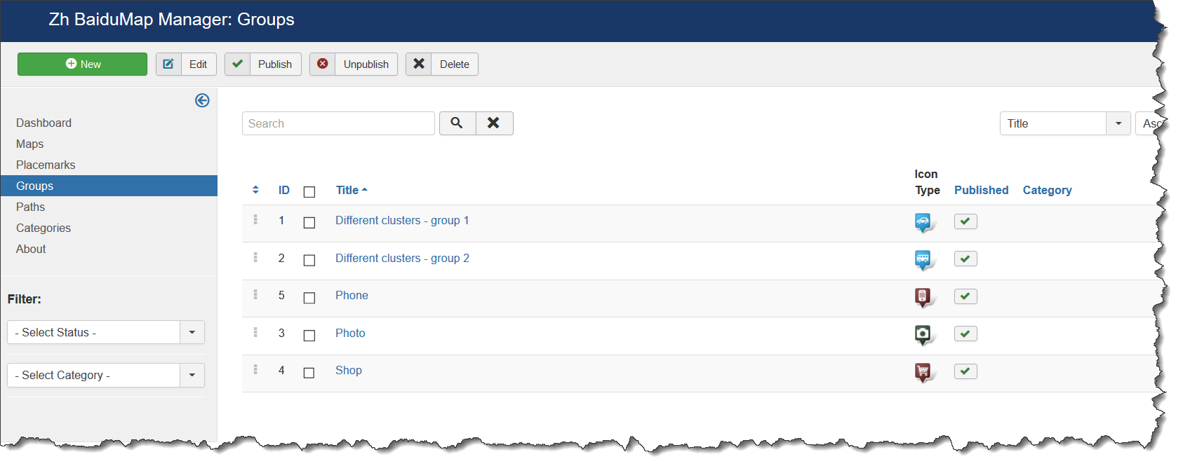
Creating Group
We turn to the menu "Groups".
Enter the number of groups.
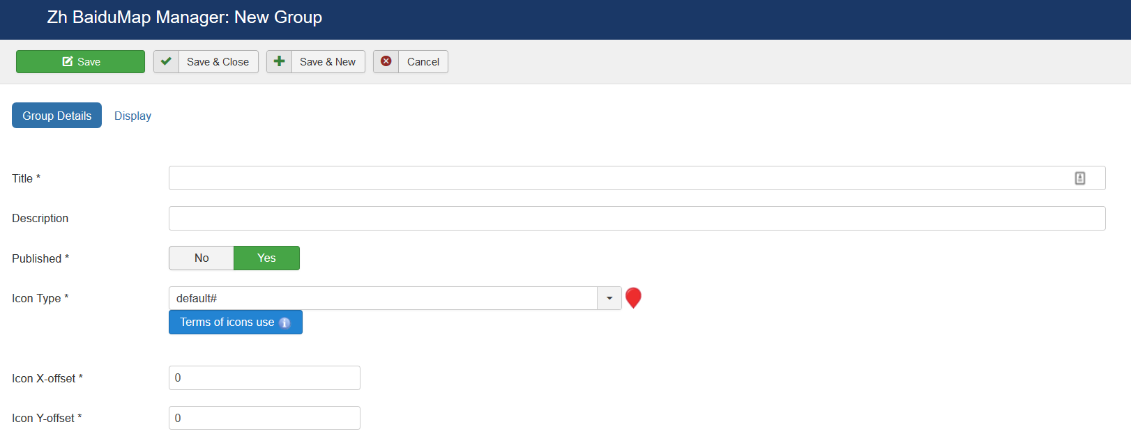
Group properties
| Title | Group Title |
| Description | Description |
| Published | Published |
| Icon Type | Icon Type |
| Icon X-offset | Icon offset |
| Icon Y-offset | Icon offset |
| Override Placemark Icon | Change icon of placemark to group icon |
| Override Cluster Icon | Change icon of cluster when you create cluster for each group |
| Active in Group List | Set Group state to active (show markers) when page displayed. This parameter uses in two cases: show markers in different clusters, or show markers and set active group in group list (when use marker managing by group list). It also can be used for managing paths by group list. |
| Category | The category that this group is assigned to |
| User ordering index | Use this field to manual sorting groups in group list |
Display
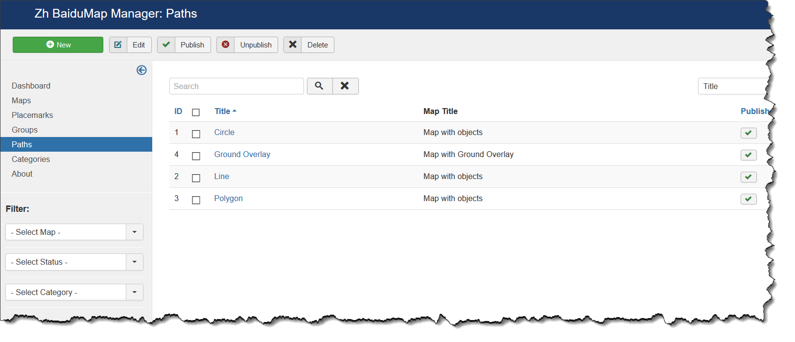
Creating Path
The path means polylines, polygons, circles or special map objects (layers).
We turn to the menu "Paths".
Enter the necessary number of paths with reference to a specific map.
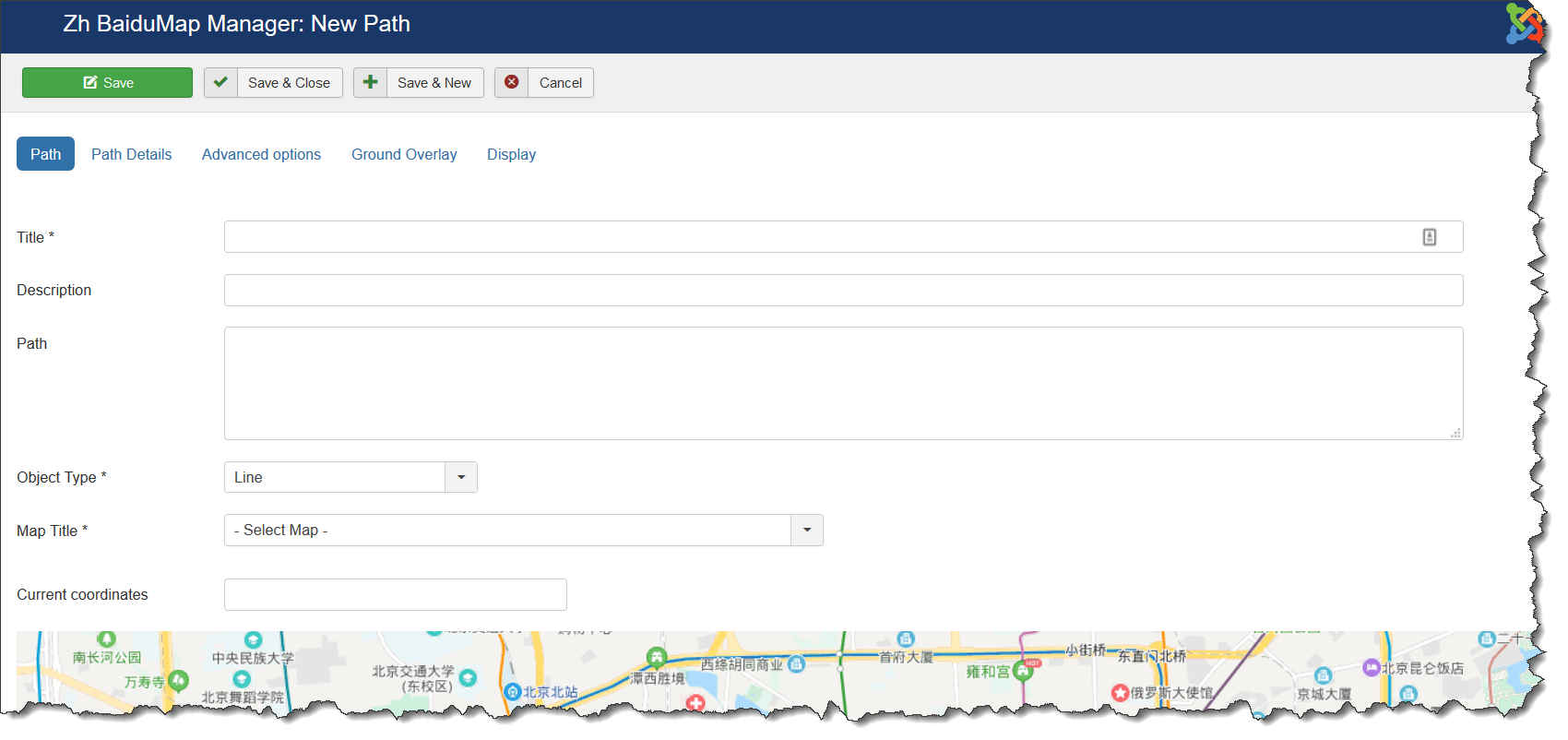
Field Path - a set of coordinates of points, the coordinates (Longitude, Latitude) are separated by comma (,), the points themselves - separated by a semicolon (;)
Coordinates it is convenient to choose by dragging the marker (values are substituted into the reference field in the form Current coordinates, from there you can copy and add a separator and value in the field Path), or clicking the mouse on the desired location.
Path properties
| Title | Path Title |
| Description | Description |
| Path | Path for example: 30.385787878185525,59.92335689062723;30.387547407299284,59.92374467628344 |
| Object Type | Map object type
|
| Map Title | Title of the map, where path would be displayed |
| Current coordinates | Current coordinates |
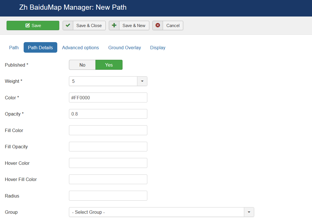
Path Details
| Published | Published |
| Weight | Line Weight |
| Color | Line Color for example: #FF0000 |
| Opacity | Opacity, number value between 0.0 and 1.0 |
| Fill Color | Fill Color (for rectangles, circles) for example: #FF0000 |
| Fill Opacity | Fill Opacity, number value between 0.0 and 1.0 |
| Hover Color | Hover Color for example: #FF0000 |
| Hover Fill Color | Hover Fill Color (for rectangles, circles) for example: #FF0000 |
| Radius | Circle radius in meters |
| Group | Group, it can be used for managing by Group List |
| Category | The category that this path is assigned to |
| Addition HTML text | HTML text, that will be included in path popup content Be careful, if you enter email address, the other Joomla! plugin it changed, and there will be an error and map will not be shown. |
| Hover HTML text | HTML text, that will be included in path hover popup content Be careful, if you enter email address, the other Joomla! plugin it changed, and there will be an error and map will not be shown. |
Advanced options
| InfoWin Content | InfoWin Content
|
| Action by Click | Action when you click on path
|
| URL Site | Site URL to display in path popup content |
| Site Name | Site Name to display instead of URL |
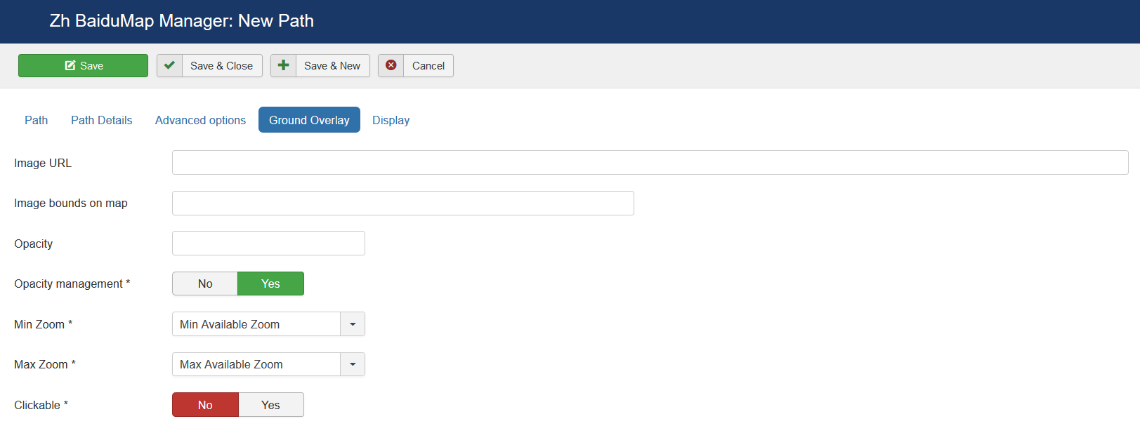
Ground Overlay
| Image URL | URL for ground overlay image |
| Image bounds on map | Longitude1,Latitude1;Longitude2,Latitude2 |
| Opacity | Value between 0 and 1 |
| Opacity management | Change opacity by Opacity Control |
| Min Zoom | Min Zoom |
| Max Zoom | Max Zoom |
| Clickable | Enable/disable click on layer |
Display
Creating Category
You can go to the menu "Categories" and add categories to the component.
Then you can walk on the map objects and tag them by category.
On the basis of categories can be further in any way extend the functionality of the component
Displaying the Map
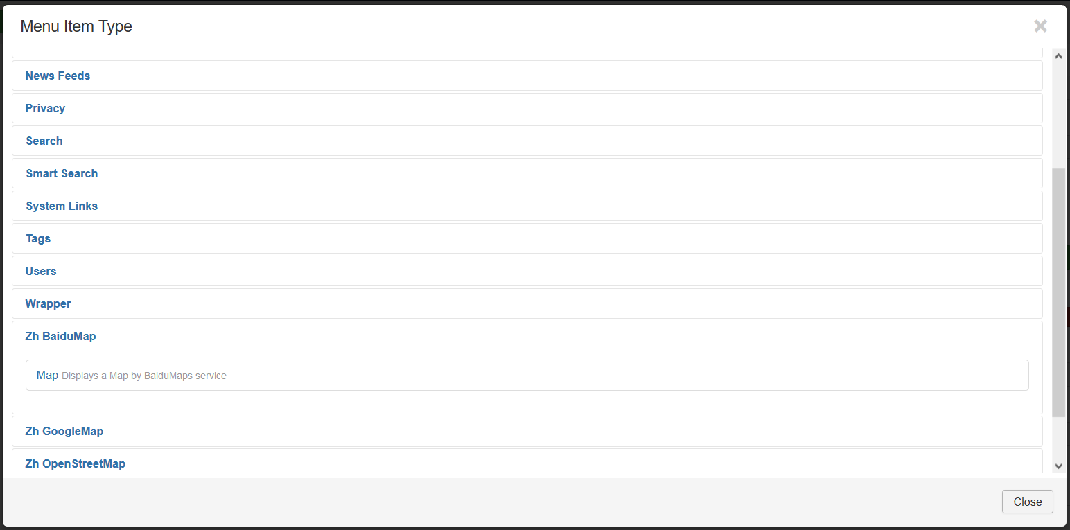
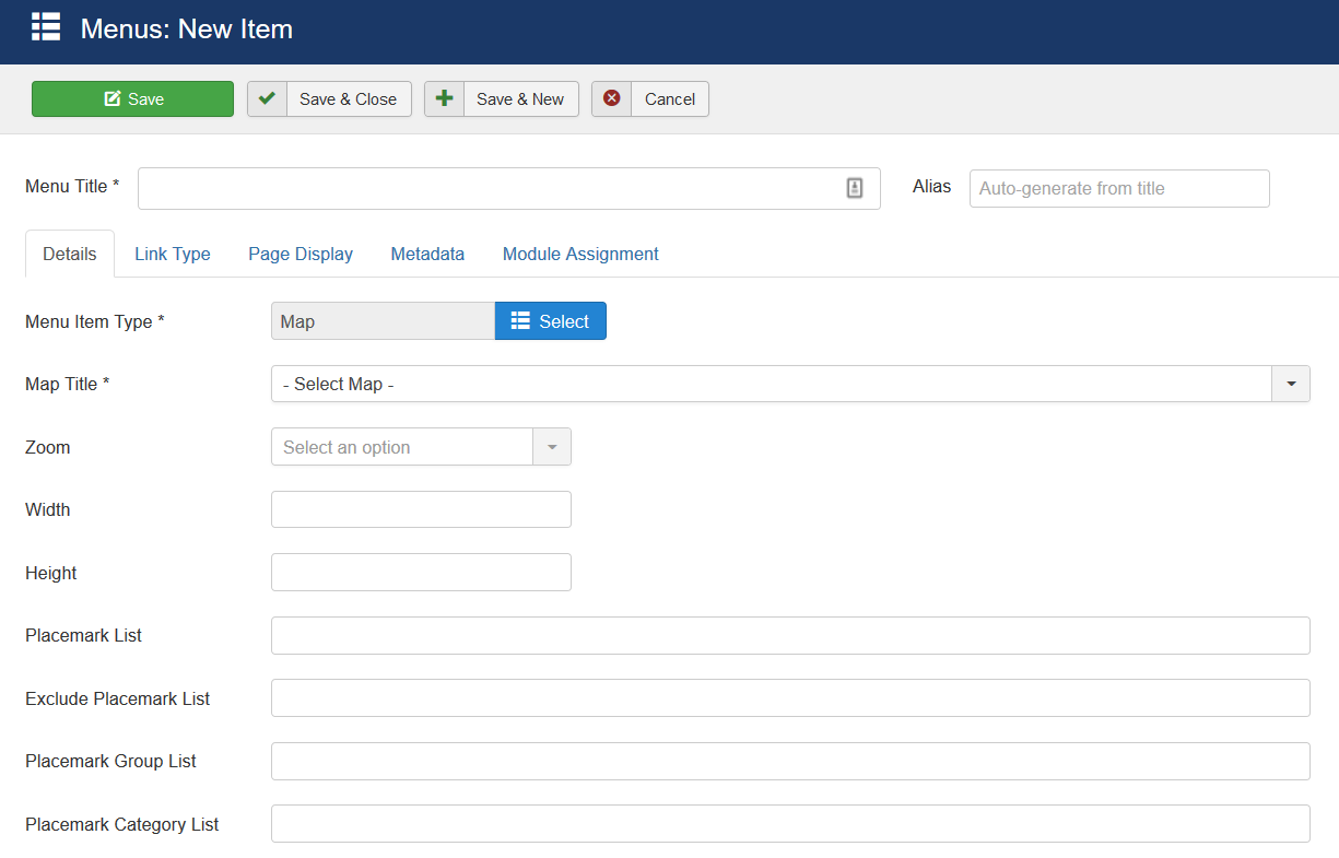
There is one menu item type.
The menu item type is Map.
It can show preconfigured map. You can override some map properties.
Create a menu item and select the type of Zh BaiduMap - Map.
Select the appropriate map.
If you do not change any other fields - you'll get the map as you defined it.
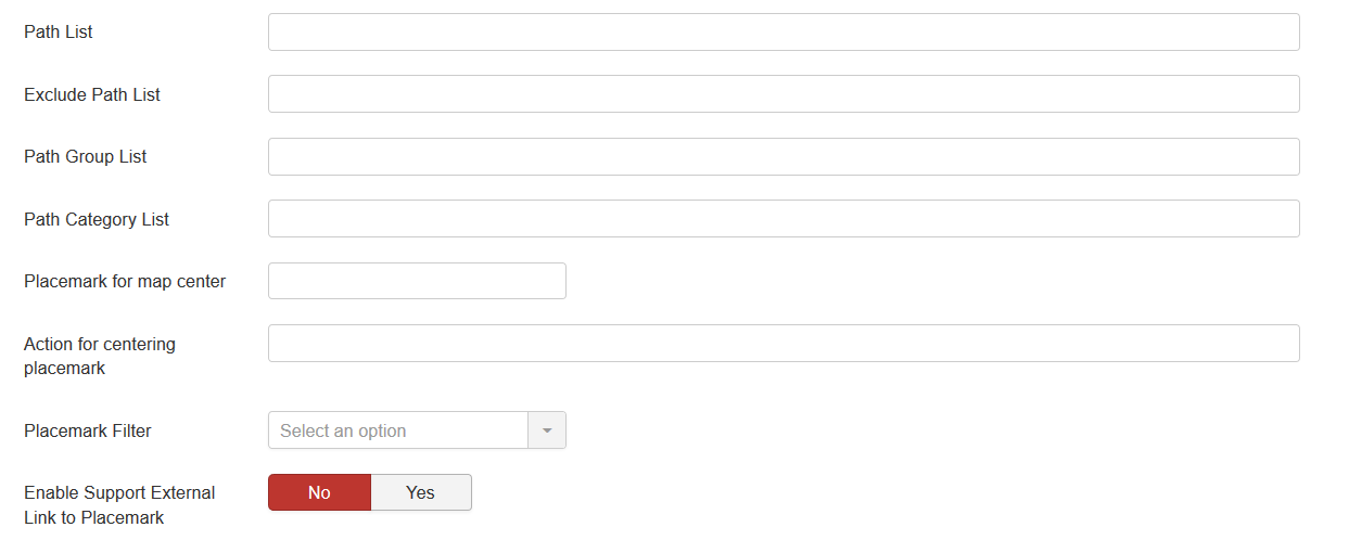
For lists you have to enter IDs by semicolon as separator
| Map Title | Map to display |
| Zoom | Map zoom |
| Width | Map Width |
| Height | Map Height |
| Placemark List | IDs of placemarks to show on map (for example, if it from different maps). |
| Exclude Placemark List | IDs of placemarks to not display on map |
| Placemark Group List | Group IDs for placemarks to show |
| Placemark Category List | Category IDs for placemarks to show |
| Path List | IDs of paths to show on map |
| Exclude Path List | IDs of paths to not display on map |
| Path Group List | Group IDs for paths to show |
| Path Category List | Category IDs for paths to show |
| Placemark for map center | Placemark ID for override map center |
| Action for centering placemark | Actions for centering placemark |
| Placemark Filter | Placemark Filter |
| Enable Support External Link to Placemark | Enable feature to create your own placemark list feature. See also in tutorials |
See also
| Language: | English • русский |
|---|
