Template:Zh OpenStreetMap Description Placemark: Difference between revisions
(Created page with "== Creating Placemark ==") |
|||
| (15 intermediate revisions by the same user not shown) | |||
| Line 1: | Line 1: | ||
== Creating Placemark == | == Creating Placemark == | ||
We turn to the menu "Placemarks". | |||
[[File:OSM-Placemark-List.png]] | |||
Enter the number of markers bound to a specific map. | |||
Coordinates it is convenient to choose by dragging the marker (the value is automatically substituted in the form fields ) or by clicking the mouse on the desired location. | |||
=== Placemark properties === | |||
[[File:OSM-Placemark-Detail-Placemark.png]] | |||
{|class="zhpropertytable" | |||
|- | |||
|class="zhproperty"|Title||class="zhdescription"|Placemark Title | |||
|- | |||
|class="zhproperty"|Description||class="zhdescription"|Description | |||
|- | |||
|class="zhproperty"|Tags||class="zhdescription"|Tags | |||
|- | |||
|class="zhproperty"|Latitude||class="zhdescription"|Latitude | |||
|- | |||
|class="zhproperty"|Longitude||class="zhdescription"|Longitude | |||
|- | |||
|class="zhproperty"|Address||class="zhdescription"|Text address of your placemark | |||
|- | |||
|class="zhproperty"|Map Title||class="zhdescription"|Title of the map, where marker would be displayed | |||
|} | |||
=== Placemark Details === | |||
[[File:OSM-Placemark-Detail-PlacemarkDetails-1.png]] | |||
[[File:OSM-Placemark-Detail-PlacemarkDetails-2.png]] | |||
[[File:OSM-Placemark-Detail-PlacemarkDetails-3.png]] | |||
[[File:OSM-Placemark-Detail-PlacemarkDetails-4.png]] | |||
{|class="zhpropertytable" | |||
|- | |||
|class="zhproperty"|Published||class="zhdescription"|Published | |||
|- | |||
|class="zhproperty"|Group||class="zhdescription"|Group | |||
|- | |||
|class="zhproperty"|Protected from user correction||class="zhdescription"|Protected placemark from user correction, when you activate creating users placemark | |||
|- | |||
|class="zhproperty"|Include in Placemark List||class="zhdescription"|Include placemark in Placemark List | |||
|- | |||
|class="zhproperty"|Category||class="zhdescription"|The category that this placemark is assigned to | |||
|- | |||
|class="zhproperty"|User ordering index||class="zhdescription"|Use this field to manual sorting placemarks in placemark list | |||
|- | |||
|class="zhproperty"|Rating||class="zhdescription"|Rating of placemark, it can be set only by rating system | |||
|- | |||
|class="zhproperty"|Show GPS information||class="zhdescription"|Show GPS information (coordinates) in popup | |||
|- | |||
|class="zhproperty"|Addition HTML text||class="zhdescription"|HTML text, that will be included in placemark popup content<br /> | |||
<p class="zh-text-alert-fill">Be careful, if you enter email address, the other Joomla! plugin it changed, and there will be an error and map will not be shown. | |||
</p> | |||
|- | |||
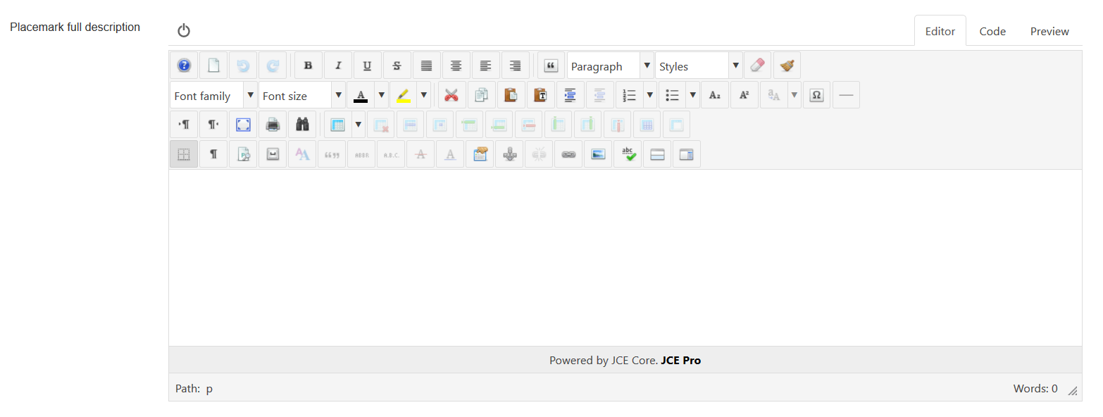
|class="zhproperty"|Placemark full description||class="zhdescription"|Placemark description (HTML text) in placemark detail view (single placemark page view) | |||
|- | |||
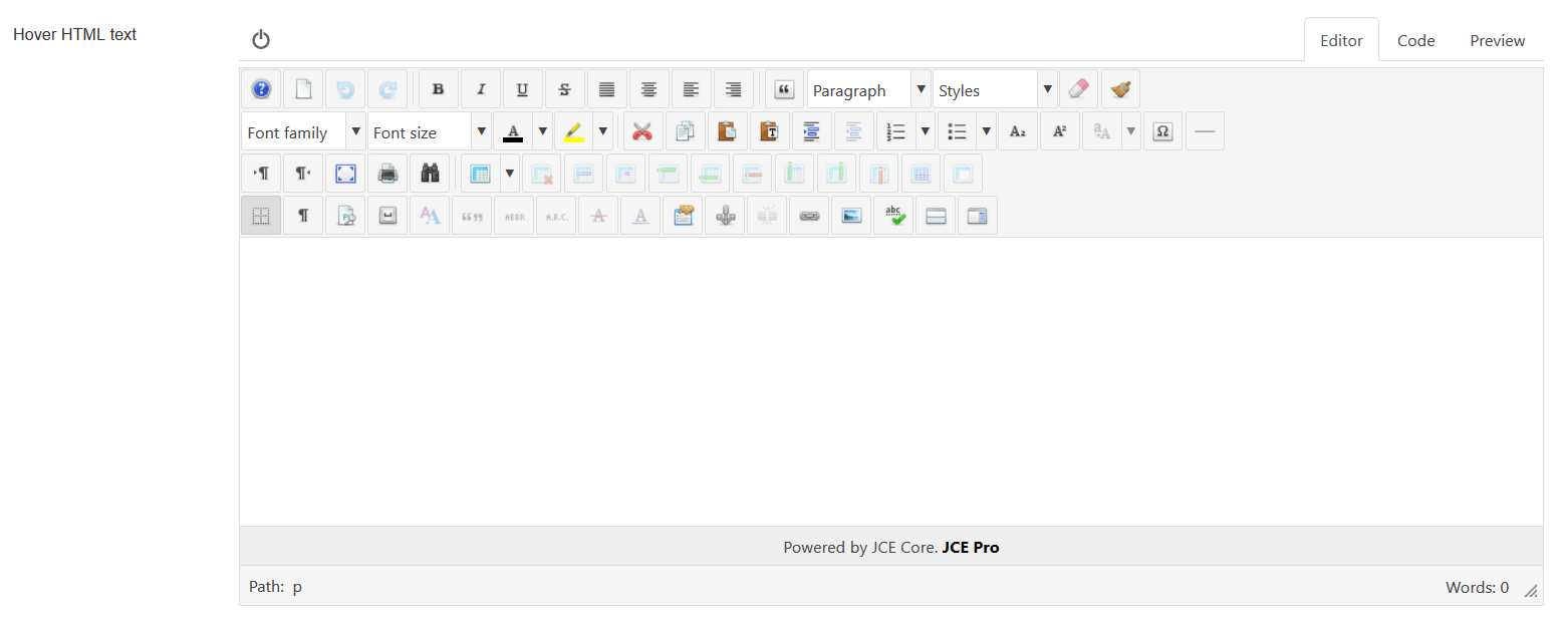
|class="zhproperty"|Hover HTML text||class="zhdescription"|Hover HTML text for placemark when enabled hovering feature | |||
|} | |||
=== Appearance properties === | |||
[[File:OSM-Placemark-Detail-AppearanceProperties-1.png]] | |||
[[File:OSM-Placemark-Detail-AppearanceProperties-2.png]] | |||
{|class="zhpropertytable" | |||
|- | |||
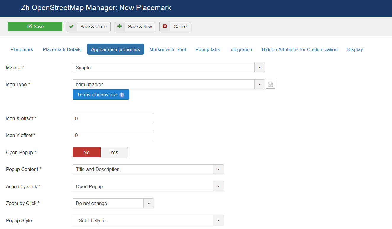
|class="zhproperty"|Marker||class="zhdescription"|Marker Type<br /> | |||
* '''No''' - Do not show marker | |||
* '''Simple''' - Marker without animation | |||
* '''Simple: Bounce''' - Marker with animation (Bounce) | |||
* '''Simple: Elastic Bounce''' - Marker with animation (Elastic Bounce) | |||
* '''Icon File: Simple''' - Marker without animation | |||
* '''Icon File: Bounce''' - Marker with animation (Bounce) | |||
* '''Icon File: Elastic Bounce''' - Marker with animation (Elastic Bounce) | |||
* '''Marker with label: Simple''' - Marker without animation and label | |||
* '''Marker with label: Bounce''' - Marker with animation (Bounce) and label | |||
* '''Marker with label: Elastic Bounce''' - Marker with animation (Elastic Bounce) and label | |||
|- | |||
|class="zhproperty"|Icon Type||class="zhdescription"|Icon Type | |||
|- | |||
|class="zhproperty"|Icon X-offset||class="zhdescription"|Icon offset | |||
|- | |||
|class="zhproperty"|Icon Y-offset||class="zhdescription"|Icon offset | |||
|- | |||
|class="zhproperty"|Open Popup||class="zhdescription"|Execute action which described in '''Action by Click''' and '''Zoom by Click''' | |||
|- | |||
|class="zhproperty"|Popup Content||class="zhdescription"|Content of Popup<br /> | |||
* '''Title and Description''' | |||
* '''Title''' | |||
* '''Description''' | |||
* '''Title and Article (by iframe)''' | |||
* '''Article (by iframe)''' | |||
* '''None''' | |||
|- | |||
|class="zhproperty"|Action by Click||class="zhdescription"|Action by Click on this placemark<br /> | |||
* '''Open Popup''' | |||
* '''Open Link in the same page''' - link, that entered in URL Site field | |||
* '''Open Link in new page''' | |||
* '''Open Popup with Tabs''' | |||
* '''Open Contact in the same page''' | |||
* '''Open Contact in new page''' | |||
* '''Open Article in the same page''' | |||
* '''Open Article in new page''' | |||
* '''Open Details in the same page''' | |||
* '''Open Details in new page''' | |||
* '''None''' | |||
|- | |||
|class="zhproperty"|Zoom by Click ||class="zhdescription"|Zoom by Click on this placemark<br /> | |||
You can change zoom when you click on marker<br /> | |||
* '''Do not change''' - zoom is not changed | |||
|- | |||
|class="zhproperty"|Popup Style||class="zhdescription"|Popup style | |||
|- | |||
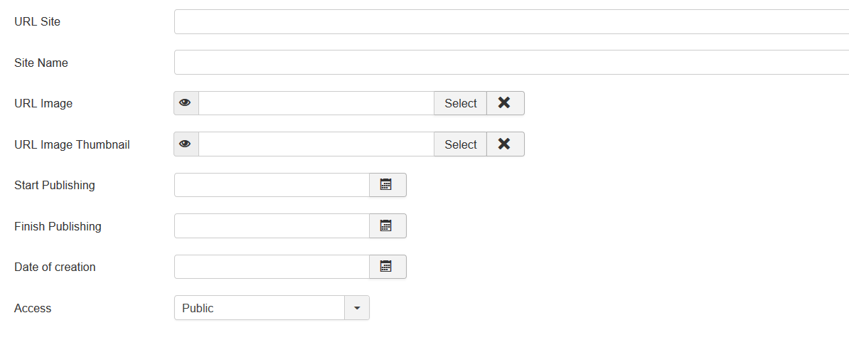
|class="zhproperty"|URL Site||class="zhdescription"|Site URL to display in placemark popup | |||
|- | |||
|class="zhproperty"|Site Name||class="zhdescription"|Site Name to display instead of URL | |||
|- | |||
|class="zhproperty"|URL Image||class="zhdescription"|Image URL to display in placemark | |||
|- | |||
|class="zhproperty"|URL Image Thumbnail||class="zhdescription"|Image URL to display in placemark list | |||
|- | |||
|class="zhproperty"|Start Publishing||class="zhdescription"|Placemark start publishing date | |||
|- | |||
|class="zhproperty"|Finish Publishing||class="zhdescription"|Placemark finish publishing date | |||
|- | |||
|class="zhproperty"|Date of creation||class="zhdescription"|Placemark creation date | |||
|- | |||
|class="zhproperty"|Access||class="zhdescription"|ACL access level to view this placemark | |||
|} | |||
=== Marker with Label === | |||
[[File:OSM-Placemark-Detail-MarkerWithLabel-1.png]] | |||
[[File:OSM-Placemark-Detail-MarkerWithLabel-2.png]] | |||
{|class="zhpropertytable" | |||
|- | |||
|class="zhproperty"|Label Class||class="zhdescription"|Label CSS Class | |||
|- | |||
|class="zhproperty"|Label X-offset||class="zhdescription"|Label offset | |||
|- | |||
|class="zhproperty"|Label Y-offset||class="zhdescription"|Label offset | |||
|- | |||
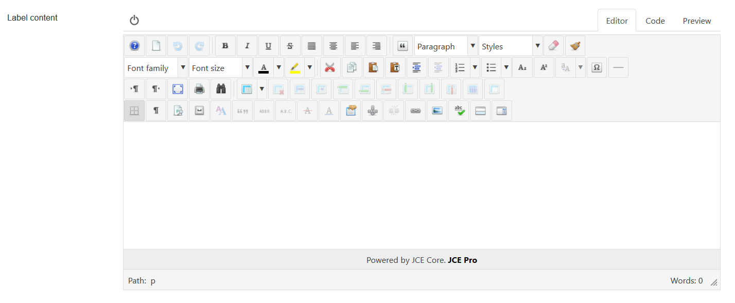
|class="zhproperty"|Label content||class="zhdescription"|HTML label content | |||
|} | |||
=== Popup Tabs === | |||
[[File:OSM-Placemark-Detail-PopupTabs-1.png]] | |||
[[File:OSM-Placemark-Detail-PopupTabs-2.png]] | |||
[[File:OSM-Placemark-Detail-PopupTabs-0.png]] | |||
{|class="zhpropertytable" | |||
|- | |||
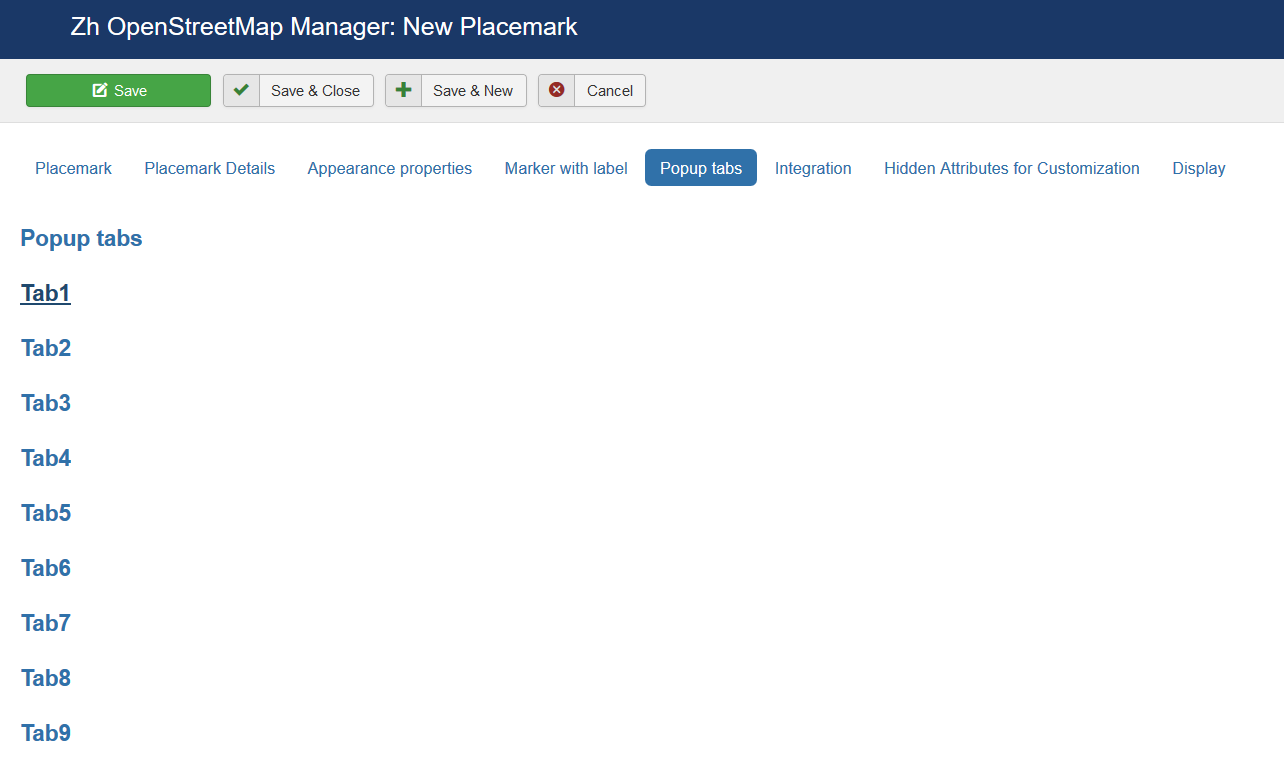
|class="zhproperty"|Add Popup content||class="zhdescription"|Add Popup content into popup | |||
* '''No''' | |||
* '''as first tab''' - add popup content before all visible tabs | |||
* '''as last tab''' - add popup content after all visible tabs | |||
* '''replace content''' - add popup content as infobubble content, without any tab | |||
|} | |||
[[File:OSM-Placemark-Detail-PopupTabs-3.png]] | |||
{|class="zhpropertytable" | |||
|- | |||
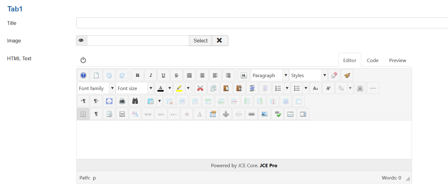
|class="zhproperty"|Title||class="zhdescription"|Tab Title | |||
|- | |||
|class="zhproperty"|Image||class="zhdescription"|You can use image to build image gallery in single placemark view | |||
|- | |||
|class="zhproperty"|HTML Text||class="zhdescription"|Tab text | |||
|} | |||
=== Integration === | |||
[[File:OSM-Placemark-Detail-Integration-1.png]] | |||
[[File:OSM-Placemark-Detail-Integration-2.png]] | |||
[[File:OSM-Placemark-Detail-Integration-3.png]] | |||
{|class="zhpropertytable" | |||
|- | |||
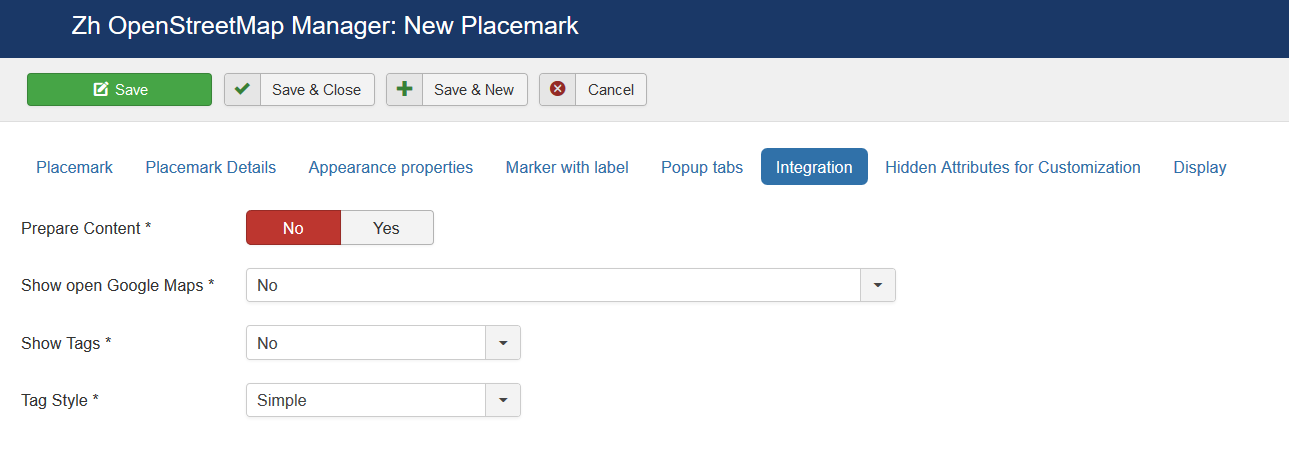
|class="zhproperty"|Prepare Content||class="zhdescription"|Run other plugins for popup content | |||
|- | |||
|class="zhproperty"|Show open Google Maps||class="zhdescription"|Show link or toolbar button, which opens Google Maps | |||
* '''No''' | |||
* '''Button (show direction), open link in new page''' | |||
* '''Button (show direction), open link in the same page''' | |||
* '''Link (show direction), open link in new page''' | |||
* '''Link (show direction), open link in the same page''' | |||
* '''Button (show marker for title), open link in new page''' | |||
* '''Button (show marker for title), open link in the same page''' | |||
* '''Link (show marker for title), open link in new page''' | |||
* '''Link (show marker for title), open link in the same page''' | |||
* '''Button (show marker for coordinates), open link in new page''' | |||
* '''Button (show marker for coordinates), open link in the same page''' | |||
* '''Link (show marker for coordinates), open link in new page''' | |||
* '''Link (show marker for coordinates), open link in the same page''' | |||
|- | |||
|class="zhproperty"|Show Tags||class="zhdescription"|Show tags in popup content | |||
* '''No''' | |||
* '''Placemark''' | |||
* '''Contact''' | |||
|- | |||
|class="zhproperty"|Tag Style||class="zhdescription"|User which associate with placemark | |||
* '''Simple''' | |||
* '''Advanced''' | |||
* '''External''' | |||
|- | |||
|class="zhproperty"|User||class="zhdescription"|User which associate with placemark | |||
|- | |||
|class="zhproperty"|Show user prompts||class="zhdescription"|Type of view user information<br /> | |||
* '''No''' | |||
* '''Text''' | |||
* '''Icon''' | |||
* '''No prompts''' | |||
|- | |||
|class="zhproperty"|Contact||class="zhdescription"|Contact which associate with placemark | |||
|- | |||
|class="zhproperty"|Show contact prompts||class="zhdescription"|Type of view contact information<br /> | |||
* '''No''' | |||
* '''Text''' | |||
* '''Icon''' | |||
* '''No prompts''' | |||
|- | |||
|class="zhproperty"|Contact Button in Popup toolbar||class="zhdescription"|Show Contact Button in Popup toolbar | |||
|- | |||
|class="zhproperty"|Alternative Contact URL||class="zhdescription"|You can alternative URL to show contact page (instead of standard joomla's call) | |||
|- | |||
|class="zhproperty"|Placemark details Button in Popup toolbar||class="zhdescription"|Show Placemark Button in Popup toolbar | |||
|- | |||
|class="zhproperty"|Alternative Details URL||class="zhdescription"|You can alternative URL to show details page (instead of standard call detail placemark view) | |||
|- | |||
|class="zhproperty"|Placemark Details for standard call||class="zhdescription"|You can override default details attributes for detail view | |||
By default placemark detail page is opened without enabling additional loading bootstrap library and styles, without thumbnail and image gallery, without Additional HTML text and full text description. | |||
You can change default behavior by passing parameters, separated by comma (,) | |||
* '''load bootstrap''' | |||
* '''load bootstrap styles''' | |||
* '''thumbnail''' | |||
* '''image gallery''' | |||
* '''addition html text''' | |||
* '''full description''' | |||
For example, if you enter '''image gallery,addition html text,full description''' into field, the detail view for placemark will be with two additional description (short "Addition HTML text" and full "Placemark full description"), and image gallery will be displayed too | |||
|- | |||
|class="zhproperty"|Article||class="zhdescription"|Article which associate with placemark | |||
|- | |||
|class="zhproperty"|Article Button in Popup toolbar||class="zhdescription"|Show Article Button in Popup toolbar | |||
|- | |||
|class="zhproperty"|Alternative Article URL||class="zhdescription"|You can alternative URL to show article page (instead of standard joomla's call) | |||
|- | |||
|class="zhproperty"|iframe tag Article CSS||class="zhdescription"|You can apply CSS style for iframe tag (when use article in popup content) | |||
|} | |||
=== Hidden Attributes for Customization === | |||
[[File:OSM-Placemark-Detail-HiddenAttributes-1.png]] | |||
[[File:OSM-Placemark-Detail-HiddenAttributes-2.png]] | |||
For your convenience you can also change the labels of the fields by joomla overrides | |||
<pre> | |||
COM_ZHOSMMAP_MAPMARKER_DETAIL_ATTRIBUTE1_LABEL | |||
COM_ZHOSMMAP_MAPMARKER_DETAIL_ATTRIBUTE2_LABEL | |||
… | |||
COM_ZHOSMMAP_MAPMARKER_DETAIL_ATTRIBUTE9_LABEL | |||
</pre> | |||
For example, you can enter some data into this fields. | |||
In table columns have names | |||
<pre> | |||
attribute1 | |||
attribute2 | |||
... | |||
attribute9 | |||
</pre> | |||
You can use this fields, for example, for integration with other systems or etc. | |||
=== Display === | |||
[[File:OSM-Placemark-Detail-Display.png]] | |||
=== Placemark Customization === | |||
Copy your marker images (format PNG) in the directory | |||
<pre> | |||
/administrator/components/com_zhosmmap/assets/icons/ | |||
</pre> | |||
Component will automatically pick up the picture when choosing the type of marker. | |||
The only requirement - the file name use English letters and can't contain any special character; the file extension have to be a .png ie in lower case, because names of images stored in a database without the extension, and it is appended in the output. | |||
Don't forget about [[Zh_OpenStreetMap_Description#CompatibilityModeRSFAnchor|Compatibility Mode for Resource Files]] | |||
=== Grouping === | |||
The marker may be included in one group, for this to specify a marker belonging to the group. If the field of markers grouping is set (field value Group Control is different from No), then starts an additional feature: a list of active groups (the location is determined by this same field, with the first four (left, top, right, bottom) correspond to the table form of representation, while the two latter (Group-Map, Map-Group) - based on the div, and you have the opportunity to do anything with them. | |||
The map also has a drop-down list Group CSS - which implements the following functionality: | |||
* the first two styles - predefined | |||
* the third - you can override it in your CSS file template | |||
* while in three cases, just have three different names of objects, respectively, we can change the styles they like. | |||
The following names | |||
for the div-tag ID takes the value | |||
* OMapsMenu-advanced | |||
* OMapsMenu-simple | |||
* OMapsMenu-external | |||
for ul-tag | |||
* zhom-menu-advanced | |||
* zhom-menu-simple | |||
* zhom-menu-external | |||
Accordingly, styles, prescribes for them. Field Show Group Icon is used to display icons in the list of groups. | |||
Latest revision as of 08:22, 15 April 2020
Creating Placemark
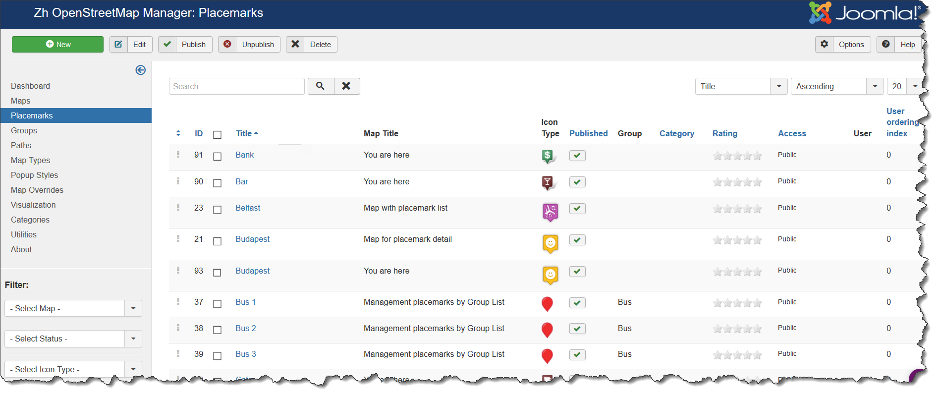
We turn to the menu "Placemarks".
Enter the number of markers bound to a specific map.
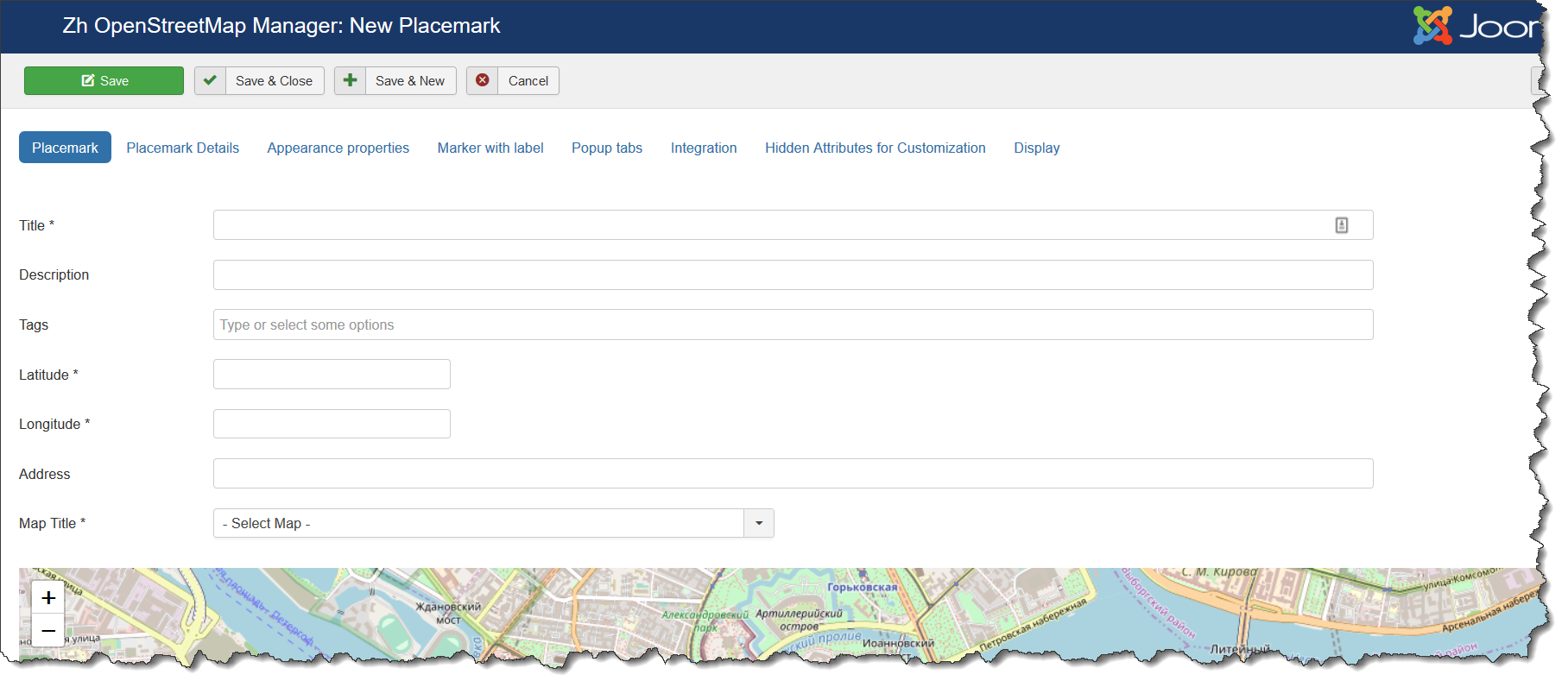
Coordinates it is convenient to choose by dragging the marker (the value is automatically substituted in the form fields ) or by clicking the mouse on the desired location.
Placemark properties
| Title | Placemark Title |
| Description | Description |
| Tags | Tags |
| Latitude | Latitude |
| Longitude | Longitude |
| Address | Text address of your placemark |
| Map Title | Title of the map, where marker would be displayed |
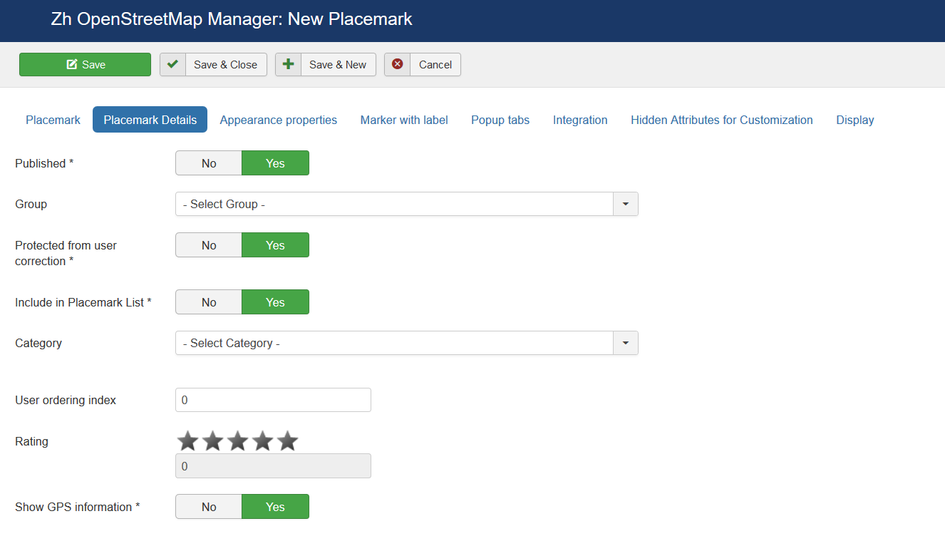
Placemark Details
| Published | Published |
| Group | Group |
| Protected from user correction | Protected placemark from user correction, when you activate creating users placemark |
| Include in Placemark List | Include placemark in Placemark List |
| Category | The category that this placemark is assigned to |
| User ordering index | Use this field to manual sorting placemarks in placemark list |
| Rating | Rating of placemark, it can be set only by rating system |
| Show GPS information | Show GPS information (coordinates) in popup |
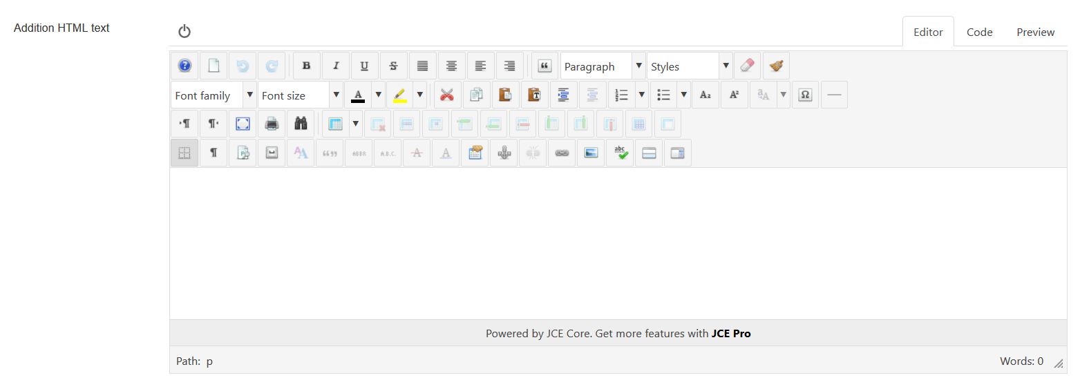
| Addition HTML text | HTML text, that will be included in placemark popup content Be careful, if you enter email address, the other Joomla! plugin it changed, and there will be an error and map will not be shown. |
| Placemark full description | Placemark description (HTML text) in placemark detail view (single placemark page view) |
| Hover HTML text | Hover HTML text for placemark when enabled hovering feature |
Appearance properties
| Marker | Marker Type
|
| Icon Type | Icon Type |
| Icon X-offset | Icon offset |
| Icon Y-offset | Icon offset |
| Open Popup | Execute action which described in Action by Click and Zoom by Click |
| Popup Content | Content of Popup
|
| Action by Click | Action by Click on this placemark
|
| Zoom by Click | Zoom by Click on this placemark You can change zoom when you click on marker
|
| Popup Style | Popup style |
| URL Site | Site URL to display in placemark popup |
| Site Name | Site Name to display instead of URL |
| URL Image | Image URL to display in placemark |
| URL Image Thumbnail | Image URL to display in placemark list |
| Start Publishing | Placemark start publishing date |
| Finish Publishing | Placemark finish publishing date |
| Date of creation | Placemark creation date |
| Access | ACL access level to view this placemark |
Marker with Label
| Label Class | Label CSS Class |
| Label X-offset | Label offset |
| Label Y-offset | Label offset |
| Label content | HTML label content |
Popup Tabs
| Add Popup content | Add Popup content into popup
|
| Title | Tab Title |
| Image | You can use image to build image gallery in single placemark view |
| HTML Text | Tab text |
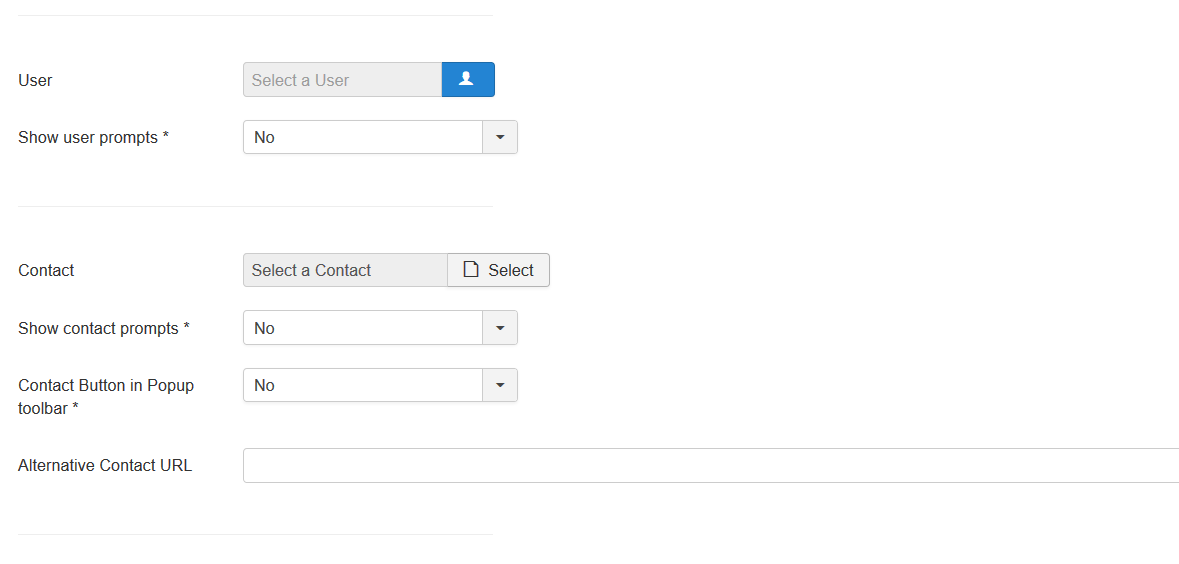
Integration
| Prepare Content | Run other plugins for popup content |
| Show open Google Maps | Show link or toolbar button, which opens Google Maps
|
| Show Tags | Show tags in popup content
|
| Tag Style | User which associate with placemark
|
| User | User which associate with placemark |
| Show user prompts | Type of view user information
|
| Contact | Contact which associate with placemark |
| Show contact prompts | Type of view contact information
|
| Contact Button in Popup toolbar | Show Contact Button in Popup toolbar |
| Alternative Contact URL | You can alternative URL to show contact page (instead of standard joomla's call) |
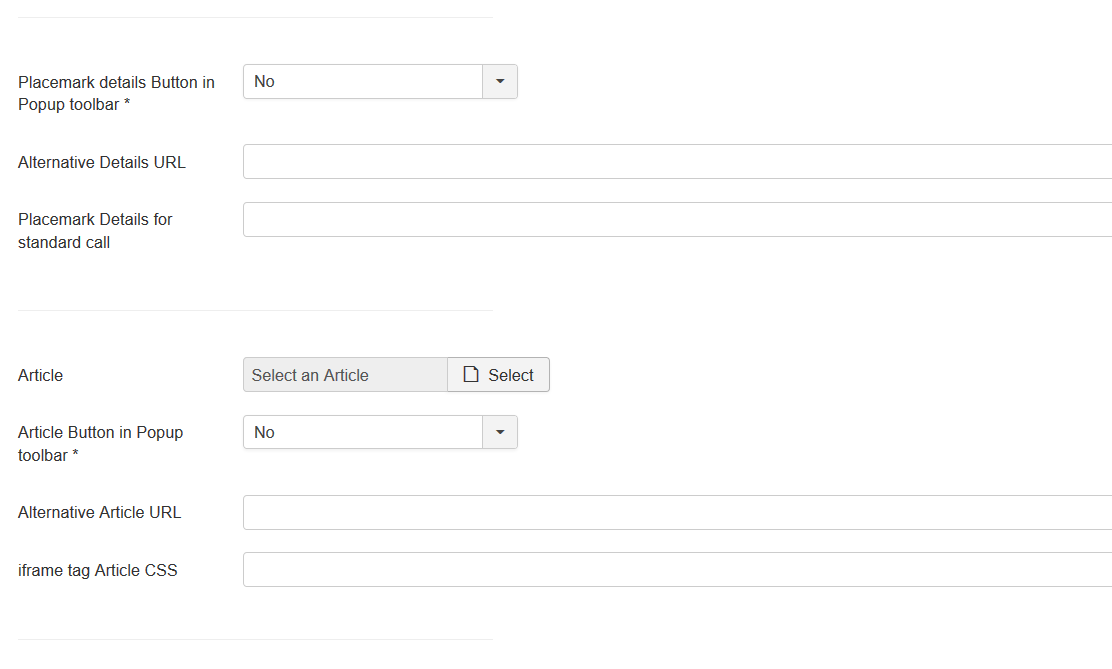
| Placemark details Button in Popup toolbar | Show Placemark Button in Popup toolbar |
| Alternative Details URL | You can alternative URL to show details page (instead of standard call detail placemark view) |
| Placemark Details for standard call | You can override default details attributes for detail view
By default placemark detail page is opened without enabling additional loading bootstrap library and styles, without thumbnail and image gallery, without Additional HTML text and full text description. You can change default behavior by passing parameters, separated by comma (,)
For example, if you enter image gallery,addition html text,full description into field, the detail view for placemark will be with two additional description (short "Addition HTML text" and full "Placemark full description"), and image gallery will be displayed too |
| Article | Article which associate with placemark |
| Article Button in Popup toolbar | Show Article Button in Popup toolbar |
| Alternative Article URL | You can alternative URL to show article page (instead of standard joomla's call) |
| iframe tag Article CSS | You can apply CSS style for iframe tag (when use article in popup content) |
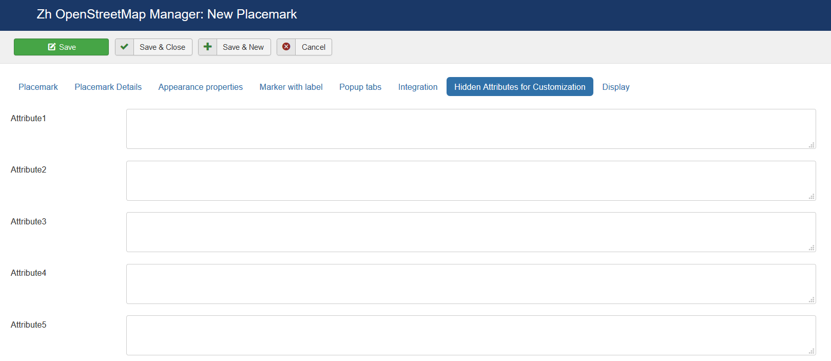
Hidden Attributes for Customization
For your convenience you can also change the labels of the fields by joomla overrides
COM_ZHOSMMAP_MAPMARKER_DETAIL_ATTRIBUTE1_LABEL

COM_ZHOSMMAP_MAPMARKER_DETAIL_ATTRIBUTE2_LABEL

…

COM_ZHOSMMAP_MAPMARKER_DETAIL_ATTRIBUTE9_LABEL
For example, you can enter some data into this fields.
In table columns have names
attribute1

attribute2
...

attribute9
You can use this fields, for example, for integration with other systems or etc.
Display
Placemark Customization
Copy your marker images (format PNG) in the directory
/administrator/components/com_zhosmmap/assets/icons/
Component will automatically pick up the picture when choosing the type of marker.
The only requirement - the file name use English letters and can't contain any special character; the file extension have to be a .png ie in lower case, because names of images stored in a database without the extension, and it is appended in the output.
Don't forget about Compatibility Mode for Resource Files
Grouping
The marker may be included in one group, for this to specify a marker belonging to the group. If the field of markers grouping is set (field value Group Control is different from No), then starts an additional feature: a list of active groups (the location is determined by this same field, with the first four (left, top, right, bottom) correspond to the table form of representation, while the two latter (Group-Map, Map-Group) - based on the div, and you have the opportunity to do anything with them.
The map also has a drop-down list Group CSS - which implements the following functionality:
- the first two styles - predefined
- the third - you can override it in your CSS file template
- while in three cases, just have three different names of objects, respectively, we can change the styles they like.
The following names
for the div-tag ID takes the value
- OMapsMenu-advanced
- OMapsMenu-simple
- OMapsMenu-external
for ul-tag
- zhom-menu-advanced
- zhom-menu-simple
- zhom-menu-external
Accordingly, styles, prescribes for them. Field Show Group Icon is used to display icons in the list of groups.
